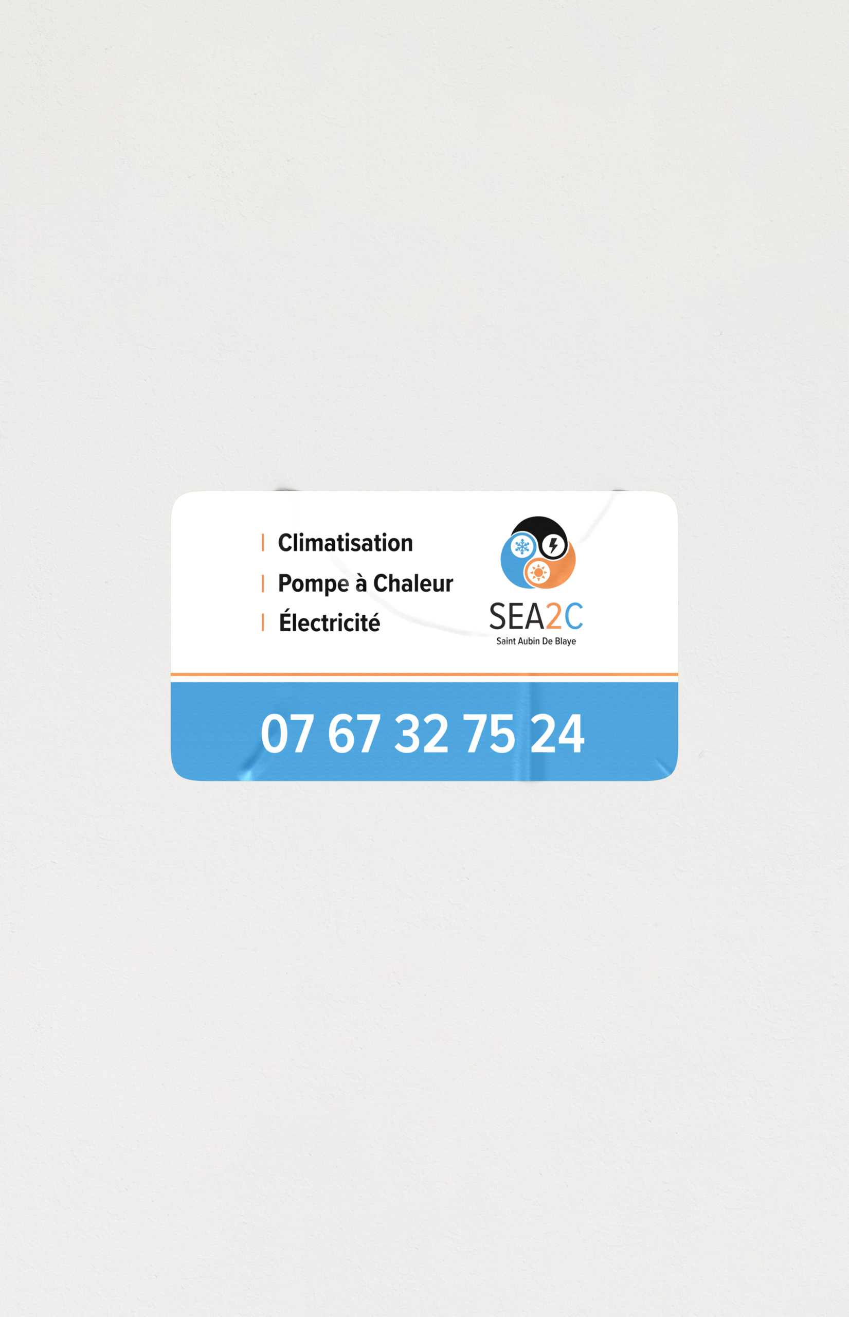
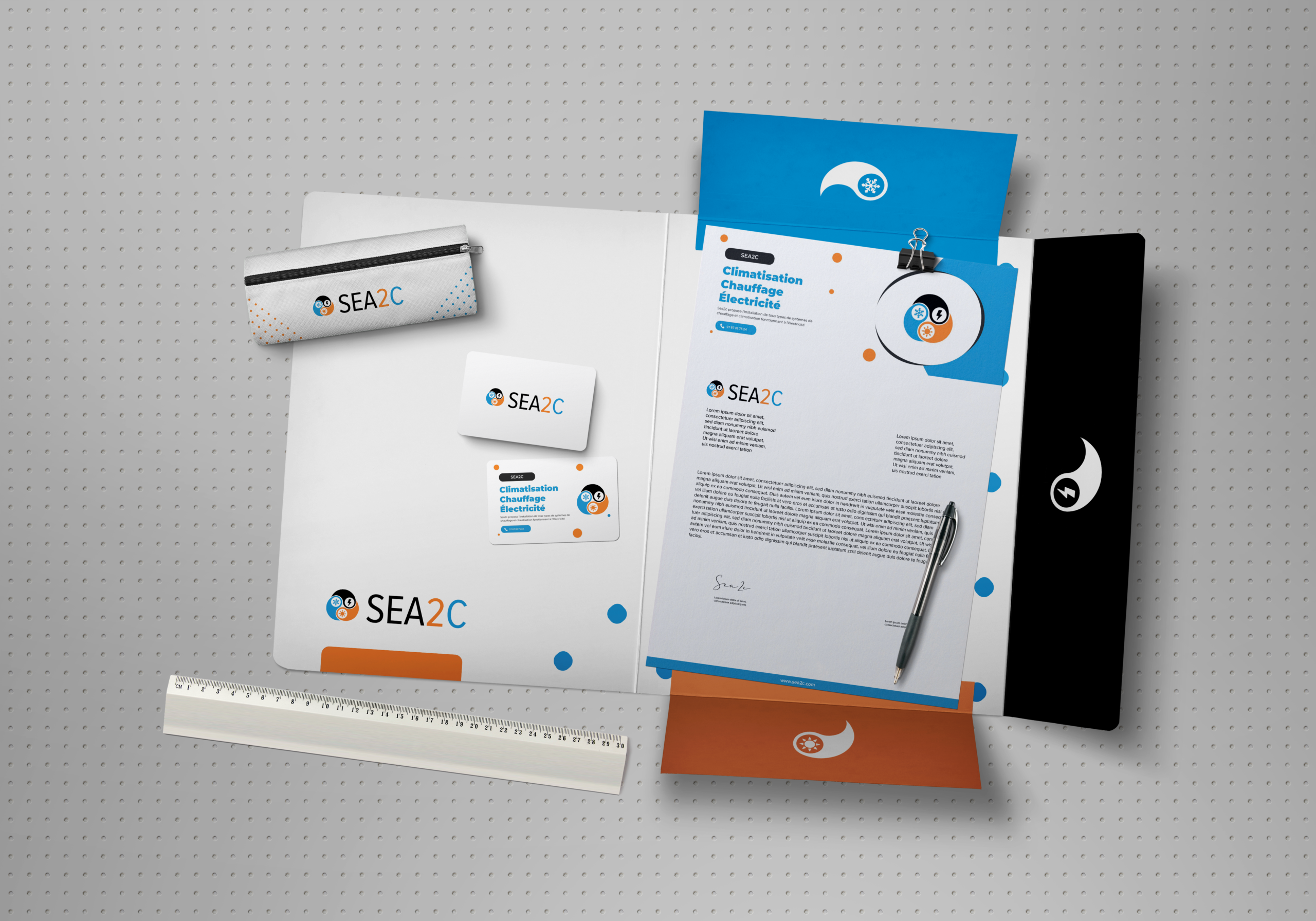
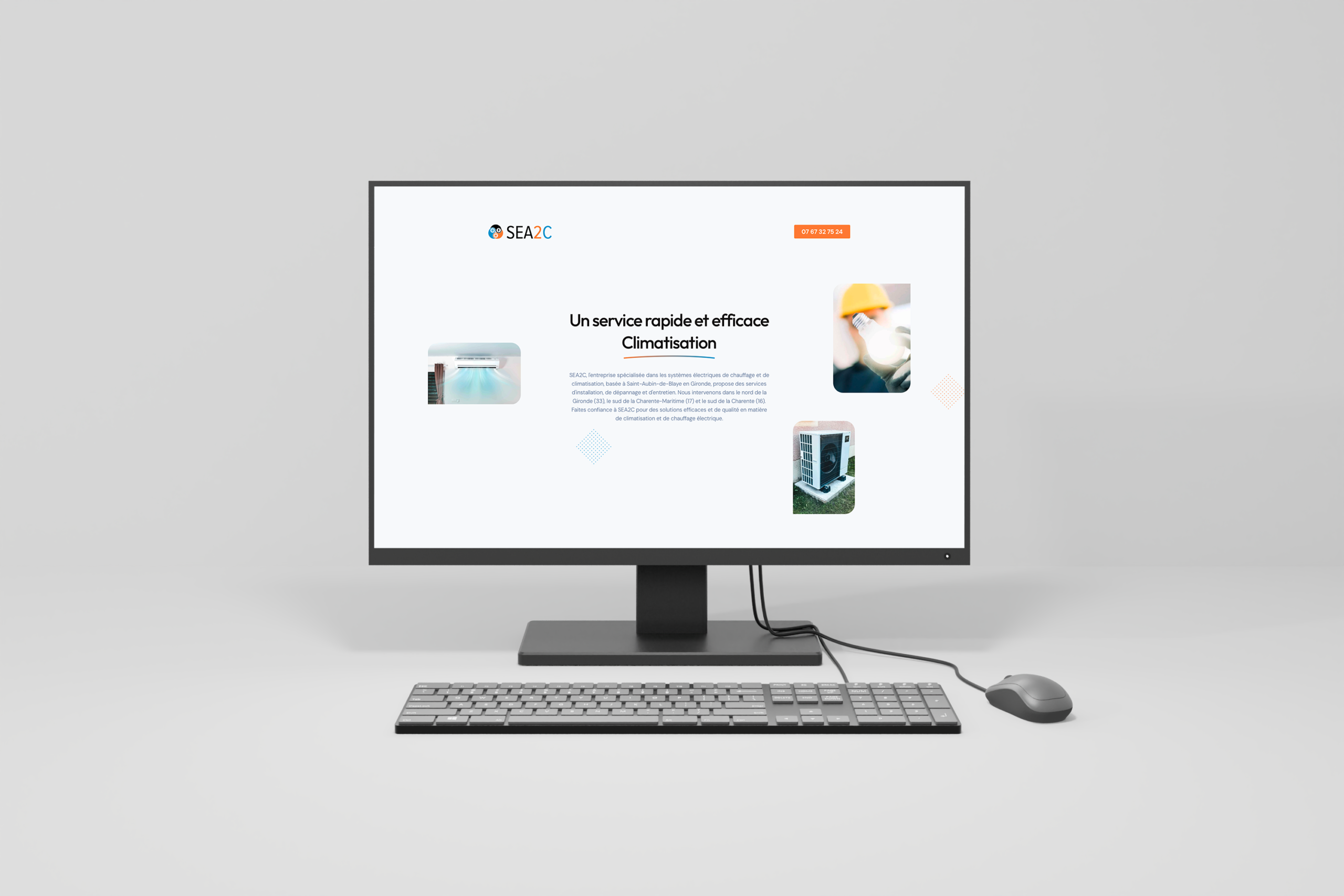
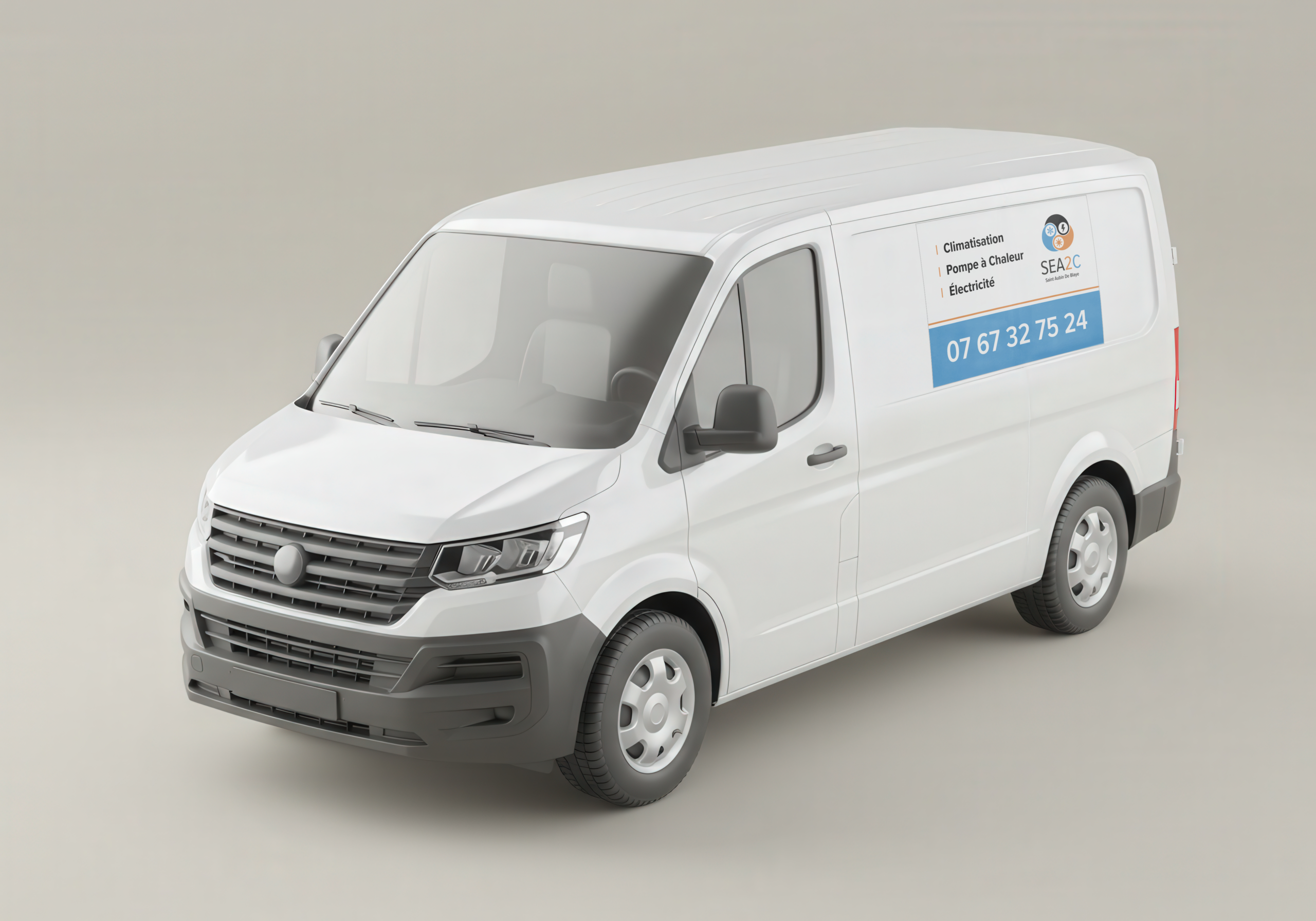
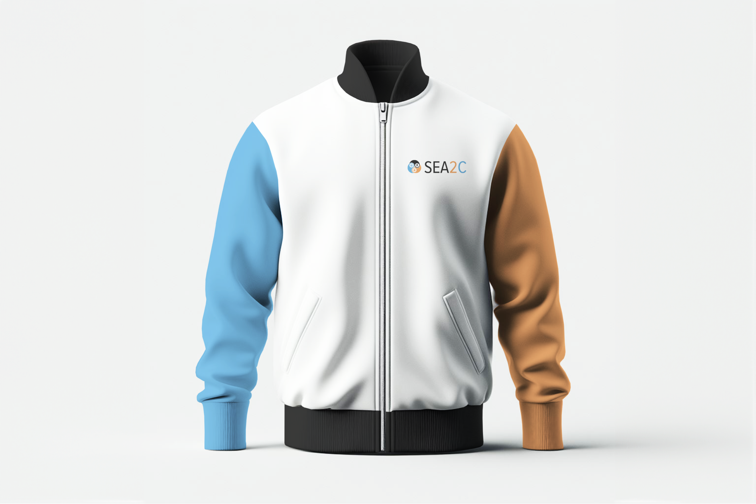
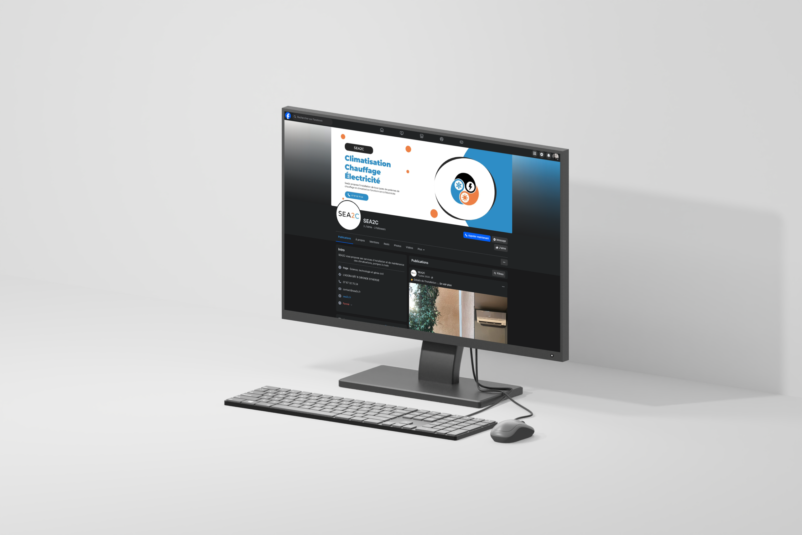
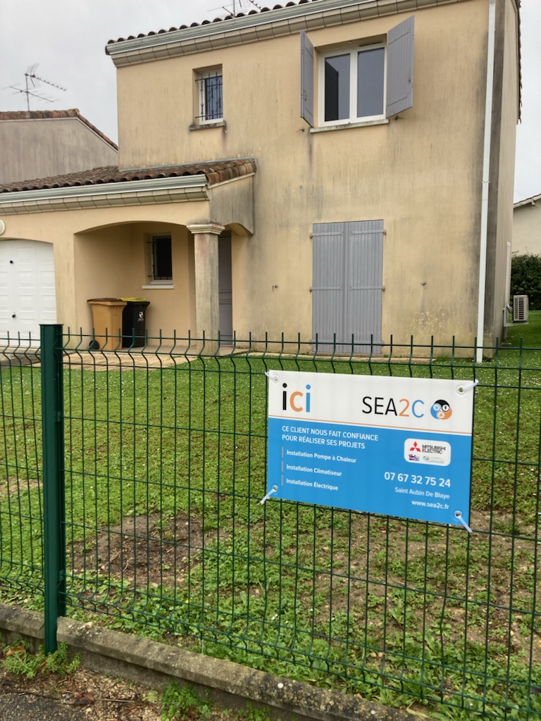
SEA2C a appelé notre équipe à créer son identité visuelle, en choisissant le pack d'identité visuelle et le pack de maquette. SEA2C est spécialisée dans les systèmes de chauffage et de climatisation électriques, basée en Gironde, offrant des services d'installation, de réparation et d'entretien. Faites confiance à SEA2C pour des solutions efficaces et de qualité en matière de climatisation et de chauffage.
Client
SEA2C
Rôle
Directrice artistique
Services
Identité visuelle et Prototypes
SEA2C is a local expert in HVAC (heating, ventilation, air conditioning) and electrical systems. The visual identity needed to represent three core elements: heat, cold, and electricity all within an artisanal yet professional universe. The chosen color palette transitions from orange (heat) to blue (cold), symbolizing the brand’s ability to manage both extremes. The identity balances craftsmanship (trustworthy, hands-on, local) with professionalism (reliable, efficient, technical expertise).
Translating three abstract concepts (heat, cold, electricity) into a single, cohesive visual identity. Using orange and blue together without creating visual conflict or looking like a sports team. Avoiding a generic “HVAC” look (too many flame-and-snowflake logos exist). Conveying both artisanal (small business, personal touch) and professional (certified, high-quality) aspects.
Concevez une palette de couleurs qui passe en douceur de l'orange (chaud) au bleu (froid), avec des accents neutres ou électriques possibles (gris, blanc ou un jaune électrique/cyan brillant). Créez un logo qui symbolise l'union du chauffage, du refroidissement et de l'électricité, peut-être une forme abstraite combinant une flamme, un flocon de neige et un éclair. Développer une identité visuelle qui se sent à la fois locale/artisanale (racines Gironde) et techniquement professionnelle. Produisez un paquet de marque complet comprenant le logo, les maquettes (cartes de visite, signalisation du véhicule, uniformes, site Web). Positionner SEA2C comme l'expert local de confiance pour tous les besoins électriques de chauffage et de refroidissement.
Started with research on HVAC industry branding: common motifs include thermometers, vents, flames, snowflakes, and wrenches. Looked for ways to avoid clichés. Chose a gradient from warm orange to cool blue as the core visual device representing the range of temperatures SEA2C handles. Added a neutral gray or white for text and backgrounds to keep the design professional. Sketched logo concepts: a stylized electrical plug combined with a flame on one side and a snowflake on the other; or an abstract circular symbol where orange and blue swirl together, with a lightning bolt shape cutting through. Selected a clean, modern sans-serif typography to convey technical reliability. Designed mockups: a van wrap with the orange-blue gradient swoosh and logo, technician uniforms with embroidered logos, a business card with gradient accents, a website header showing the transition from warm to cool. Ensured the artisanal feel came through via subtle textures (like a slight grain) or handwritten-style taglines (“Local experts. Complete comfort.”). Tested the identity with potential customers to ensure it reads as trustworthy and skilled. Delivered a brand for SEA2C where heat and cold meet electricity in perfect balance, from orange to blue.