Embrace the spirit of the Winter Olympics with a design created for Coca-Cola. Let creativity and passion fuel your journey to greatness.
Client
Personnal
Role
Graphic Design
Services
Design
Challenges
& Objectives
/ Project Overview
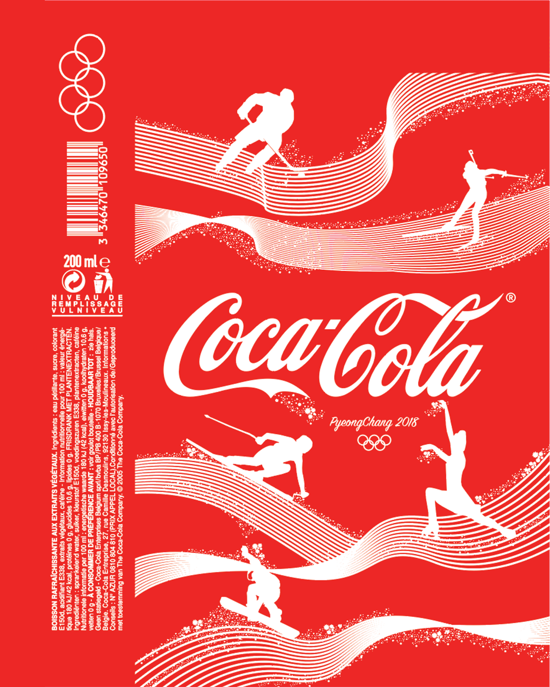
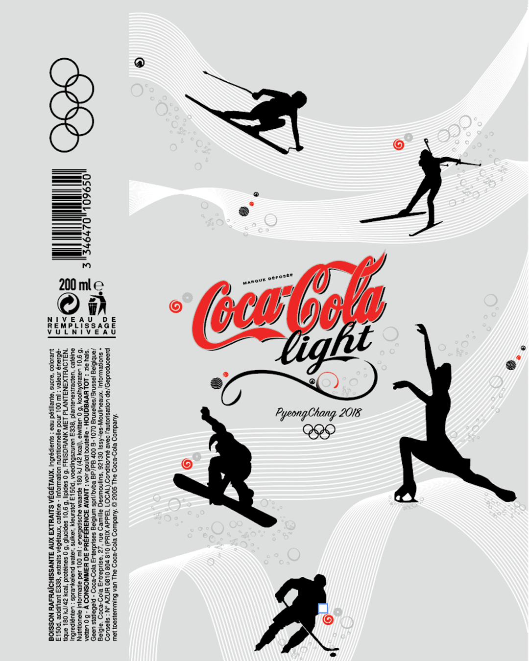
A creative project aiming to represent a graphic universe around the Coca-Cola brand. A limited edition series of bottles and packs directly linked to the PyeongChang 2018 Winter Olympics. By tapping into current events, Coca-Cola stays on trend. The brand allows its consumers to enjoy two moments around the same theme. Searching for illustrations that fit both the brand and the theme, I finally found five characters representing the Winter Olympics. They were reworked and modified to ensure graphic consistency with the Coca-Cola visual identity.
/ Challenges
Finding five Winter Olympic characters that resonate with both the Games and Coca-Cola’s brand DNA. Adapting and modifying existing illustrations to fit Coca-Cola’s strict graphic charter. Ensuring the limited edition bottles feel collectible and festive, not generic. Balancing Olympic spirit (competition, winter, athleticism) with Coca-Cola’s core values (happiness, sharing, refreshment).
/ Objectives
Create a cohesive set of five character illustrations for limited edition bottles and packs. Align every graphic element with Coca-Cola’s brand guidelines (red, white, dynamic curves, friendly tone). Celebrate the PyeongChang 2018 Winter Olympics while making the products feel timely and desirable. Deliver a design that works across bottles, multipacks, and point-of-sale displays.
Creative
Process
Started with research on PyeongChang 2018 Winter Olympic sports and mascot aesthetics. Identified five key characters representing different winter disciplines (e.g., skiing, skating, snowboarding). Sketched initial character designs, then cross-referenced with Coca-Cola’s existing illustration style (rounded shapes, smiling faces, red accents). Reworked and modified each character multiple times to ensure graphic consistency: same line weight, same color palette (Coca-Cola red, white, ice blue, gold), same friendly expression. Tested the illustrations on mockup bottles and packs to check visibility and impact. Delivered a final limited edition series that captures the excitement of the Winter Olympics while staying unmistakably Coca-Cola.