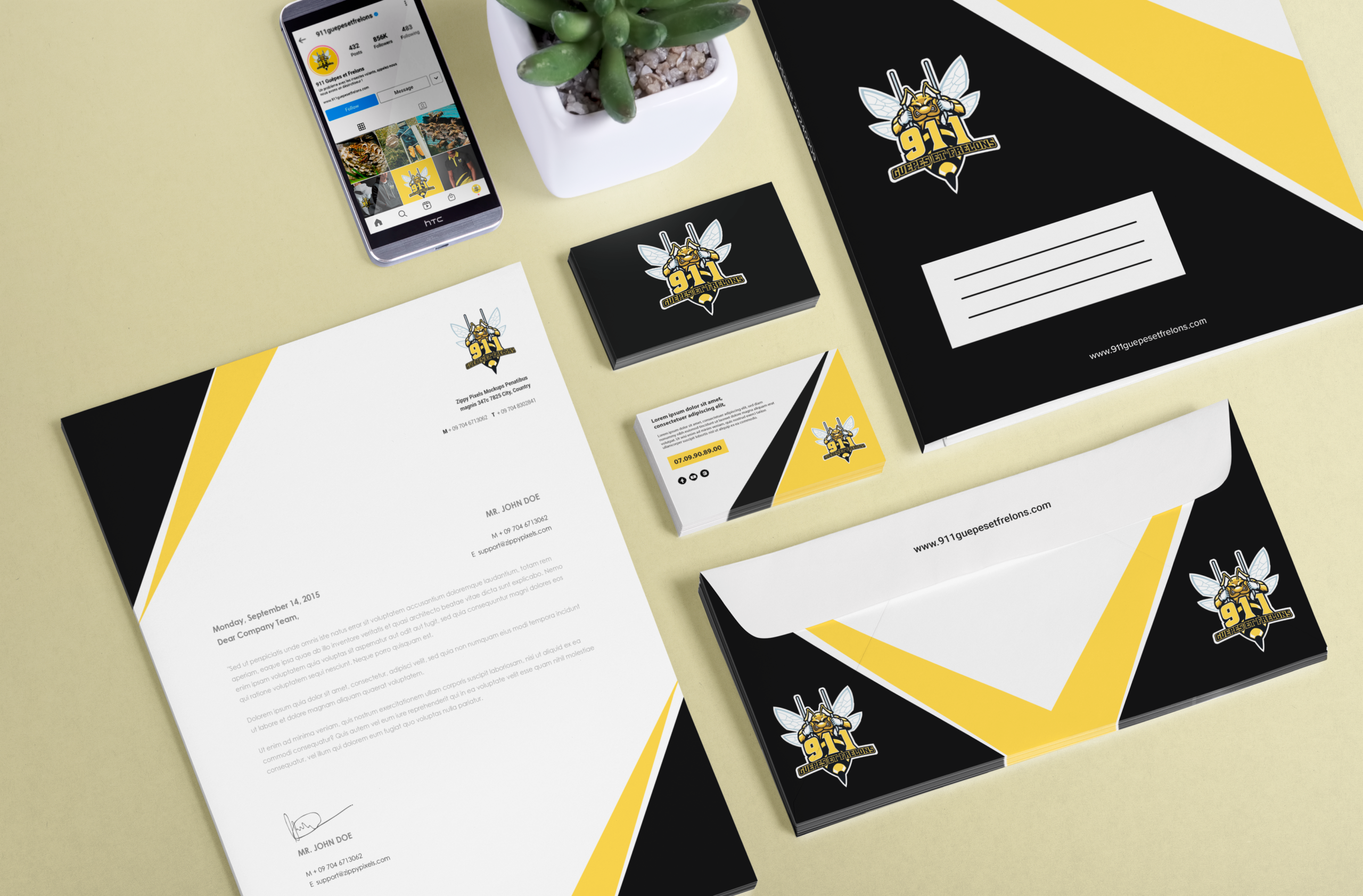
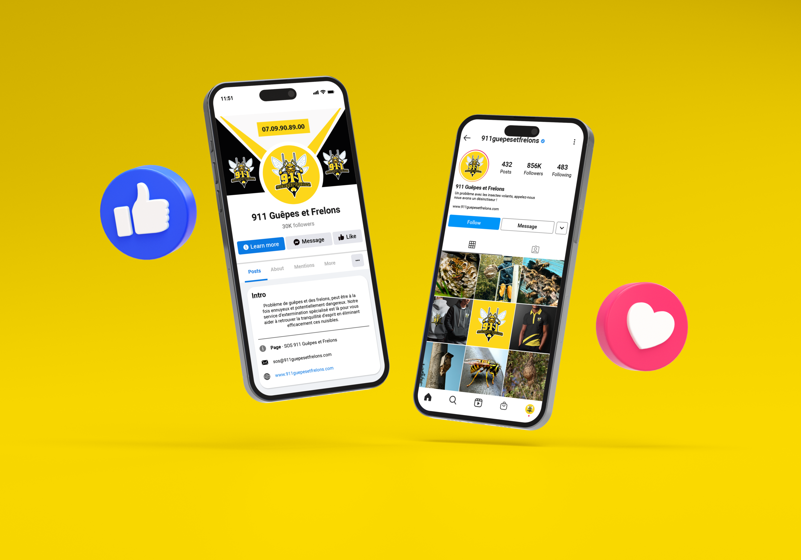
911 Guêpes et frelons ont fait appel à notre expertise pour concevoir son identité visuelle à l'aide du pack d'identité visuelle. Experts en destruction des nids de guêpes, de frelons et de frelons asiatiques à toutes les hauteurs, près de chez vous. Ils opèrent en Gironde. Une jeune entreprise qui voulait une identité reflétant son image.
Client
911 Guêpes et Frelons
Rôle
Directrice artistique
Services
Identité visuelle et Prototypes
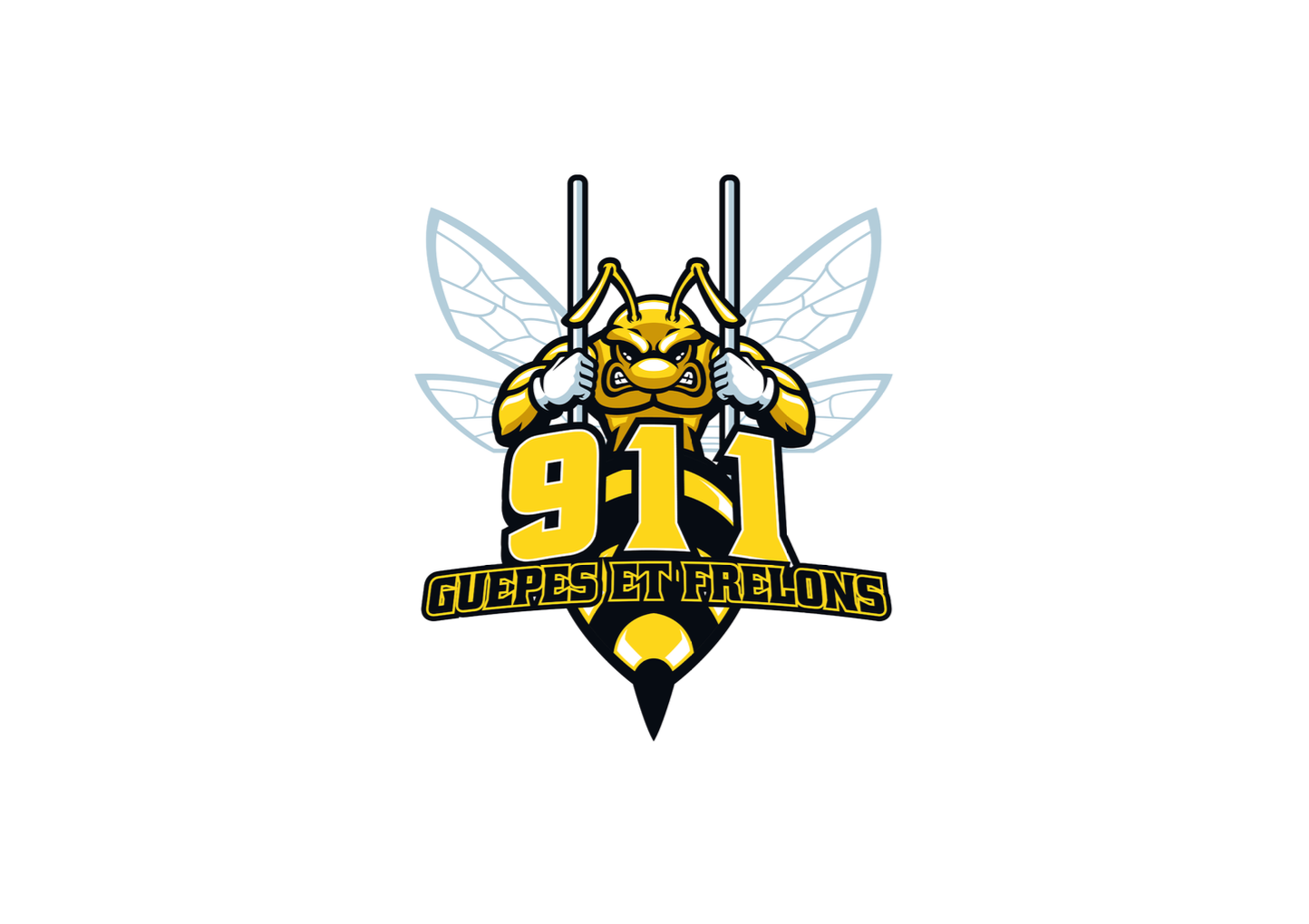
911 Guêpes et frelons is a young, dynamic pest control company specializing in the removal of wasp and hornet nests, including the invasive Asian hornet. They operate throughout Gironde, handling interventions at any height (from ground level to rooftops). The company wanted a strong, impactful visual identity that conveys strength, speed, and reliability. The logo features a muscular wasp behind bars, using dominant yellow and black colors. This imagery communicates power, danger (appropriately), and the idea of “incarcerating” pests. The overall identity is bold, aggressive, and memorable designed to inspire confidence in an emergency service.
Creating a logo that feels powerful and professional, not cartoonish or overly aggressive. Using yellow and black (common wasp colors) without looking like a generic warning sign. Making a “muscular wasp behind bars” concept recognizable at small sizes (business cards, phone screens). Balancing the urgent, dangerous nature of the service with approachability for residential customers.
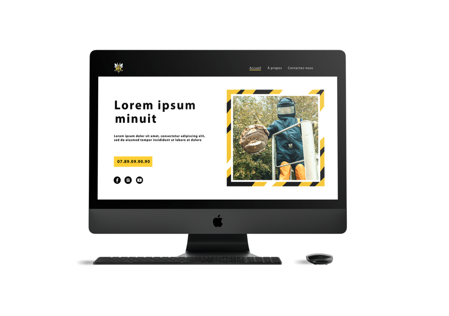
Concevez un logo audacieux avec une guêpe musclée derrière les barreaux en jaune et noir. Développez une palette de couleurs dominée par le jaune et le noir à contraste élevé, avec des accents neutres possibles (blanc ou gris foncé) pour la lisibilité. Créez une identité visuelle qui transmet l'expertise, la rapidité et la fiabilité pour les interventions d'urgence. Produire un paquet de marque complet comprenant un logo, des cartes de visite, une signalisation de véhicule, des patchs uniformes et un en-tête de site Web. Positionnez le 911 Guêpes et frelons comme expert local de retrait pour l'enlèvement de nids en Gironde.
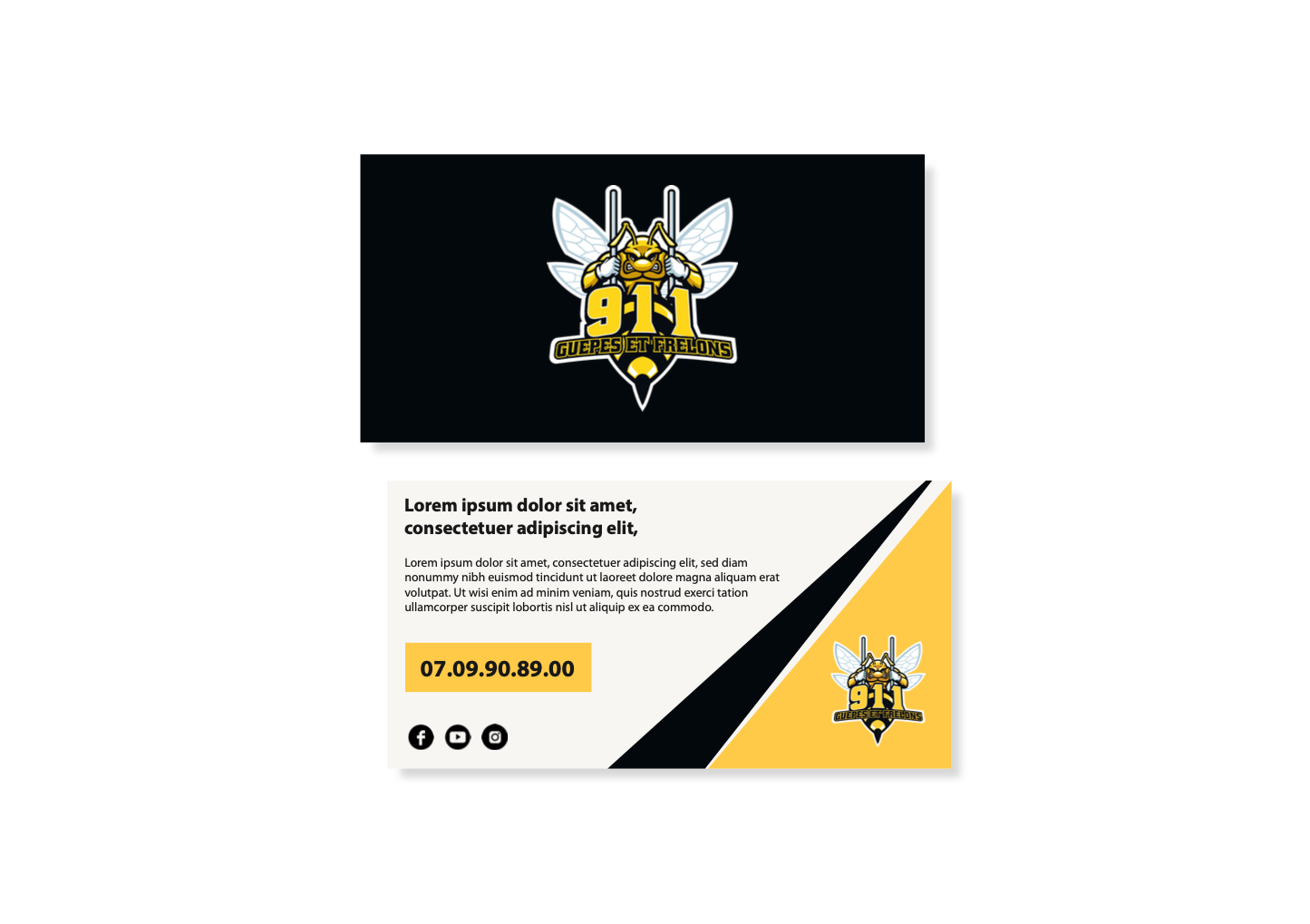
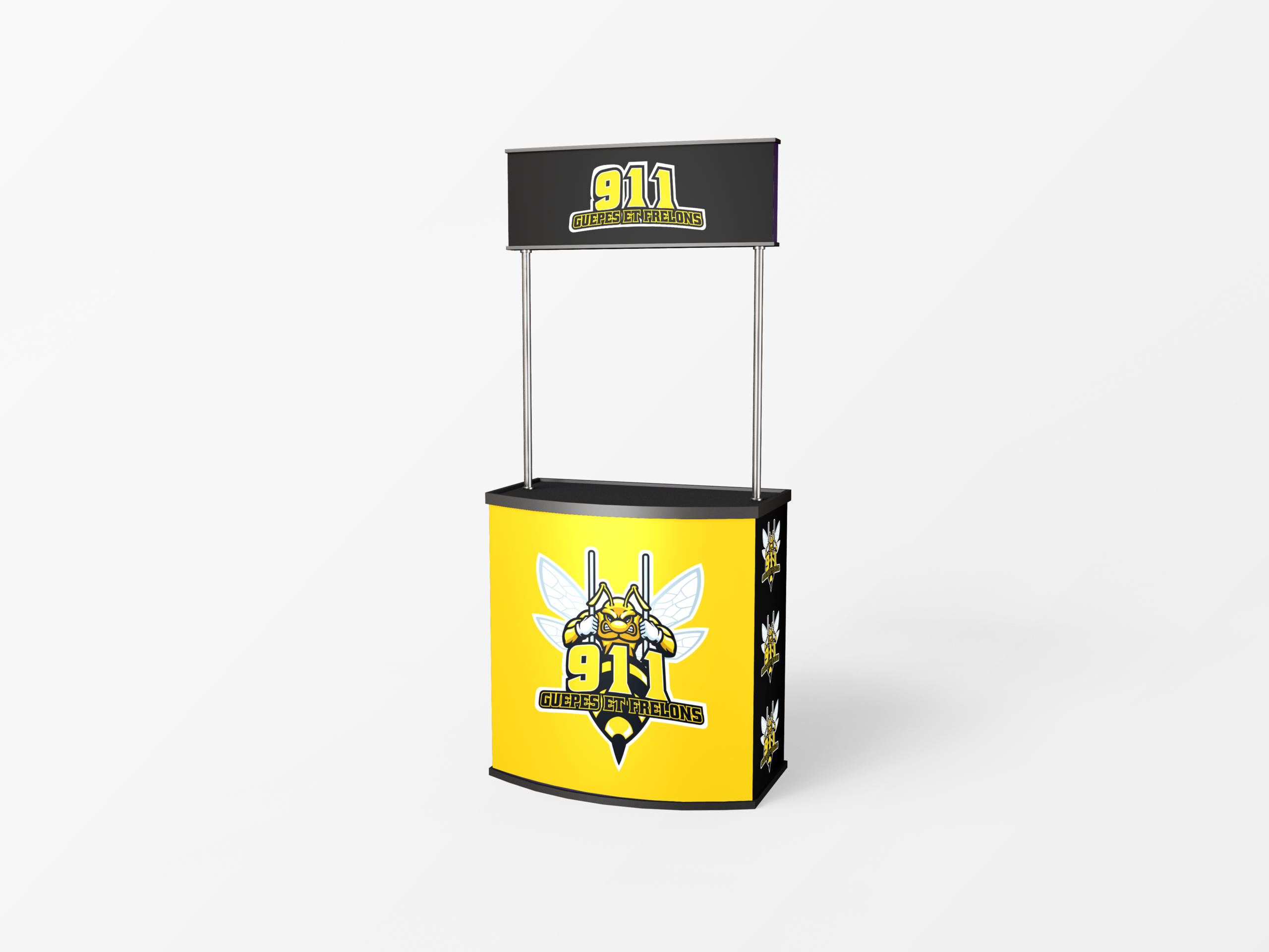
Started with research on pest control branding: often use shields, crosses, or cartoon bugs. Avoided clichés by focusing on strength and incarceration metaphors. Chose yellow and black as primary colors (wasp warning colors, high visibility, strong contrast). Sketched multiple logo concepts: a wasp with exaggerated muscular arms and thorax, shown behind prison bars or a cage. Refined the wasp’s expression to be fierce but not grotesque. Added the “911” prefix to emphasize emergency response. Selected a bold, condensed sans-serif typography for the company name to match the aggressive tone. Designed mockups: a van wrap with the large logo and phone number, technician uniforms with embroidered patches, business cards with yellow and black gradient, a website header showing a wasp nest with the logo overlaid. Ensured all materials include clear emergency contact information. Tested the identity with potential customers to ensure it conveys trust and rapid action. Delivered a brand for 911 Guêpes et frelons where the muscular wasp behind bars says it all: we lock up your pest problem, fast and strong.