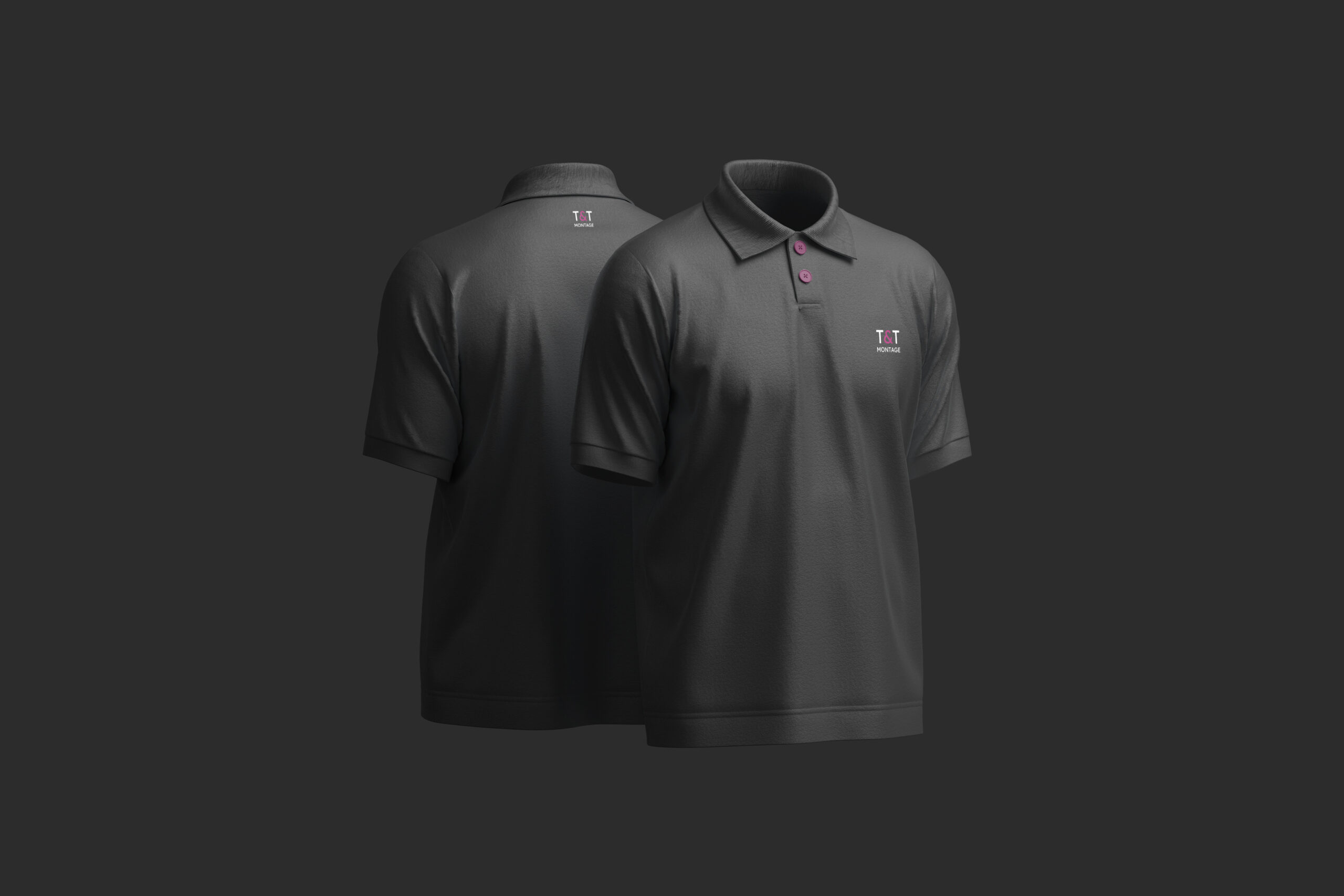
Thomas et Timothé ont uni leur expertise et leur passion pour l'art et le design pour créer une entreprise d'assemblage de meubles où la technique rencontre la créativité. Leur expérience diversifiée, du mobilier de bureau aux boîtes symphoniques, les a conduits à une approche unique : pour eux, l'assemblage de meubles est un acte créatif qui donne vie à l'âme de la pièce. Leur philosophie transforme l'assemblage en un processus artistique où la technique sert l'esthétique.

Client

T&T MONTAGE

Rôle

Directrice artistique

Services

Identité visuelle et Prototypes

Défis & Objectifs

/ Aperçu du projet

Attentifs aux détails, ils accordent une attention méticuleuse à chaque assemblée, considérant chaque meuble comme un objet unique racontant une histoire. Leur plus grande satisfaction réside dans le résultat final combinant beauté, confort et fonctionnalité. Leur mission va au-delà du simple service : en tant que véritables conteurs, ils transforment un pack plat en un meuble sophistiqué, plein d'histoire et de caractère, contribuant à créer des environnements inspirants pour leurs clients. Leur travail est un acte de transmission et de création, visant à faire ressortir l'âme et l'histoire de chaque pièce. Leur objectif est de transformer l'assemblage technique en une expérience artistique, où la précision du geste sert le design et l'émotion.

/ Défis

Balancing technical precision (assembly, functionality) with artistic sensitivity (design, emotion, storytelling). Creating a visual identity that feels both professional (trustworthy, serious) and passionate (creative, warm). Using a palette of three colors (anthracite gray, white, vibrant purple) harmoniously without one overpowering the others. Selecting a typography (Lexend) that is readable and precise, reflecting the brand’s attention to detail. Designing a logo that combines structural lines, an assembly symbol, and elegant typography.

/ Objectifs

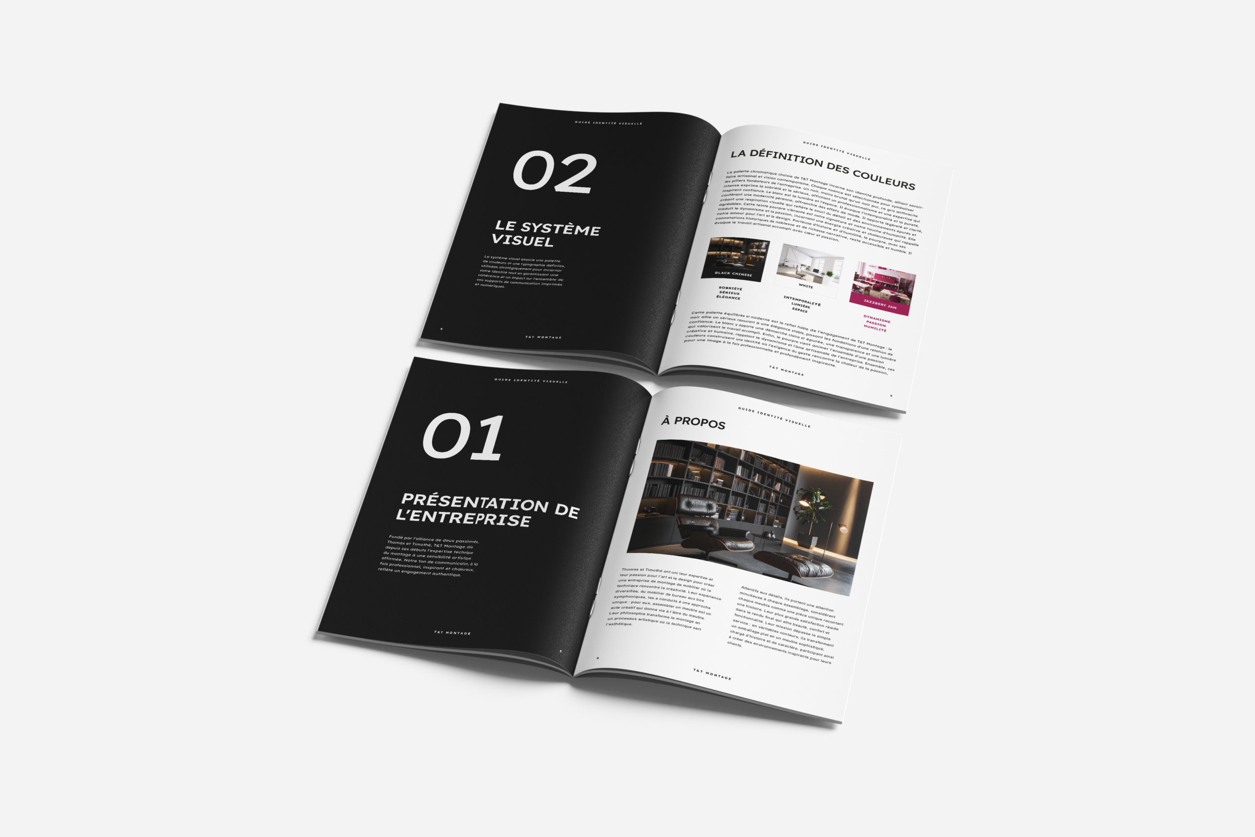
Develop a color palette: anthracite gray (sobriety, seriousness, professionalism, elegance), white (timelessness, purity, light, space, clarity), vibrant purple (dynamism, passion, creativity, humility, warmth). Use Lexend typography for its generous spacing, cognitive ease, precision, and elegance mirroring the brand’s meticulous assembly process. Design a logo featuring clean structural lines (precision), a subtle assembly or harmony symbol, and elegant typography. Build a brand identity that tells the story of meticulous assembly in service of design, comfort, and inspiration. Position T&T Montage as the intersection of craftsmanship, art, and technical excellence.

Processus
Créatif

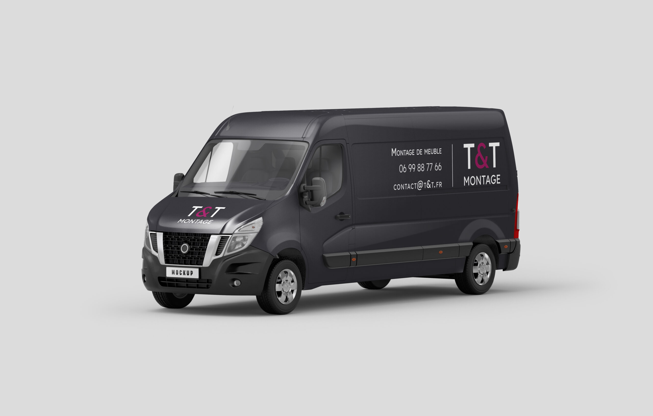
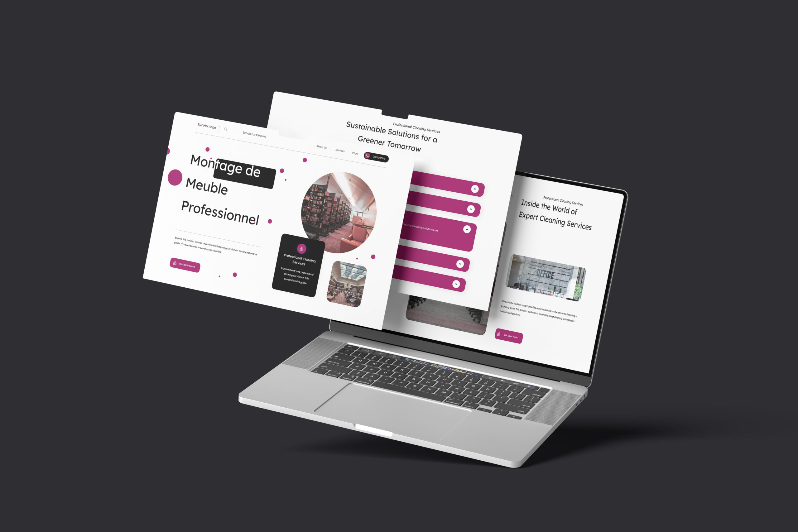
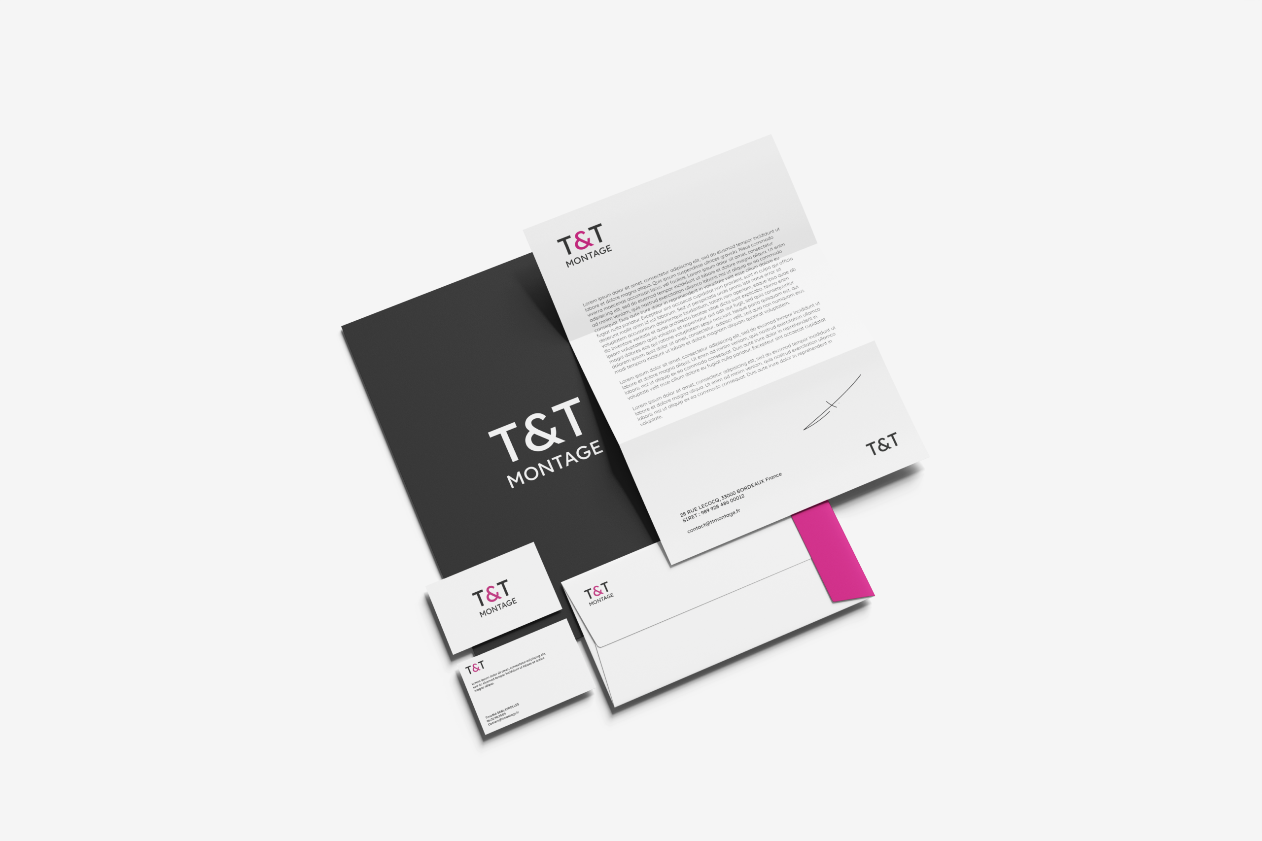
Started with the founders’ philosophy: assembly as an artistic act, technique serving aesthetics, revealing the soul of furniture. Researched furniture assembly branding (often industrial or invisible) and wanted to elevate it to artisanal storytelling. Chose a restrained palette: anthracite gray (softer than pure black) for seriousness and elegance, white for timeless purity and breathing space, vibrant purple as a signature representing passion, creativity, history, and humility. Selected Lexend typography after evaluating its cognitive ease and geometric clarity; its generous letter spacing reduces cognitive load, paralleling how careful assembly reduces stress for clients. Sketched logo concepts: structural lines suggesting a flat-pack diagram, an abstract assembly symbol (interlocking shapes or a subtle arrow/movement), paired with Lexend logotype. Refined the logo to balance technical precision (clean geometry) with artistic warmth (purple accent). Created mockups: business cards (gray background, white text, purple logo accent), website (clean white space, purple call-to-action, gray headers), uniforms (gray aprons with purple embroidery), vehicle signage, and assembly instruction sheets (using Lexend for maximum readability). Wrote brand messaging around key values: passion, excellence, elegance, story, listening, synergy. Ensured every touchpoint conveys that assembling a piece of furniture is not a chore but an act of love and precision. Delivered a visual identity for T&T Montage where every gray line speaks of professionalism, every white space breathes clarity, and every purple detail pulses with the heart of two artisans who believe that furniture, properly assembled, tells a story.

fr_FRFR