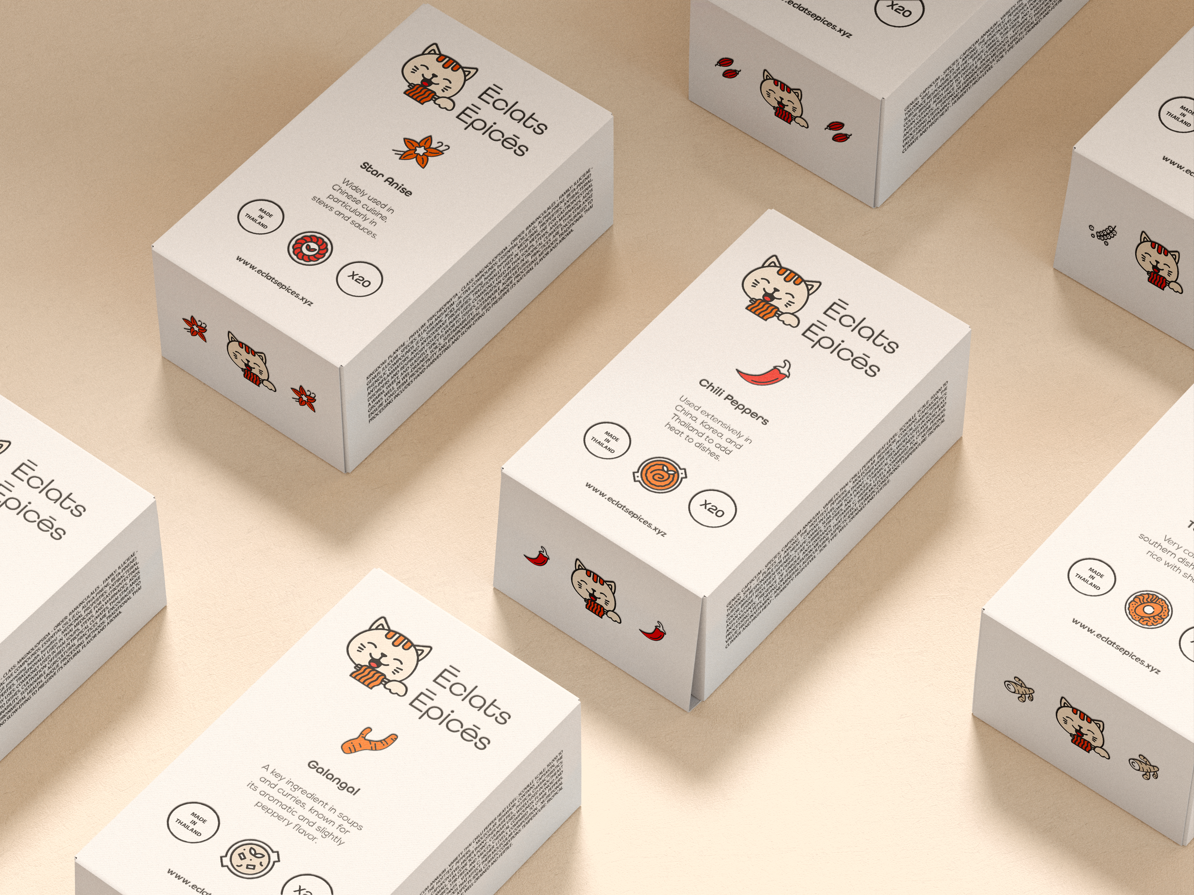
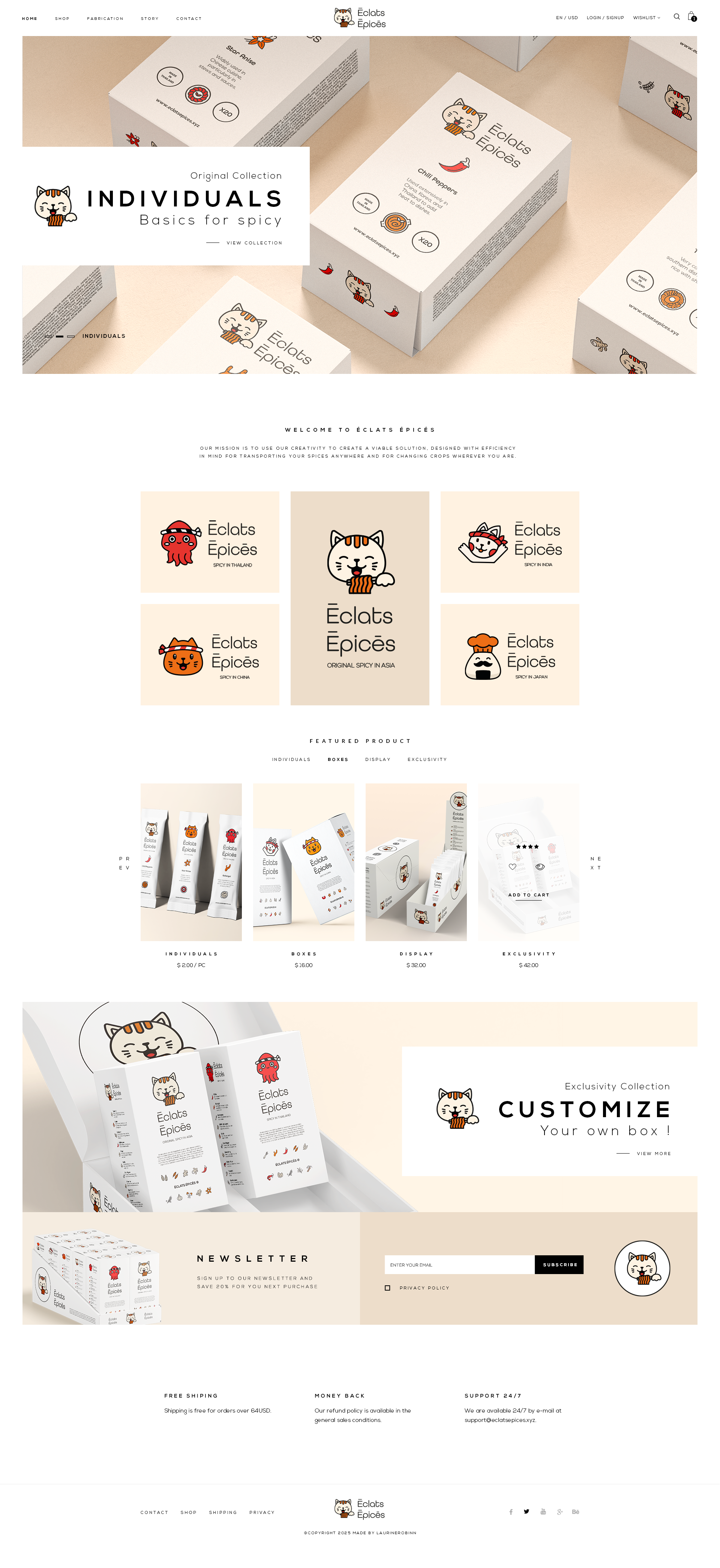
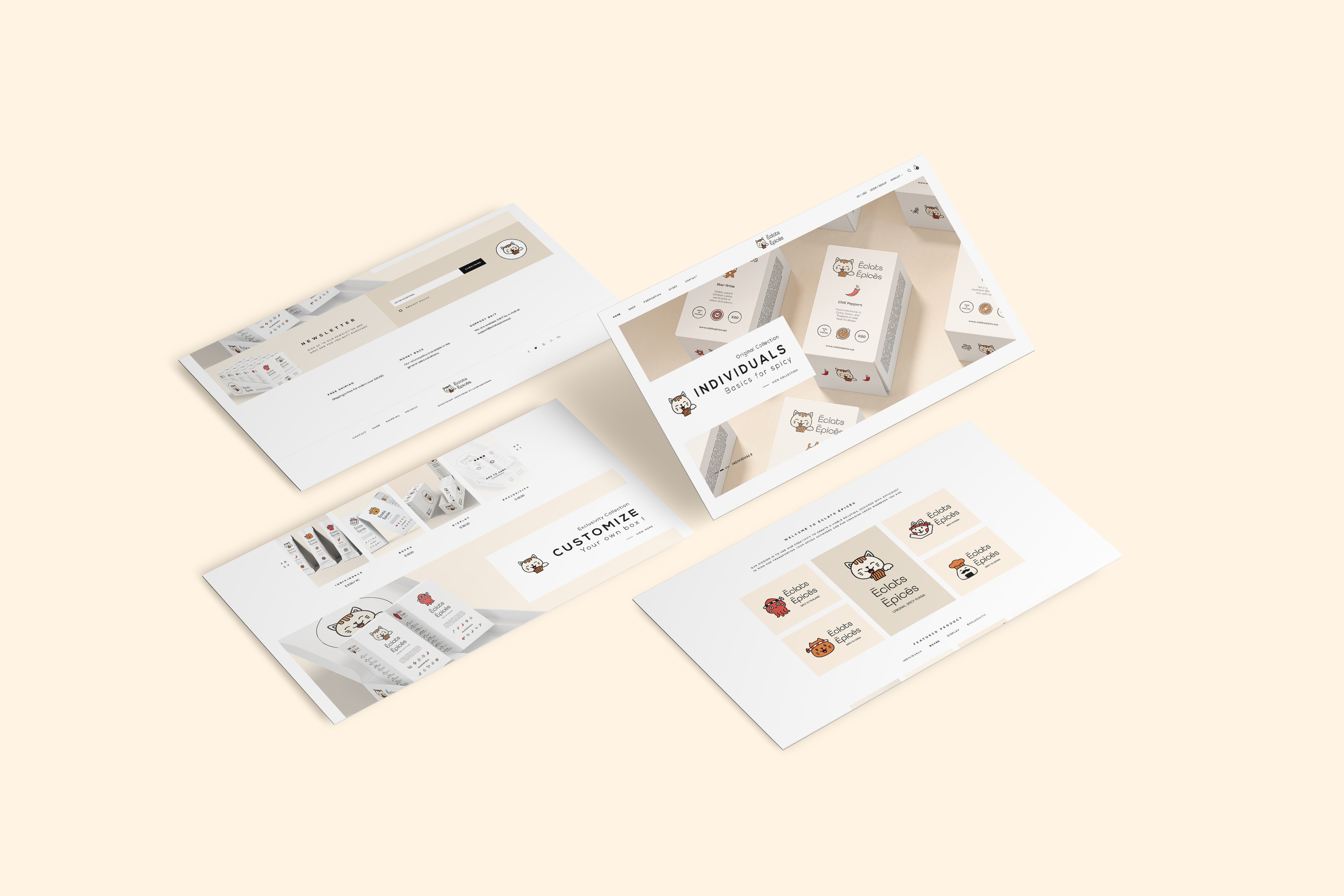
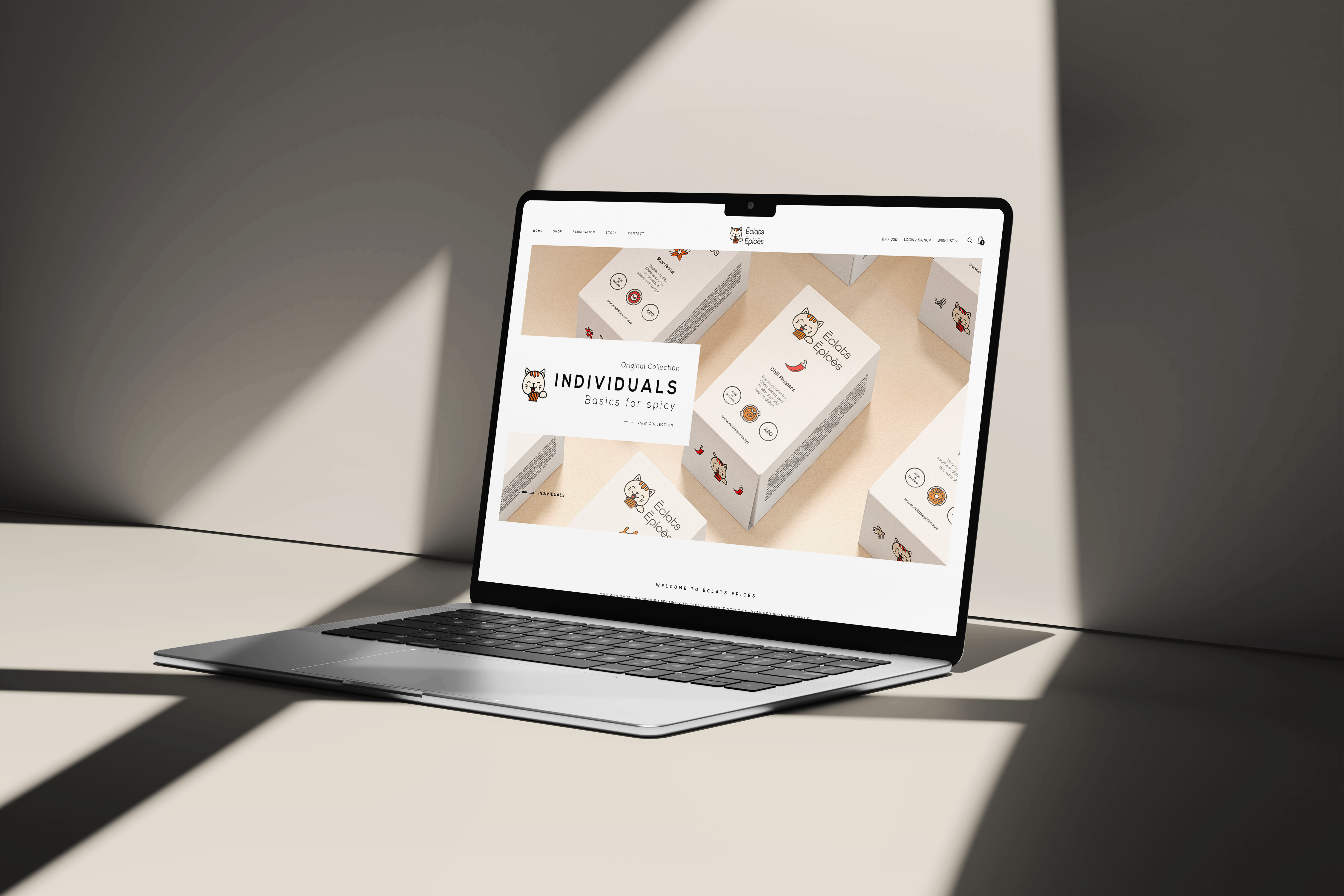
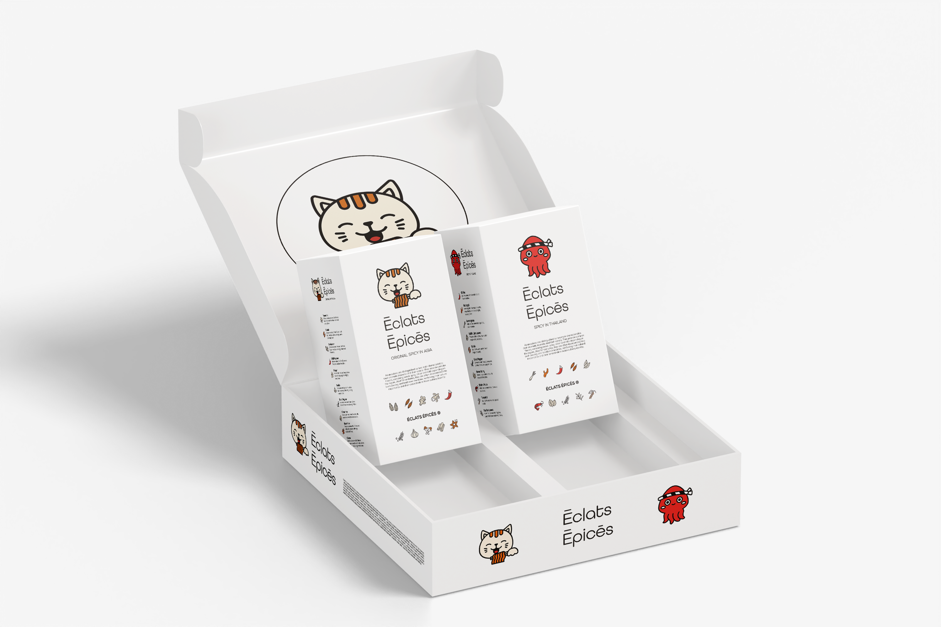
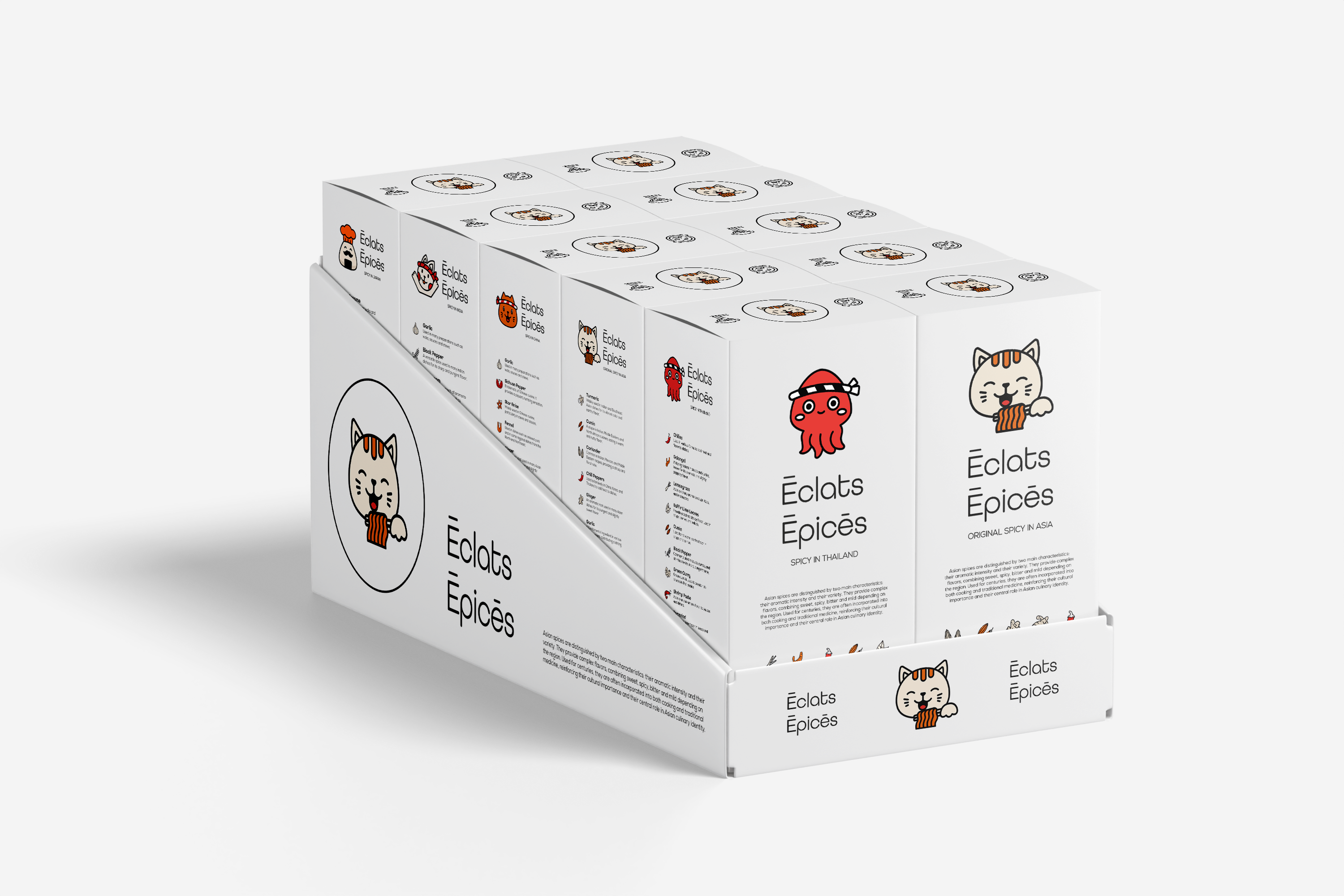
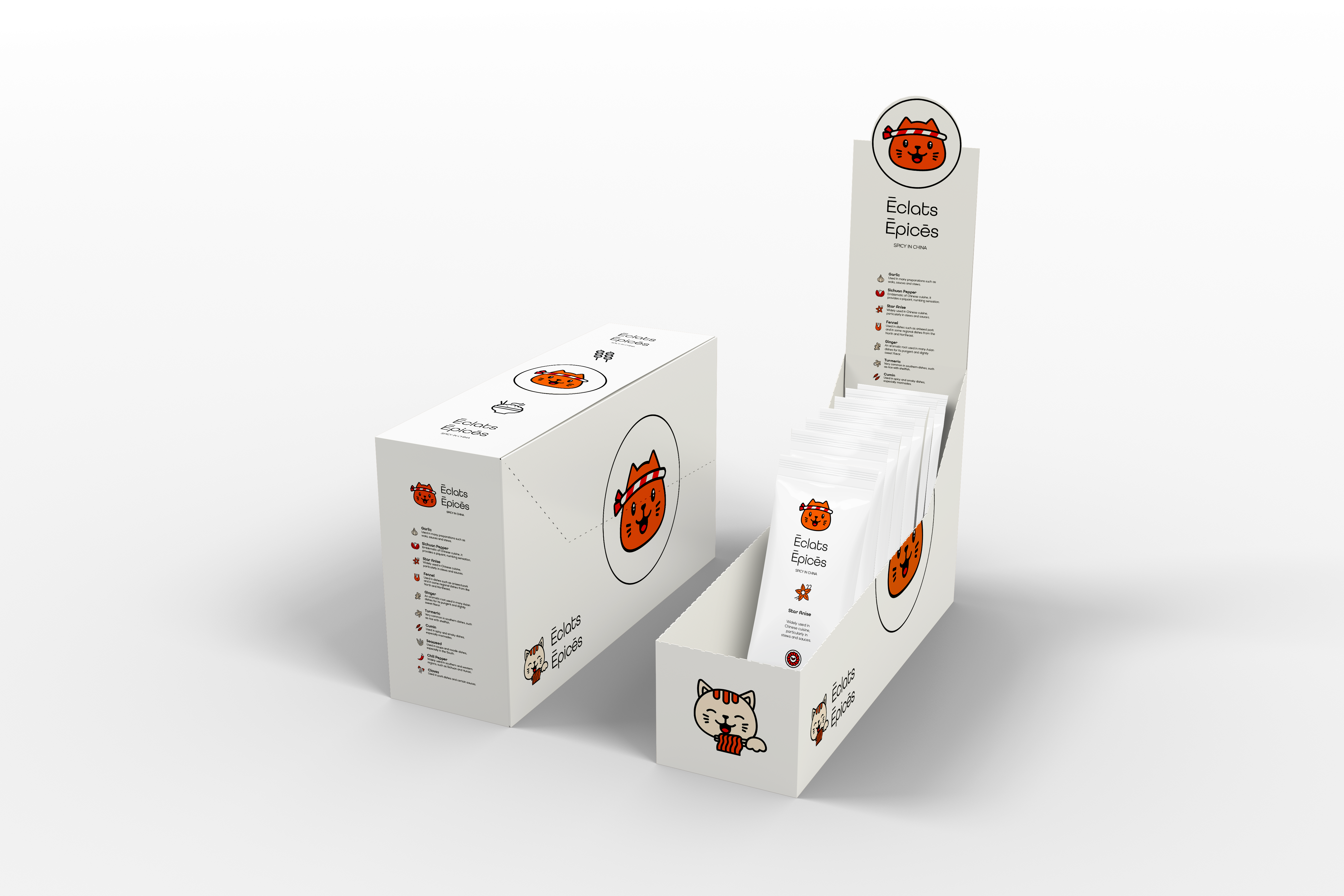
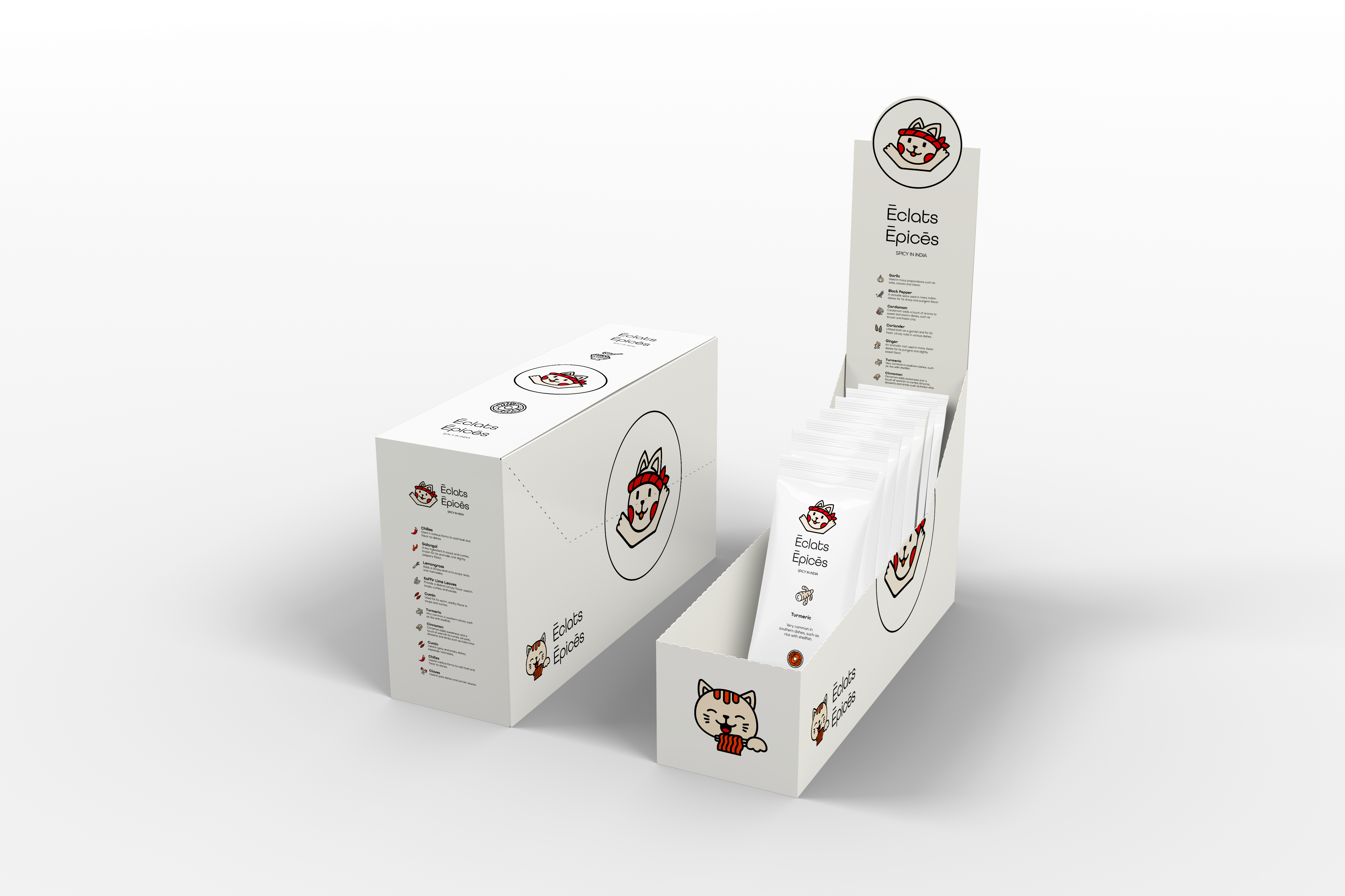
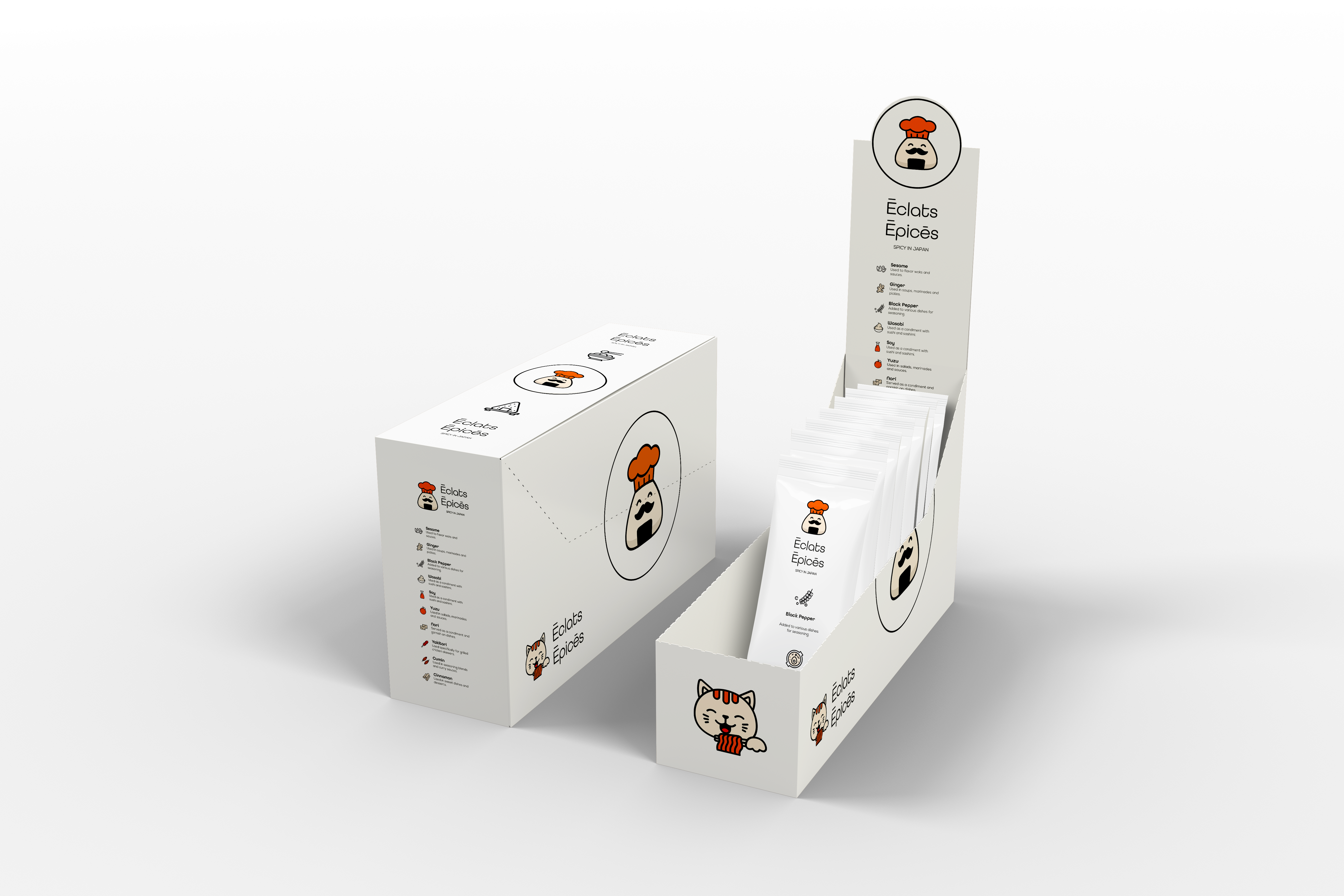
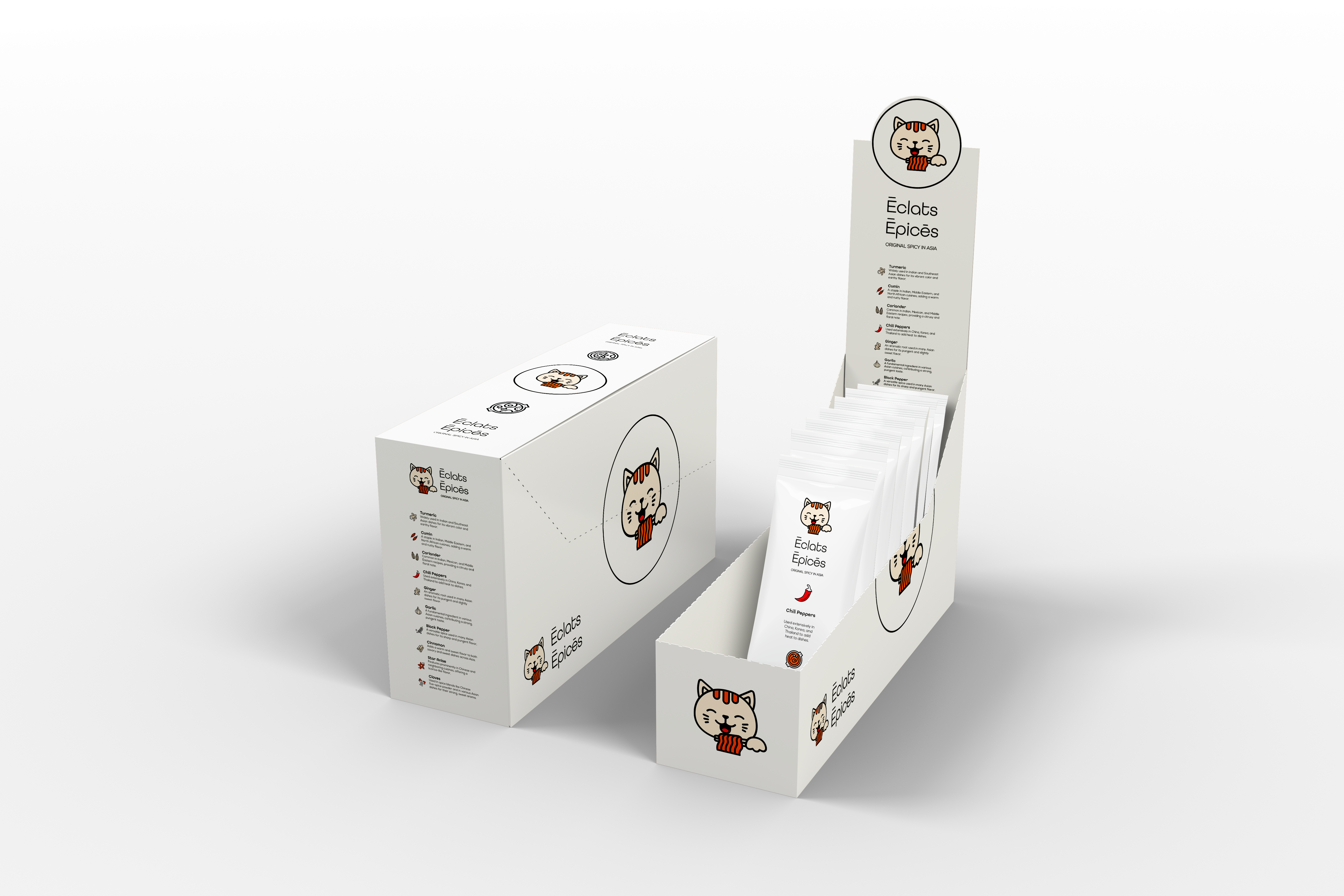
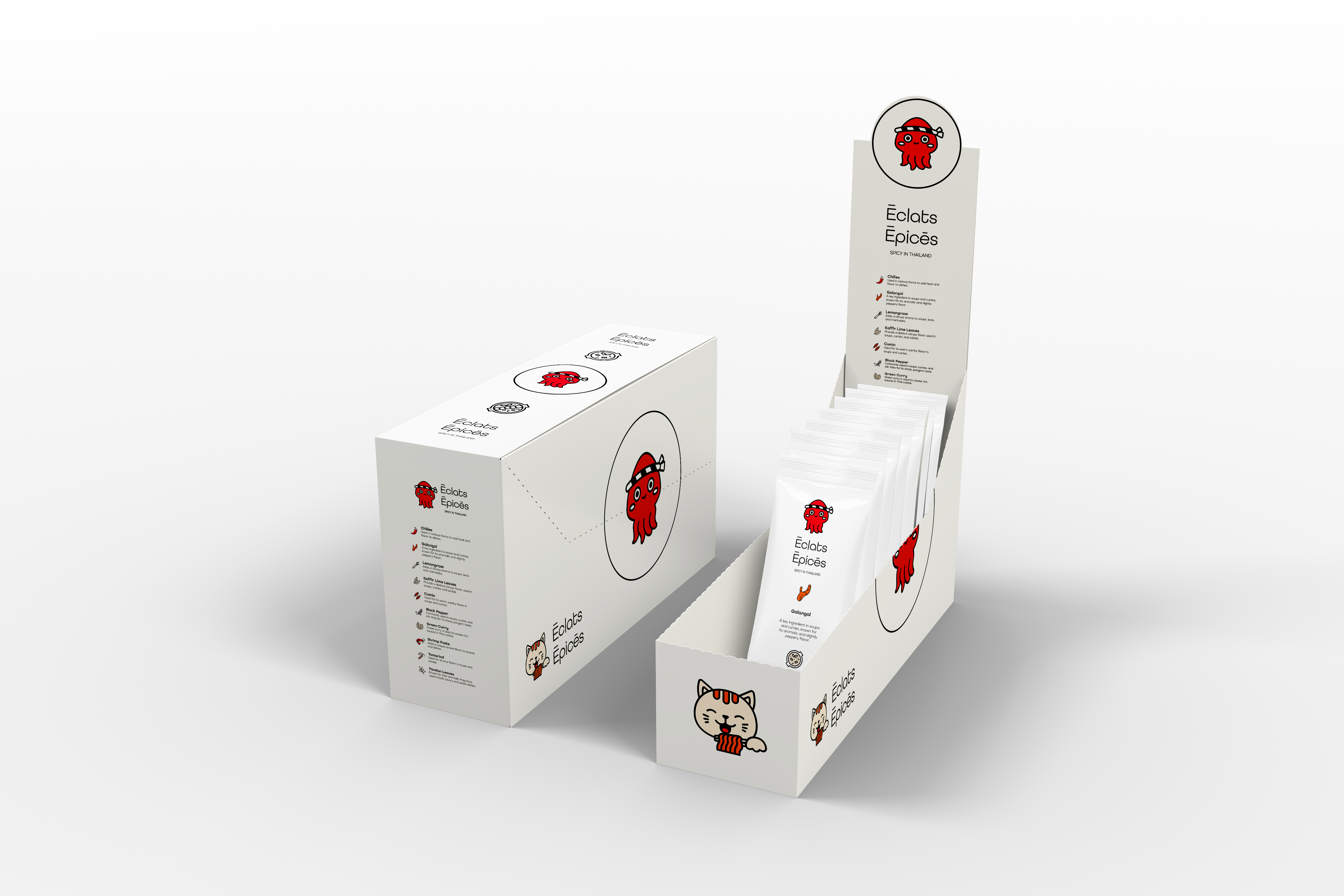
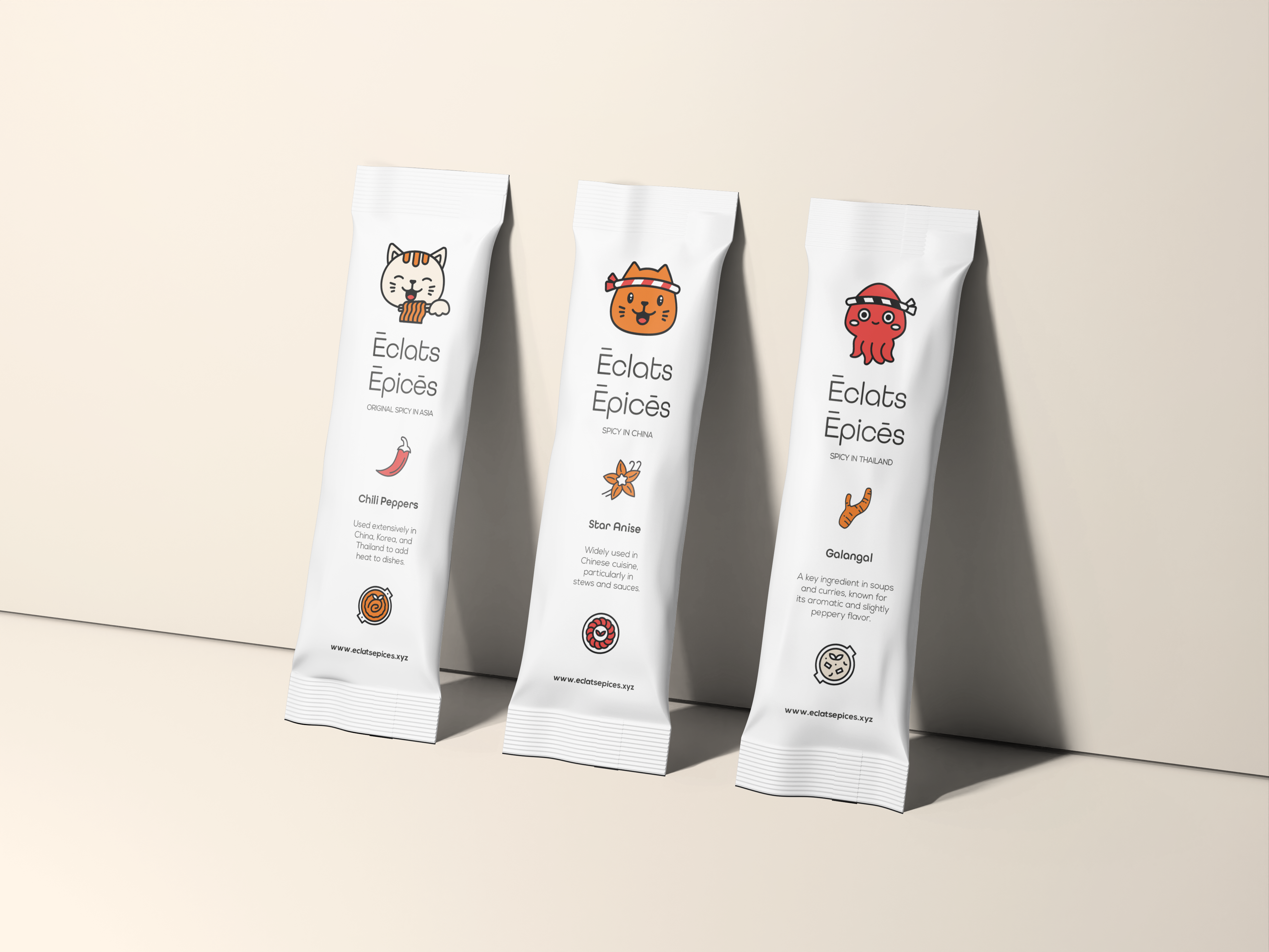
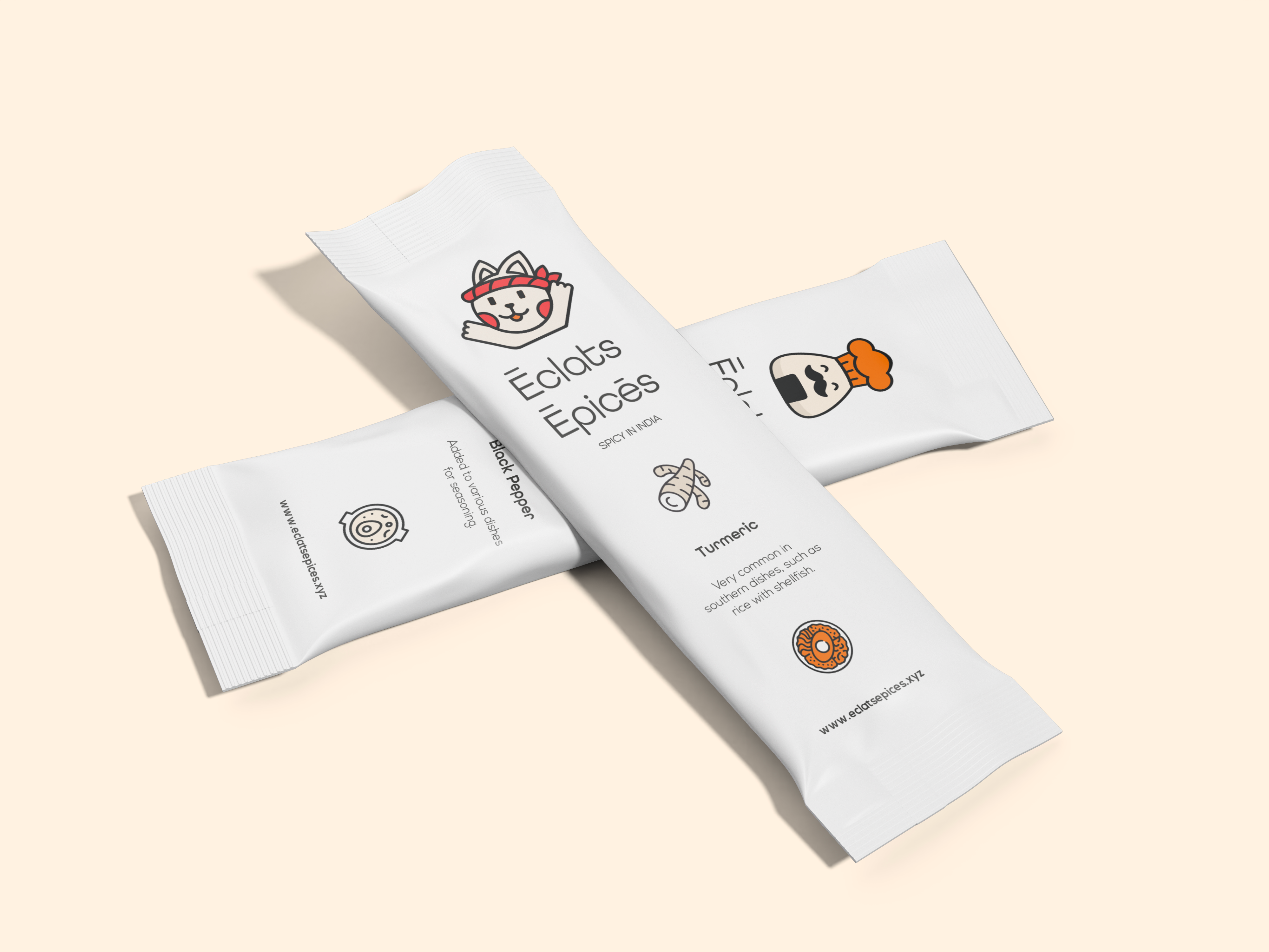
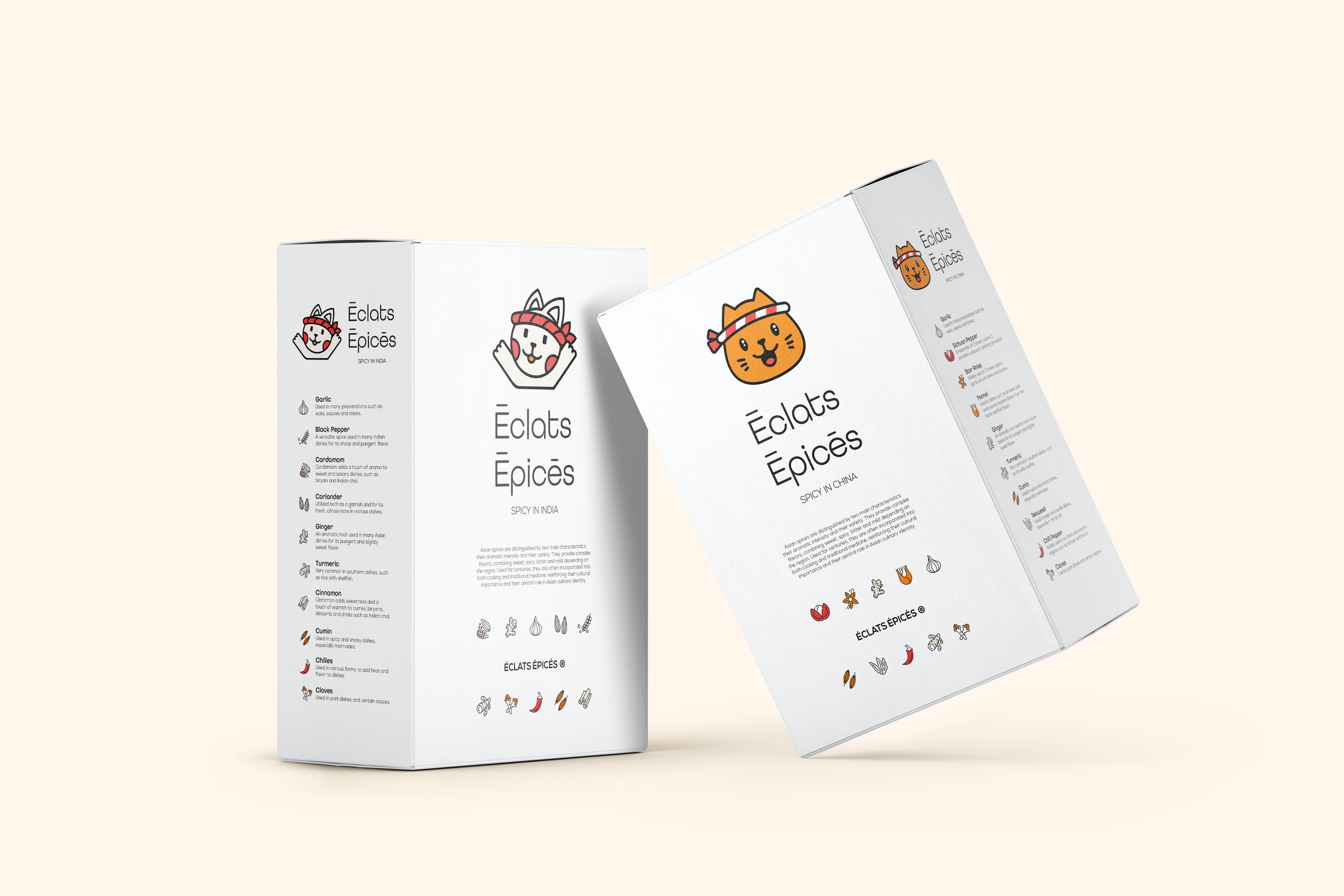
Vous voulez une aventure culinaire ? Avec Éclats Épicés, laissez vos papilles gustatives voyager ! Épices asiatiques sélectionnées avec amour, prêtes à égayer vos plats. Une identité créative avec des illustrations mignonnes et des couleurs vibrantes pour un style moderne et pratique. Une identité créée avec des emballages écologiques et adaptés aux voyages. Parce que chaque cuisine mérite d'être racontée.

Client

Personnel

Rôle

Graphiste

Services

Identité visuelle et Prototypes

Défis & Objectifs

/ Aperçu du projet

Éclats Épicés is a spice brand offering Asian spices carefully selected to bring flavor and adventure to everyday cooking. The visual identity combines cute, playful illustrations with vibrant, modern colors. The packaging is designed to be both eco-friendly and travel-friendly practical for taking spices on the go while reducing environmental impact. The brand’s core belief is that every kitchen has a story to tell, and spices are the language of that story.

/ Défis

Équilibrer la gentillesse (illustrations ludiques) avec une identité de marque d'épices moderne et sophistiquée. Utiliser des couleurs vives sans submerger le produit (les épices elles-mêmes sont souvent chaudes et terreuses). Concevoir des emballages écologiques qui sont également pratiques pour les voyages (durables, légers, refermables). Rendre les épices asiatiques accessibles et excitantes pour un large public, pas seulement pour les cuisiniers de niche ou experts.

/ Objectifs

Créez une identité de marque qui semble aventureuse, joyeuse et moderne. Développez des illustrations mignonnes et engageantes (pots à épices, ingrédients, monuments asiatiques ou motifs culturels) dans une palette de couleurs vibrantes. Concevoir des emballages respectueux de l'environnement (matériaux recyclés ou compostables) et adaptés aux voyages (compacts, étanches, faciles à emballer). Positionnez Éclats Épicés comme la marque qui transforme la cuisine quotidienne en un voyage savoureux.

Processus
Créatif

Started with the concept of culinary travel and storytelling. Researched Asian spice markets, street food scenes, and traditional ingredient packaging for inspiration. Sketched cute illustration characters: maybe a smiling chili, a dancing star anise, a cinnamon stick with a travel suitcase. Chose a vibrant color palette: bright reds, oranges, yellows, and deep greens to evoke energy, warmth, and the richness of Asian spices. Designed a logo that combines a spice motif with a travel element (a compass, a passport stamp, or a suitcase tag). Developed packaging prototypes using eco-friendly materials: glass or recycled plastic jars with bamboo lids, cardboard sleeves with soy-based inks. Added travel-friendly features: small sizes (50g or 100g), secure screw-top lids, and stackable shapes. Created labels with cute illustrations and clear spice names in a modern sans-serif font. Included a small booklet or QR code with recipe ideas for each spice blend. Applied the identity to a website mockup, social media templates, and point-of-sale displays. Delivered a brand where every jar of Éclats Épicés invites you to cook, travel, and tell your kitchen’s story one spice at a time.

fr_FRFR