Want a culinary adventure? With Éclats Épicés, let your taste buds travel! Asian spices selected with love, ready to brighten your dishes. A creative identity with cute illustrations and vibrant colors for a modern, practical style. An identity created with eco-friendly, travel-friendly packaging. Because every kitchen deserves to be told.

Client

Personal

Role

Graphic Designer

Services

Branding, Prototyping

Challenges & Objectives

/ Project Overview

Éclats Épicés is a spice brand offering Asian spices carefully selected to bring flavor and adventure to everyday cooking. The visual identity combines cute, playful illustrations with vibrant, modern colors. The packaging is designed to be both eco-friendly and travel-friendly practical for taking spices on the go while reducing environmental impact. The brand’s core belief is that every kitchen has a story to tell, and spices are the language of that story.

/ Challenges

Balancing cuteness (playful illustrations) with a modern, sophisticated spice brand identity. Using vibrant colors without overwhelming the product (spices themselves are often warm and earthy). Designing eco-friendly packaging that is also practical for travel (durable, lightweight, resealable). Making Asian spices feel accessible and exciting to a broad audience, not just niche or expert cooks.

/ Objectives

Create a brand identity that feels adventurous, joyful, and modern. Develop cute, engaging illustrations (spice jars, ingredients, Asian landmarks or cultural motifs) in a vibrant color palette. Design packaging that is eco-friendly (recyclable or compostable materials) and travel-friendly (compact, leak-proof, easy to pack). Position Éclats Épicés as the brand that turns everyday cooking into a flavorful journey.

Creative
Process

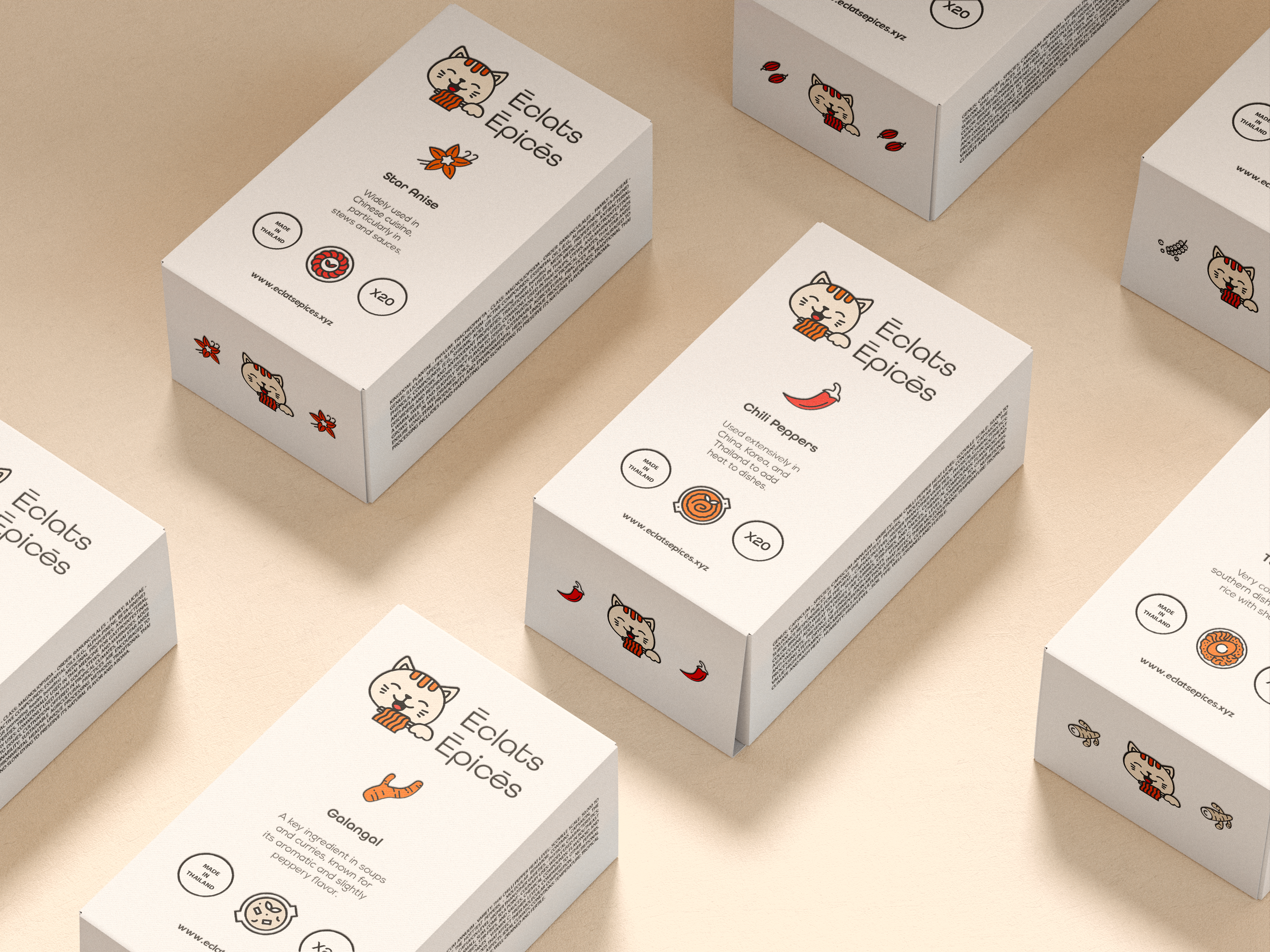
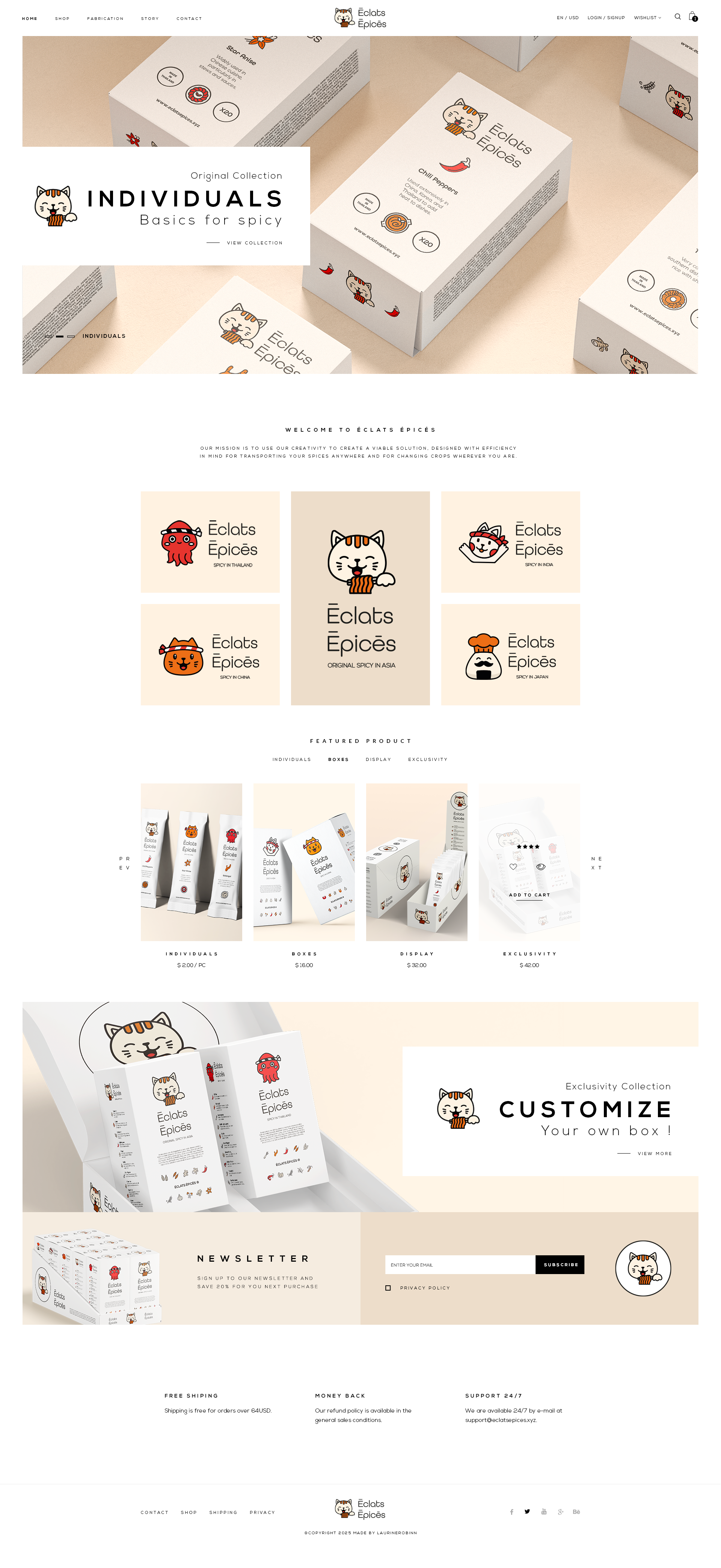
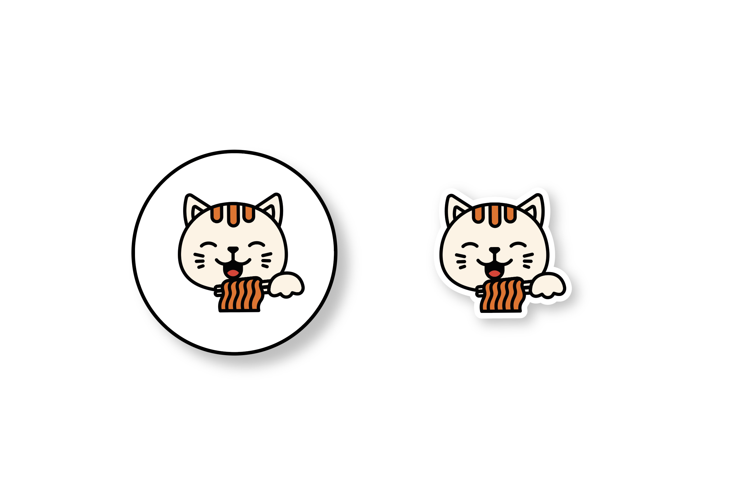
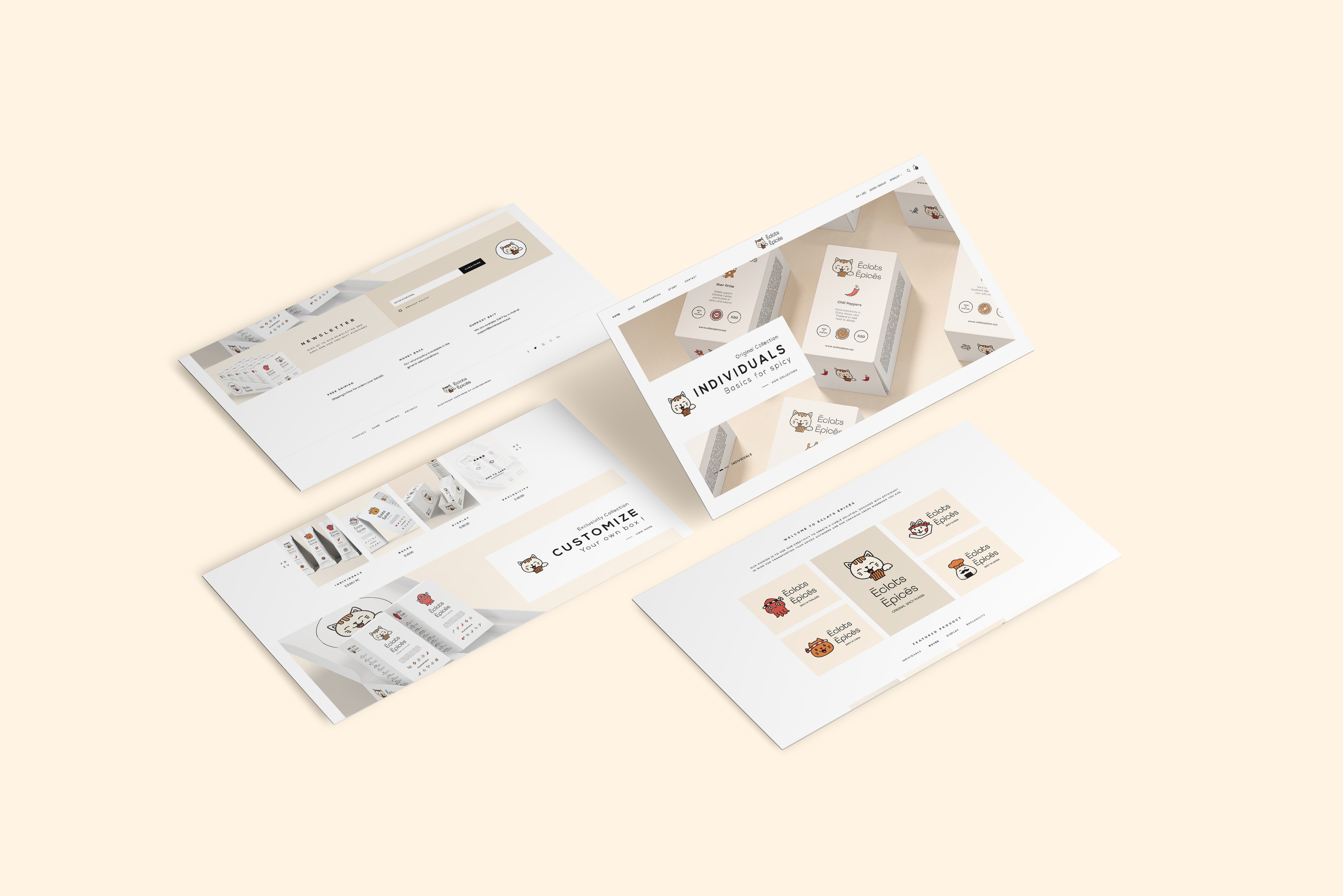
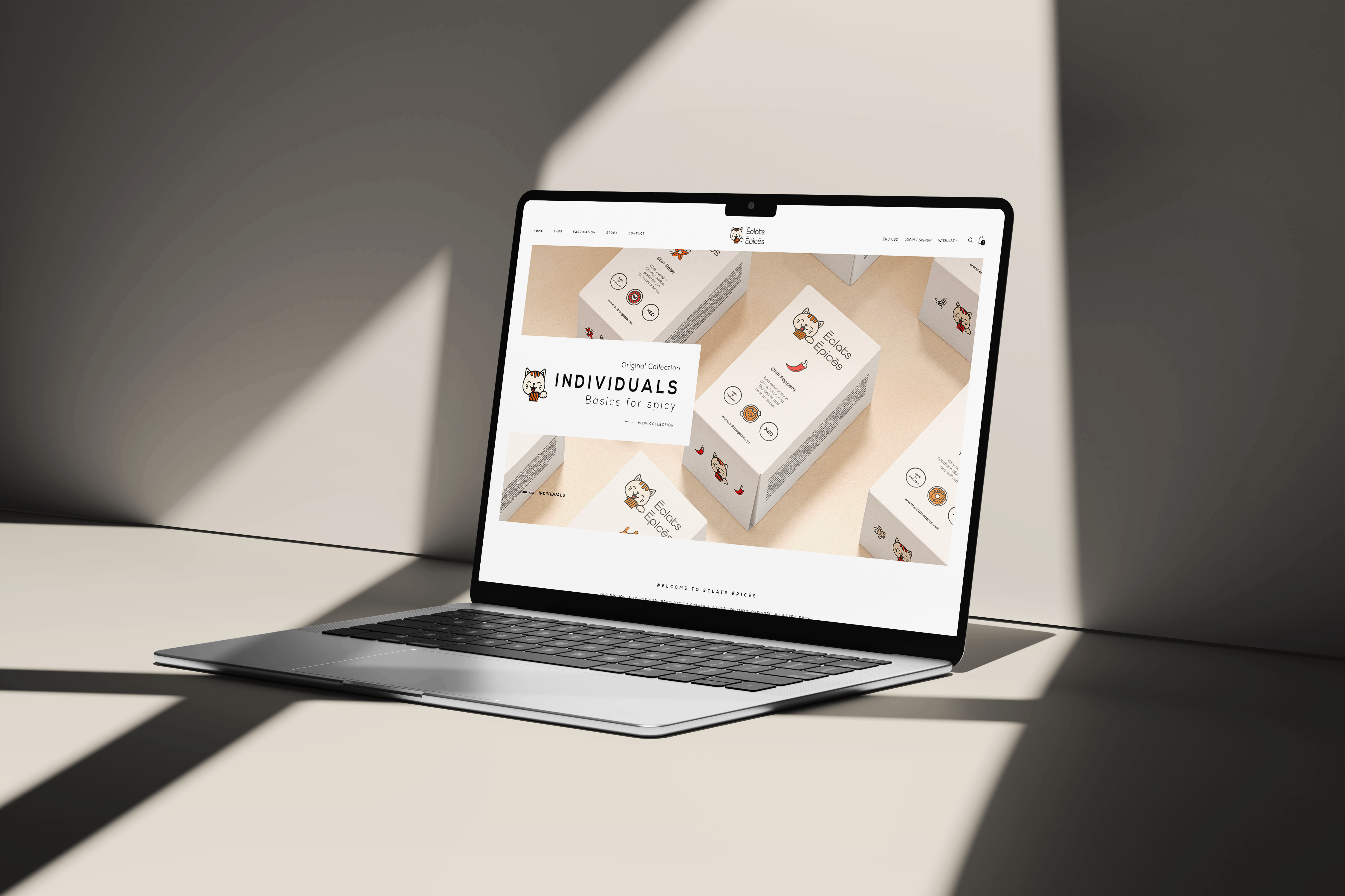
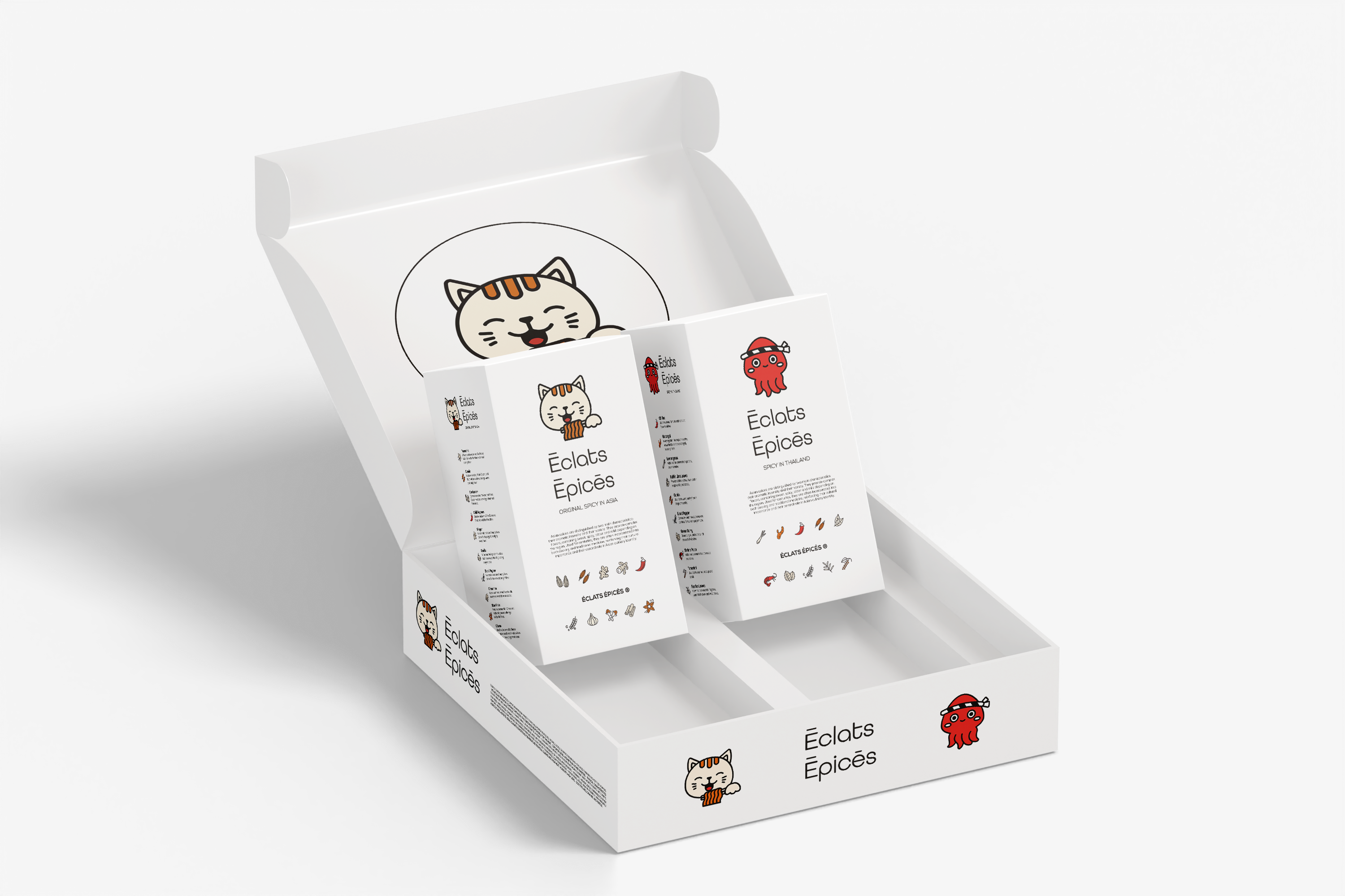
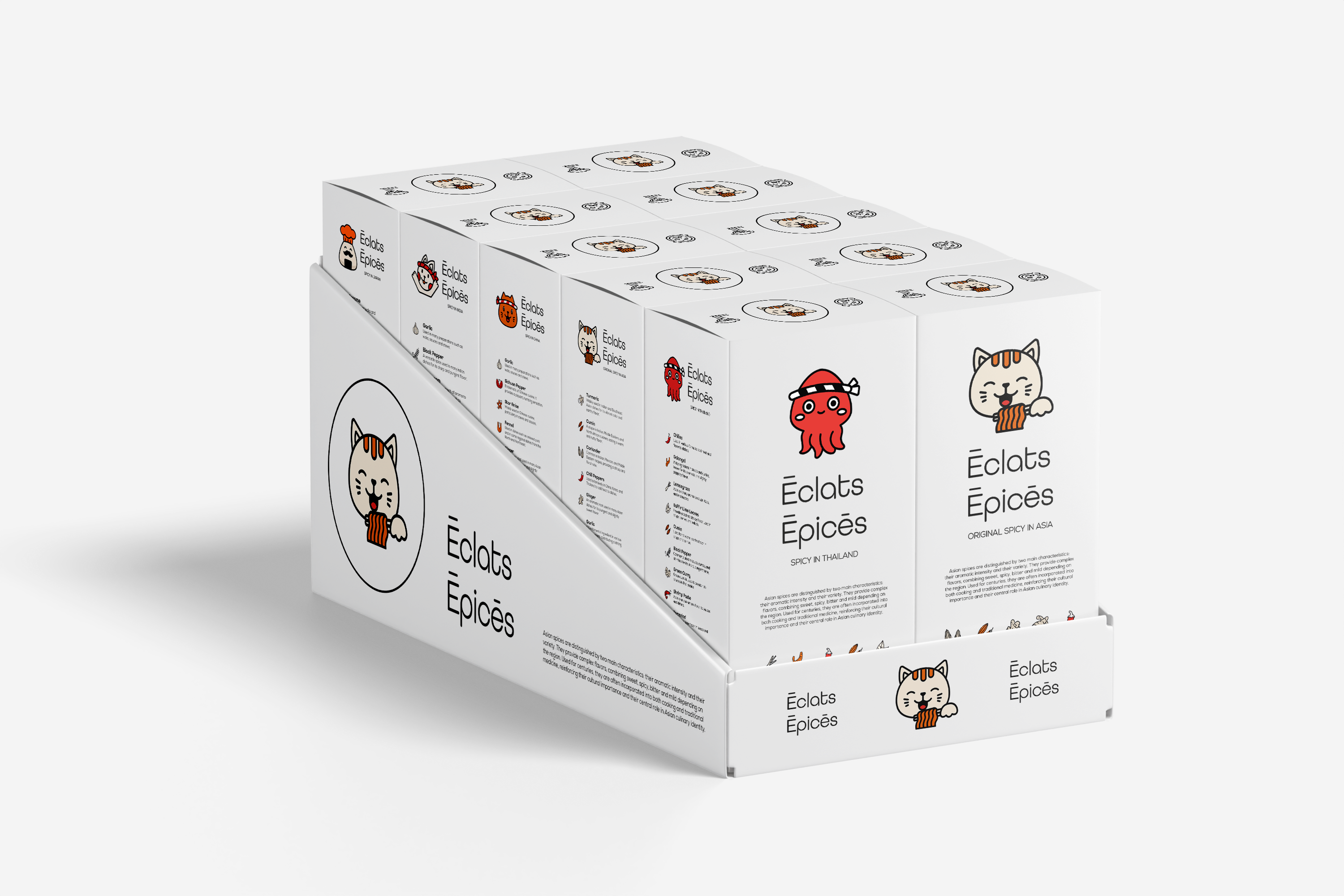
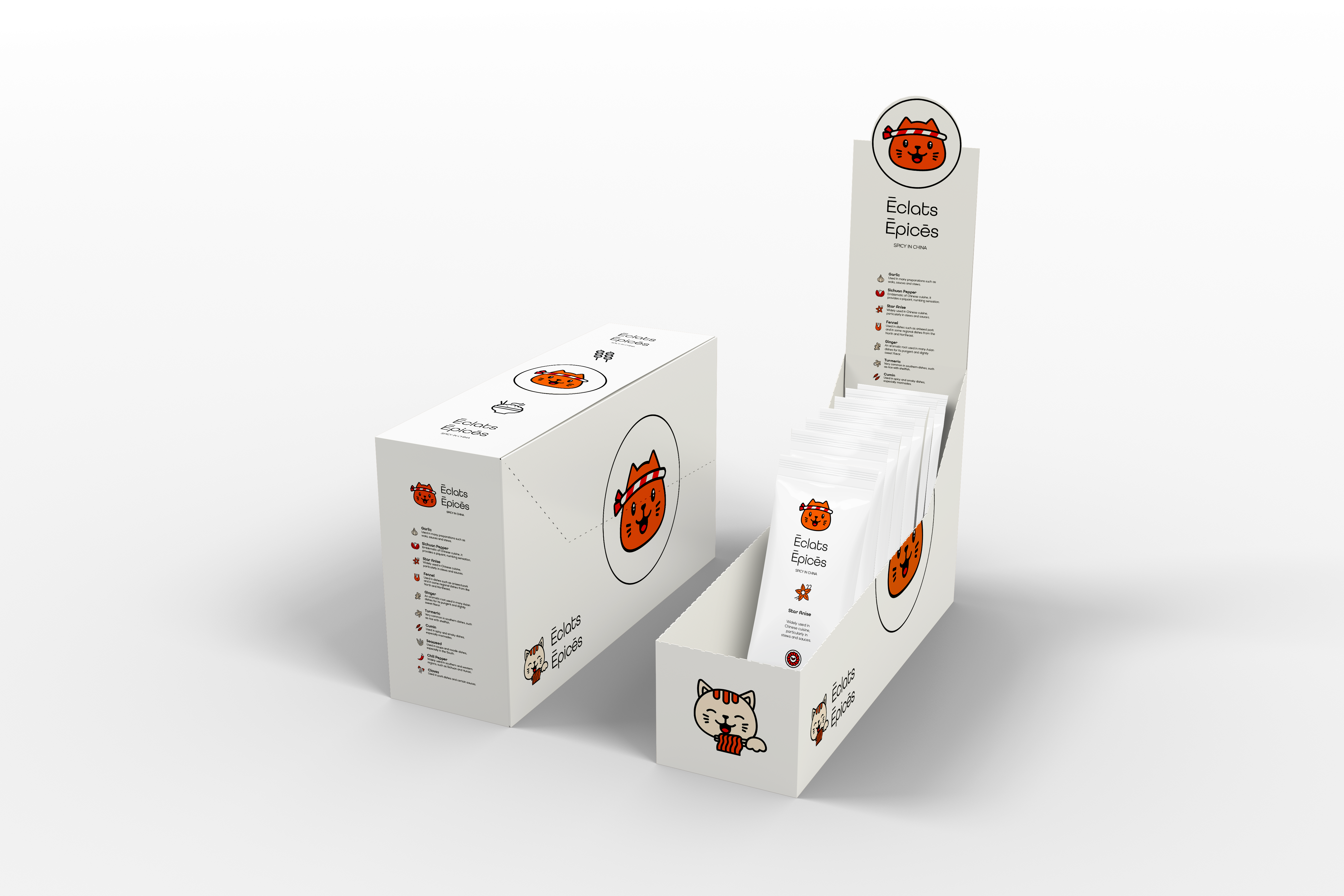
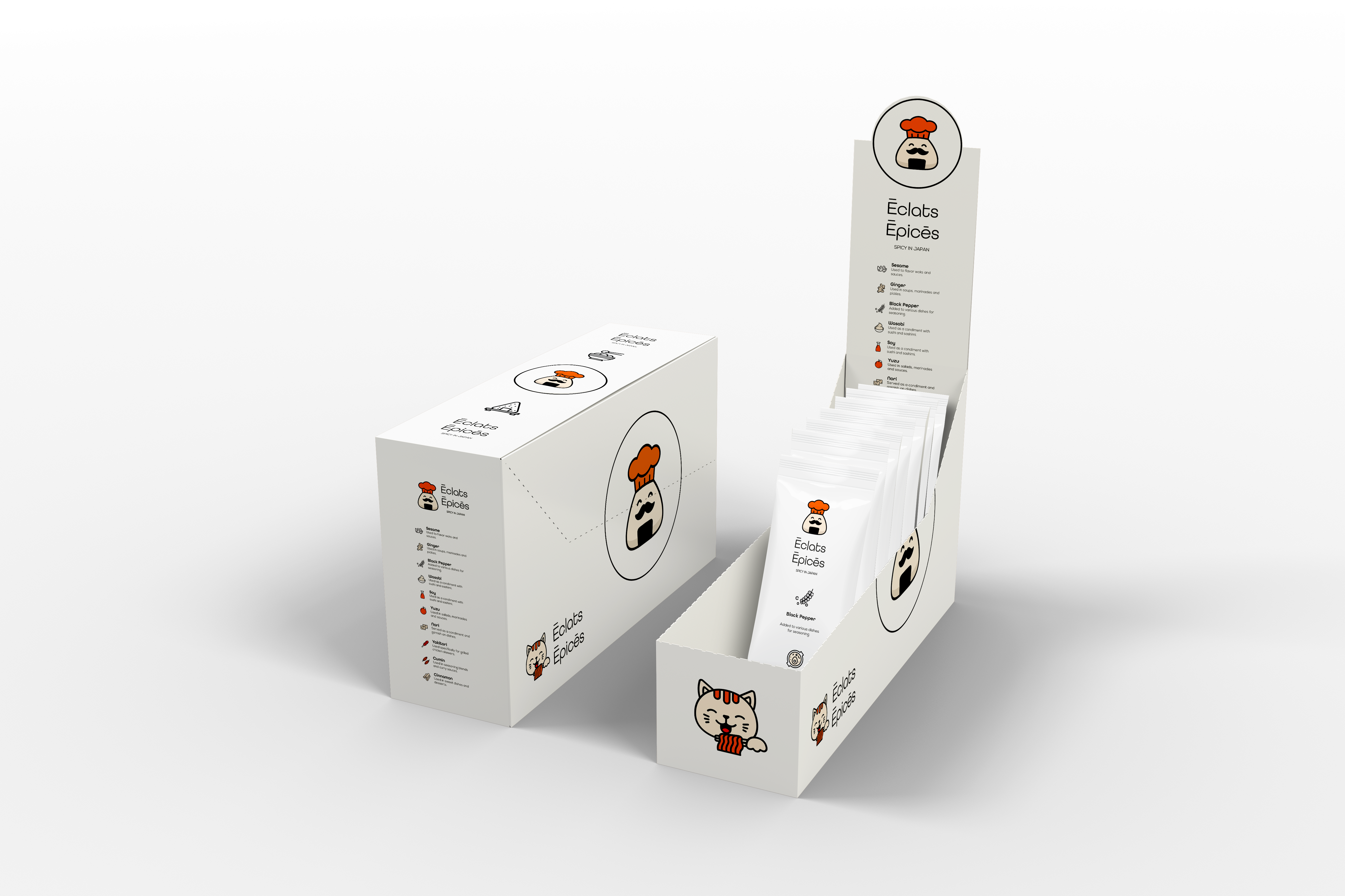
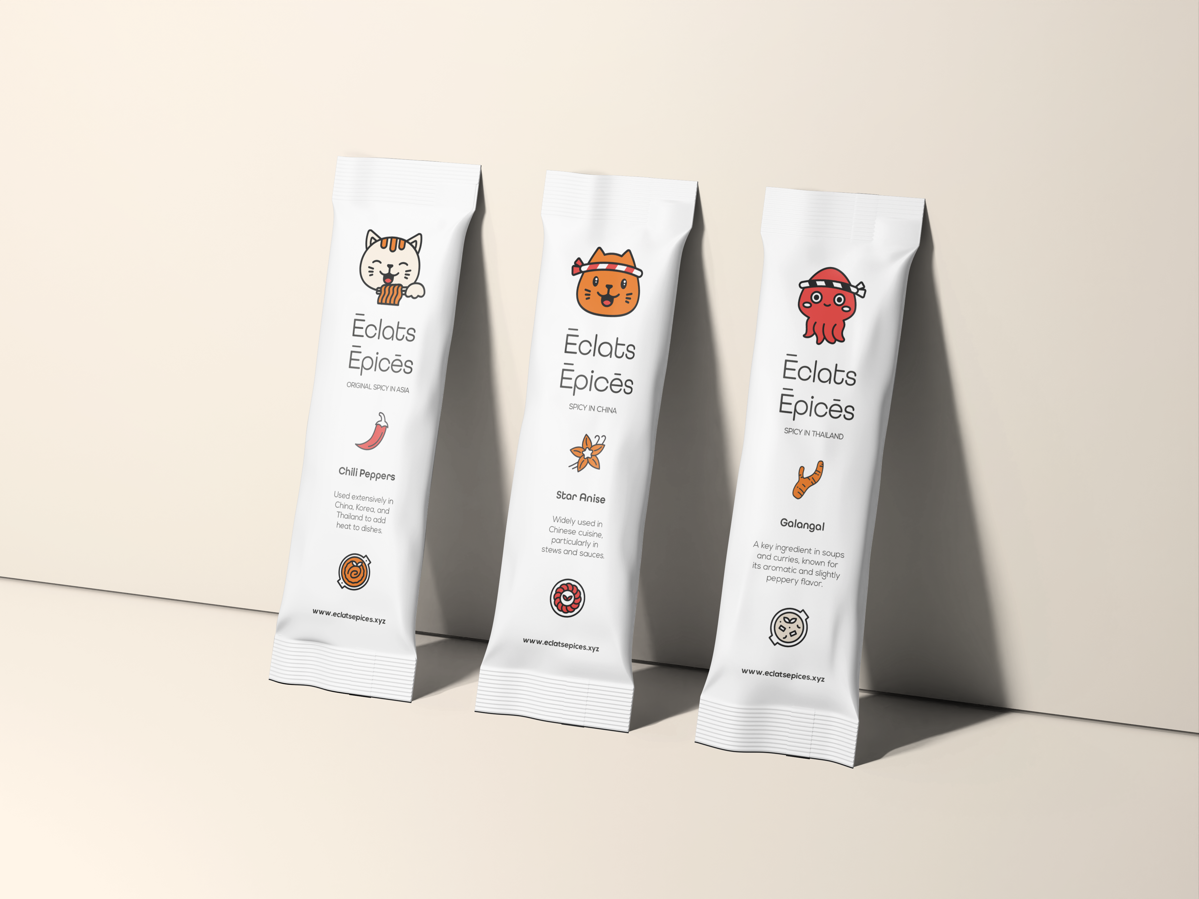
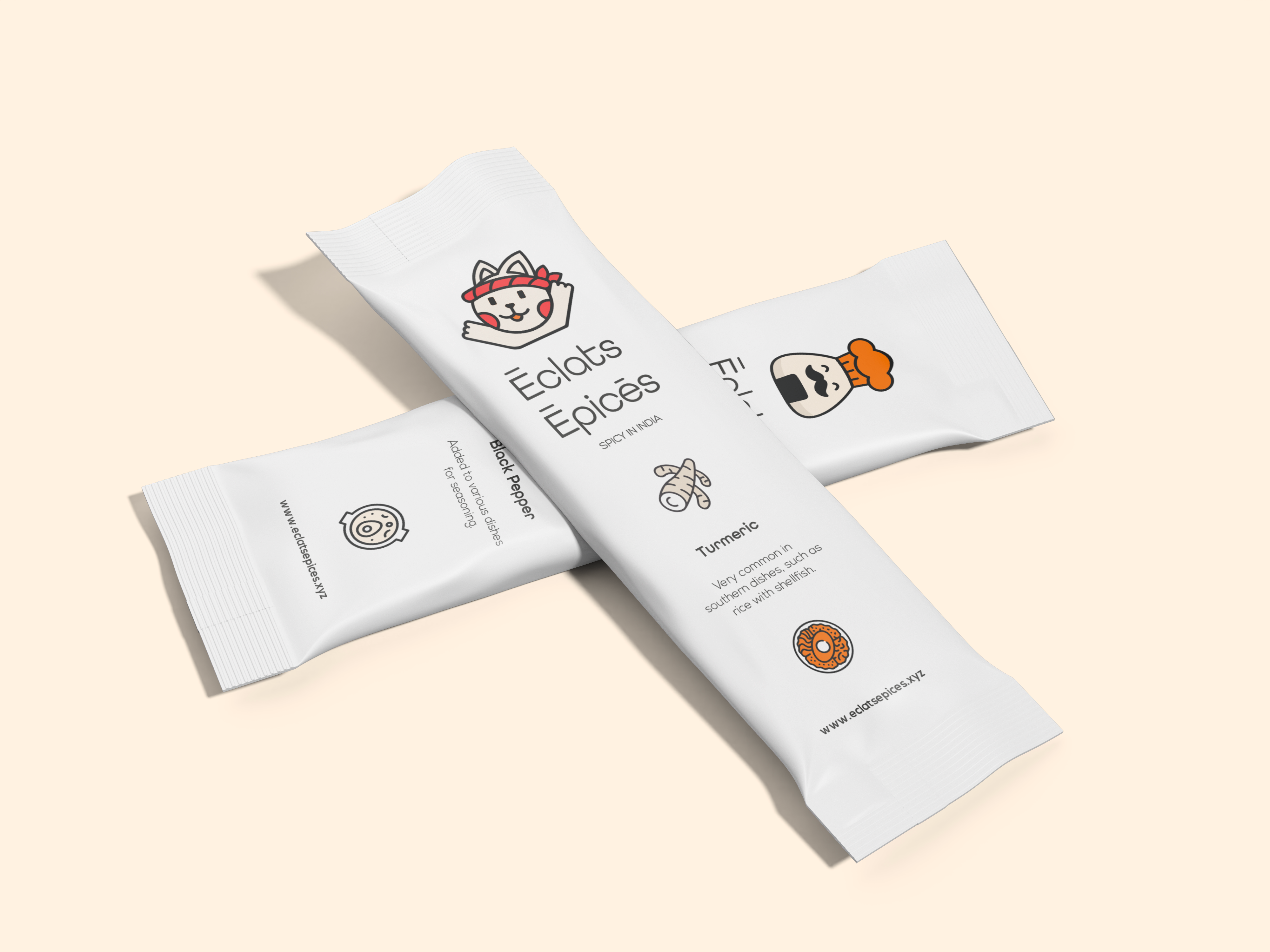
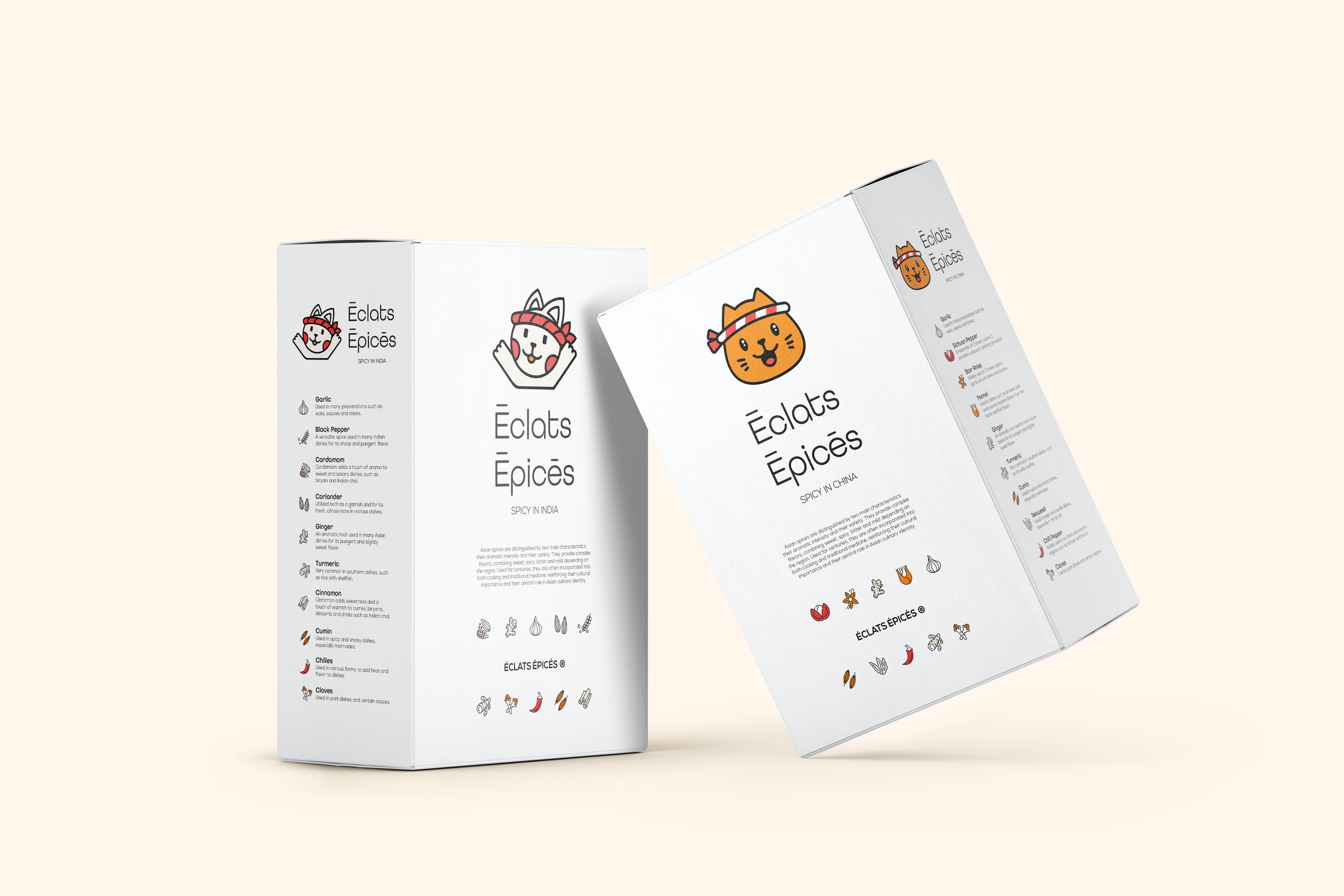
Started with the concept of culinary travel and storytelling. Researched Asian spice markets, street food scenes, and traditional ingredient packaging for inspiration. Sketched cute illustration characters: maybe a smiling chili, a dancing star anise, a cinnamon stick with a travel suitcase. Chose a vibrant color palette: bright reds, oranges, yellows, and deep greens to evoke energy, warmth, and the richness of Asian spices. Designed a logo that combines a spice motif with a travel element (a compass, a passport stamp, or a suitcase tag). Developed packaging prototypes using eco-friendly materials: glass or recycled plastic jars with bamboo lids, cardboard sleeves with soy-based inks. Added travel-friendly features: small sizes (50g or 100g), secure screw-top lids, and stackable shapes. Created labels with cute illustrations and clear spice names in a modern sans-serif font. Included a small booklet or QR code with recipe ideas for each spice blend. Applied the identity to a website mockup, social media templates, and point-of-sale displays. Delivered a brand where every jar of Éclats Épicés invites you to cook, travel, and tell your kitchen’s story one spice at a time.

Social Media

  • Design & Branding
  • Ticker Image
  • Logo Design
  • Ticker Image
  • Prototyping
  • Ticker Image
  • Design & Branding
  • Ticker Image
  • Logo Design
  • Ticker Image
  • Prototyping
  • Ticker Image

©2026 Laurine Robinn, All Rights Reserved.

en_USEN_US