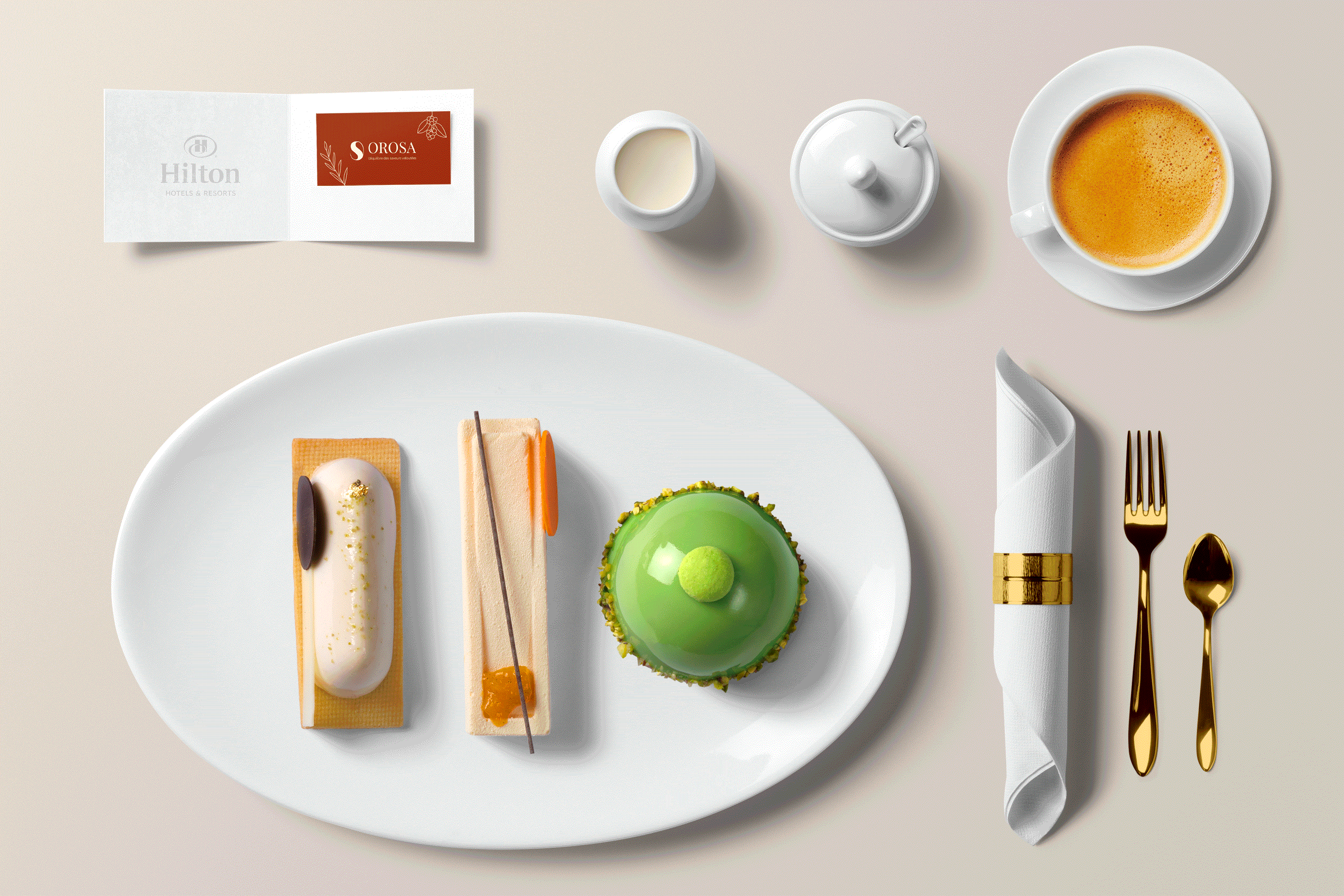
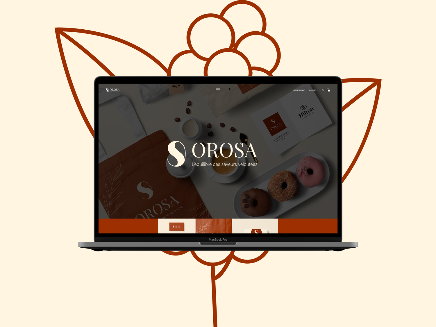
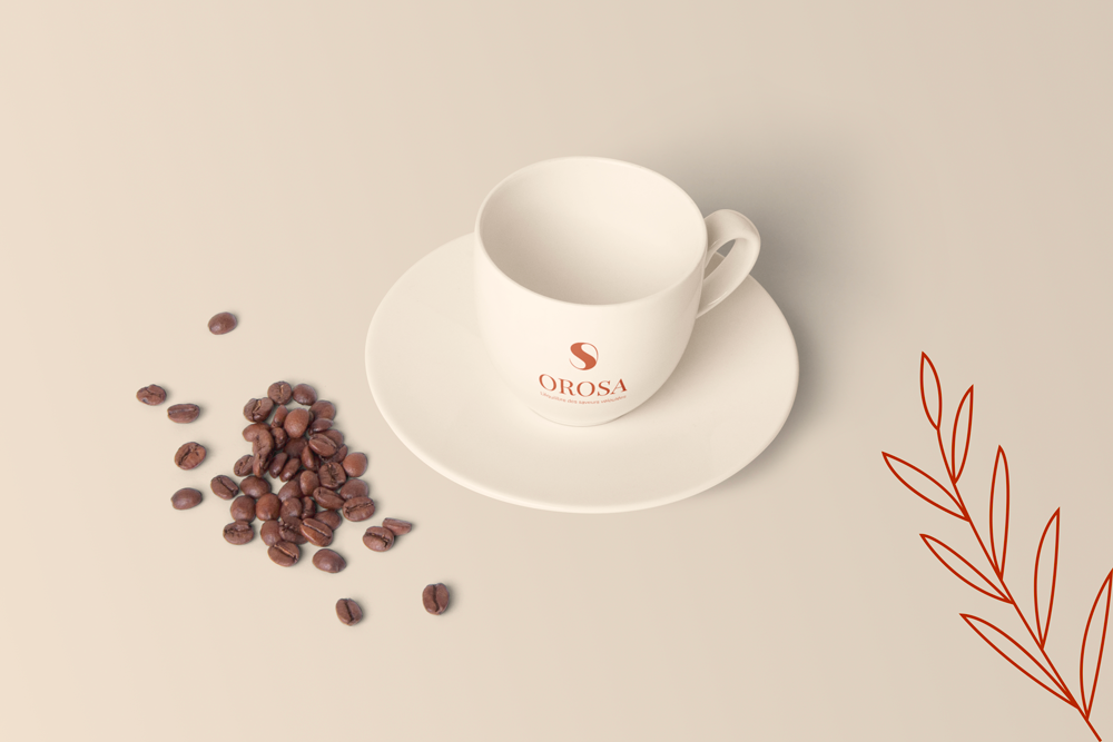
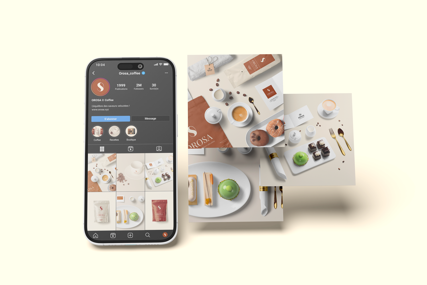
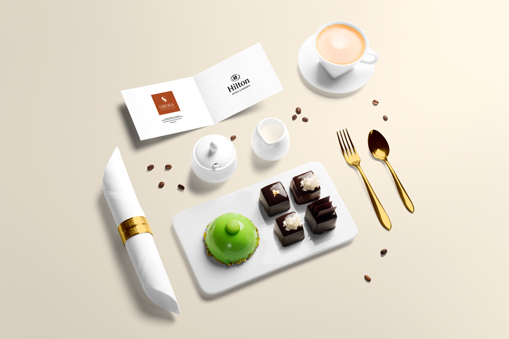
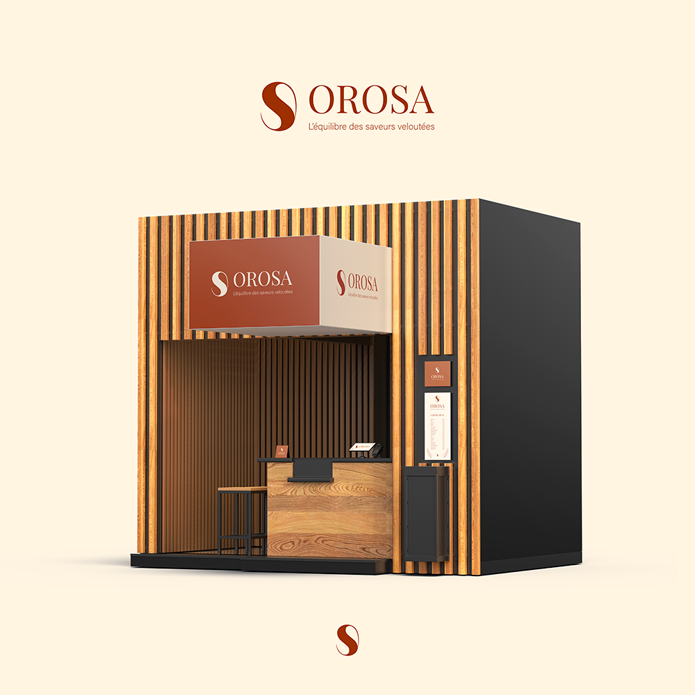
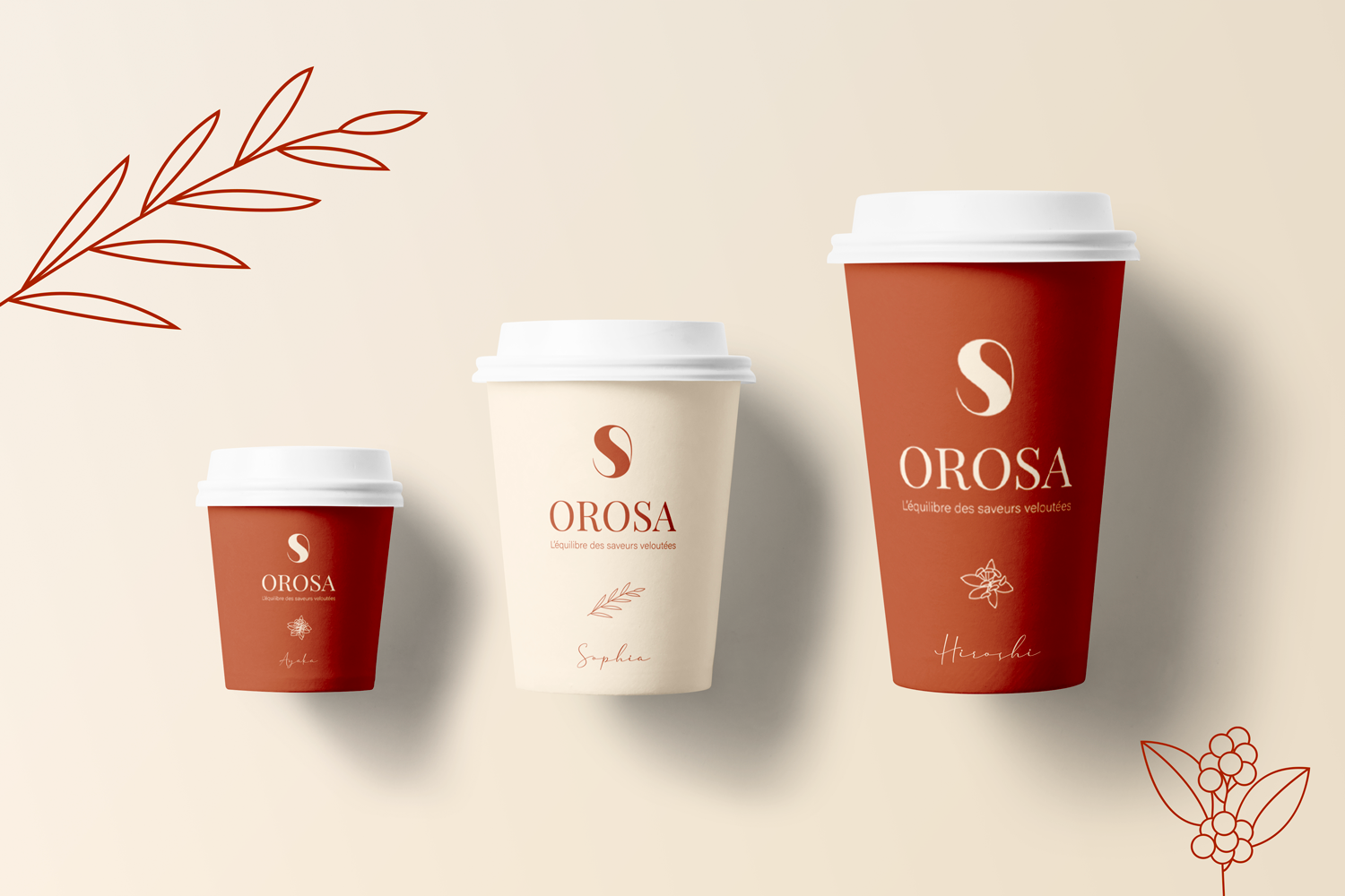
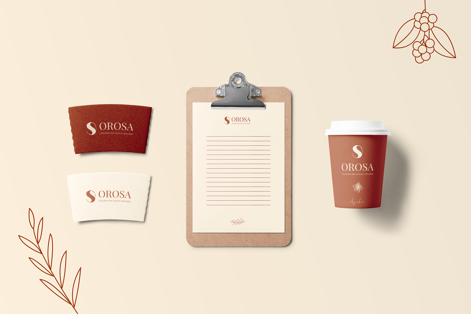
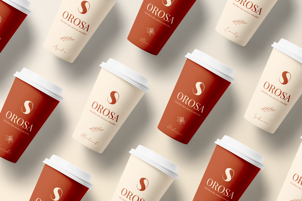
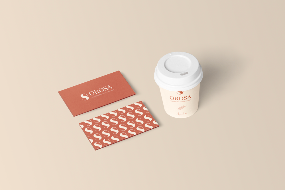
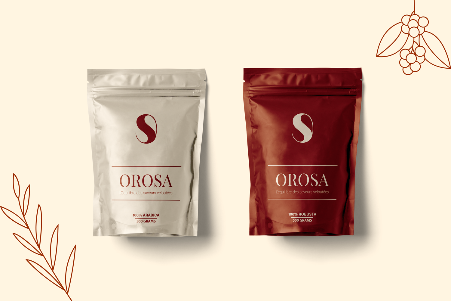
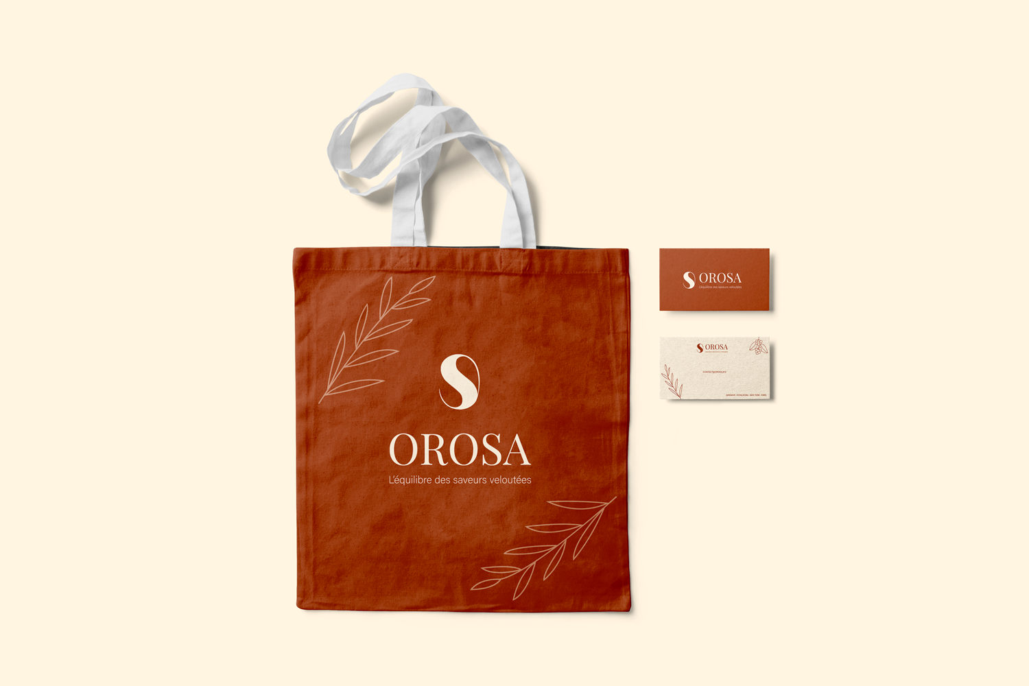
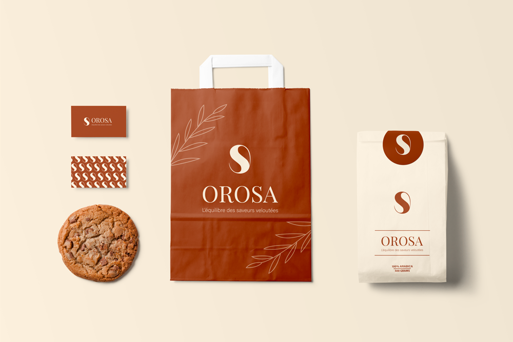
DÉCOUVREZ OROSA, UNE MARQUE DE CAFÉ POUR LES AMATEURS DE SAVEURS SUBTILES ET RAFFINÉES ! Avec des tons doux et neutres comme le beige combinés au cuivre pour évoquer la texture veloutée du café, Orosa incarne l'élégance naturelle et l'intemporalité. Notre logo, un grain de café élégant et stylisé, symbolise parfaitement un engagement envers des expériences de café inoubliables.

Client

Orosa

Rôle

Directrice artistique

Services

Identité visuelle et Prototypes

Défis & Objectifs

/ Aperçu du projet

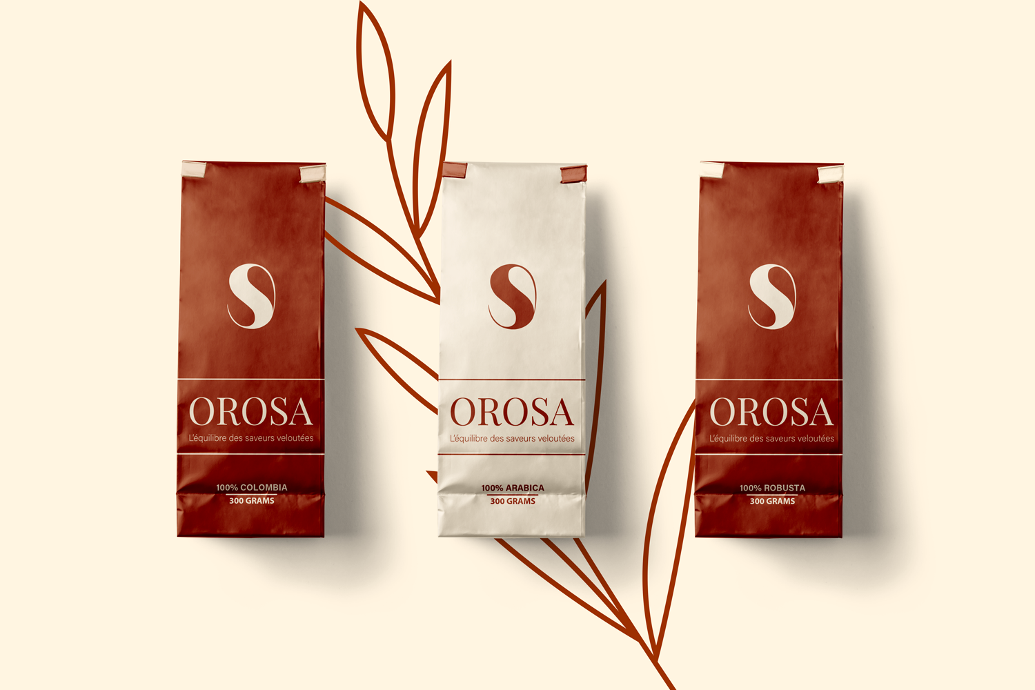
The OROSA brand embodies a subtle and refined coffee experience, where every sip is a moment of softness and luxury. The visual identity is built around a soft, neutral palette dominated by beige and cream, evoking a warm and elegant atmosphere. These hues harmonize with the velvety texture of the coffees, recalling the natural elegance of coffee beans. To enhance this sophistication, copper is integrated, symbolizing the warmth and richness of coffee. The logo an elegant, stylized coffee bean captures the duality between simplicity and sophistication, while a subtle serif typography reinforces the refined and timeless character of the brand. The overall identity evokes a sense of legend and nature, in harmony with OROSA’s subtle and refined flavors.

/ Défis

Utiliser du beige, de la crème et du cuivre sans avoir l'air fade ou générique. Créer une identité de marque de café qui semble luxueuse et raffinée, pas rustique ou industrielle. Concevoir un logo de grain de café stylisé qui est élégant, reconnaissable et distinct d'innombrables autres logos de café. Équilibrer la chaleur (cuivre, beige) avec la sophistication (typographie serif, mise en page propre).

/ Objectifs

Développez une palette de couleurs douces et neutres centrée sur des accents beiges, crème et cuivre. Concevez un logo de grain de café élégant et stylisé, à la fois simple et sophistiqué. Choisissez une typographie serif subtile qui transmet l'intemporalité et le raffinement. Construisez une identité de marque qui se sent chaleureuse, luxueuse et inoubliable. Positionnez OROSA comme le choix des amateurs de café à la recherche de saveurs subtiles et raffinées.

Processus
Créatif

Started with the sensory experience of coffee: velvety texture, warmth, richness, subtlety. Researched high-end coffee branding (Blue Bottle, Intelligentsia, Stumptown) for codes of elegance and minimalism. Chose a palette of soft beige and cream as the foundation, representing the gentle side of coffee, then added copper as a metallic accent for warmth and luxury. Sketched multiple coffee bean logos, moving away from realistic beans toward a stylized, almost abstract mark smooth curves, elegant proportions, maybe a subtle split to suggest a bean. Selected a refined serif typography (e.g., Garamond, Didot, or a custom serif) to reinforce the timeless, classic feel. Designed packaging: matte beige bags with copper foil stamping of the logo, cream-colored labels with serif typography for tasting notes. Created a brand story around the idea of “coffee as a quiet luxury moment.” Applied the identity to a website mockup, coffee bags, cups, and promotional materials. Delivered a brand where every cup of OROSA feels like a small, sophisticated ritual subtle, refined, and beautifully packaged.

fr_FRFR