DISCOVER OROSA, A COFFEE BRAND FOR LOVERS OF SUBTLE AND REFINED FLAVORS! With soft, neutral tones like beige combined with copper to evoke the velvety texture of coffee, Orosa embodies natural elegance and timelessness. Our logo, an elegant and stylized coffee bean, perfectly symbolizes a commitment to unforgettable coffee experiences.

Client

Orosa

Role

Art Director

Services

Branding, Prototyping

Challenges & Objectives

/ Project Overview

The OROSA brand embodies a subtle and refined coffee experience, where every sip is a moment of softness and luxury. The visual identity is built around a soft, neutral palette dominated by beige and cream, evoking a warm and elegant atmosphere. These hues harmonize with the velvety texture of the coffees, recalling the natural elegance of coffee beans. To enhance this sophistication, copper is integrated, symbolizing the warmth and richness of coffee. The logo an elegant, stylized coffee bean captures the duality between simplicity and sophistication, while a subtle serif typography reinforces the refined and timeless character of the brand. The overall identity evokes a sense of legend and nature, in harmony with OROSA’s subtle and refined flavors.

/ Challenges

Using beige, cream, and copper without looking bland or generic. Creating a coffee brand identity that feels luxurious and refined, not rustic or industrial. Designing a stylized coffee bean logo that is elegant, recognizable, and distinct from countless other coffee logos. Balancing warmth (copper, beige) with sophistication (serif typography, clean layout).

/ Objectives

Develop a soft, neutral color palette centered on beige, cream, and copper accents. Design an elegant, stylized coffee bean logo that is both simple and sophisticated. Select a subtle serif typography that conveys timelessness and refinement. Build a brand identity that feels warm, luxurious, and unforgettable. Position OROSA as the choice for coffee lovers seeking subtle, refined flavors.

Creative
Process

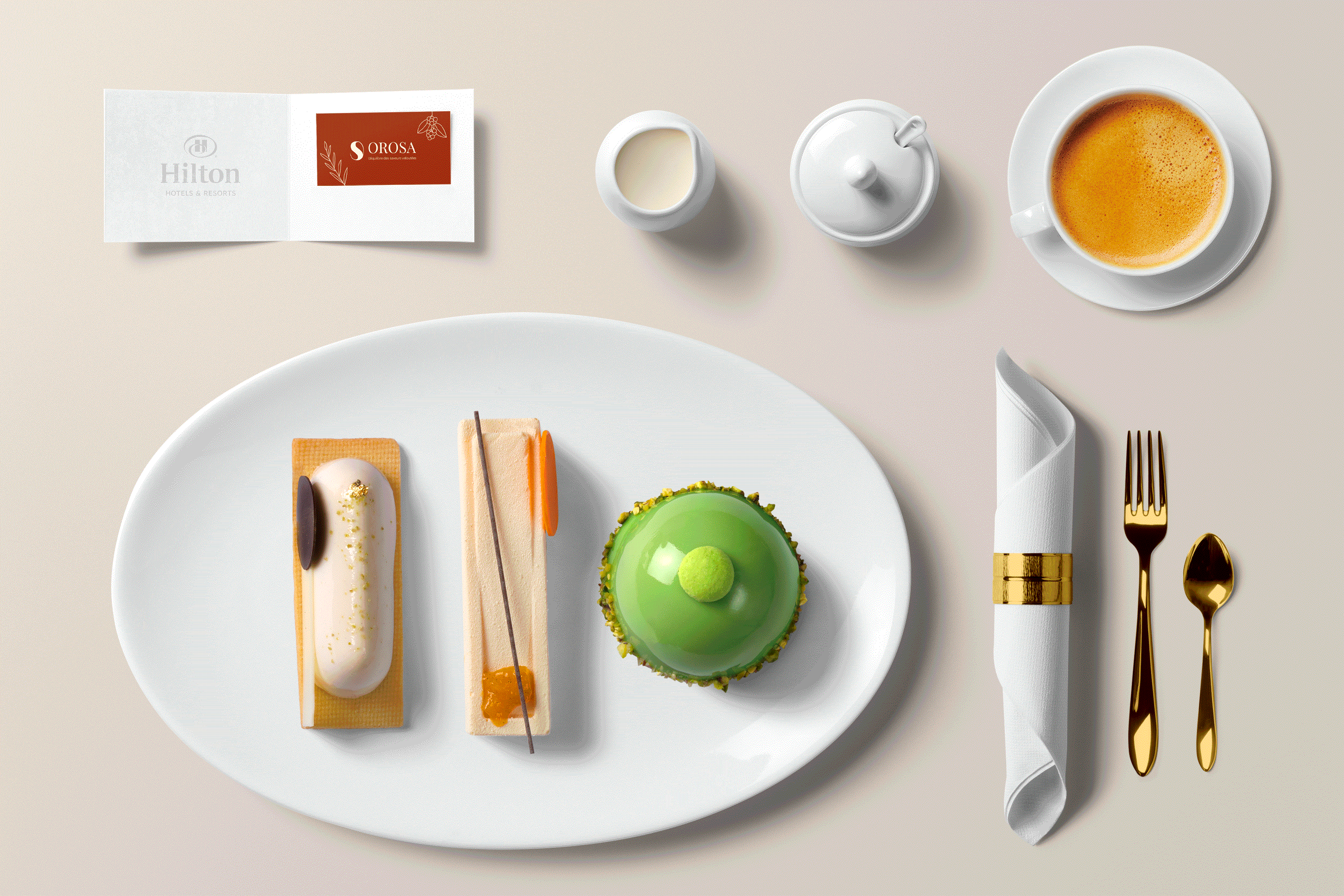
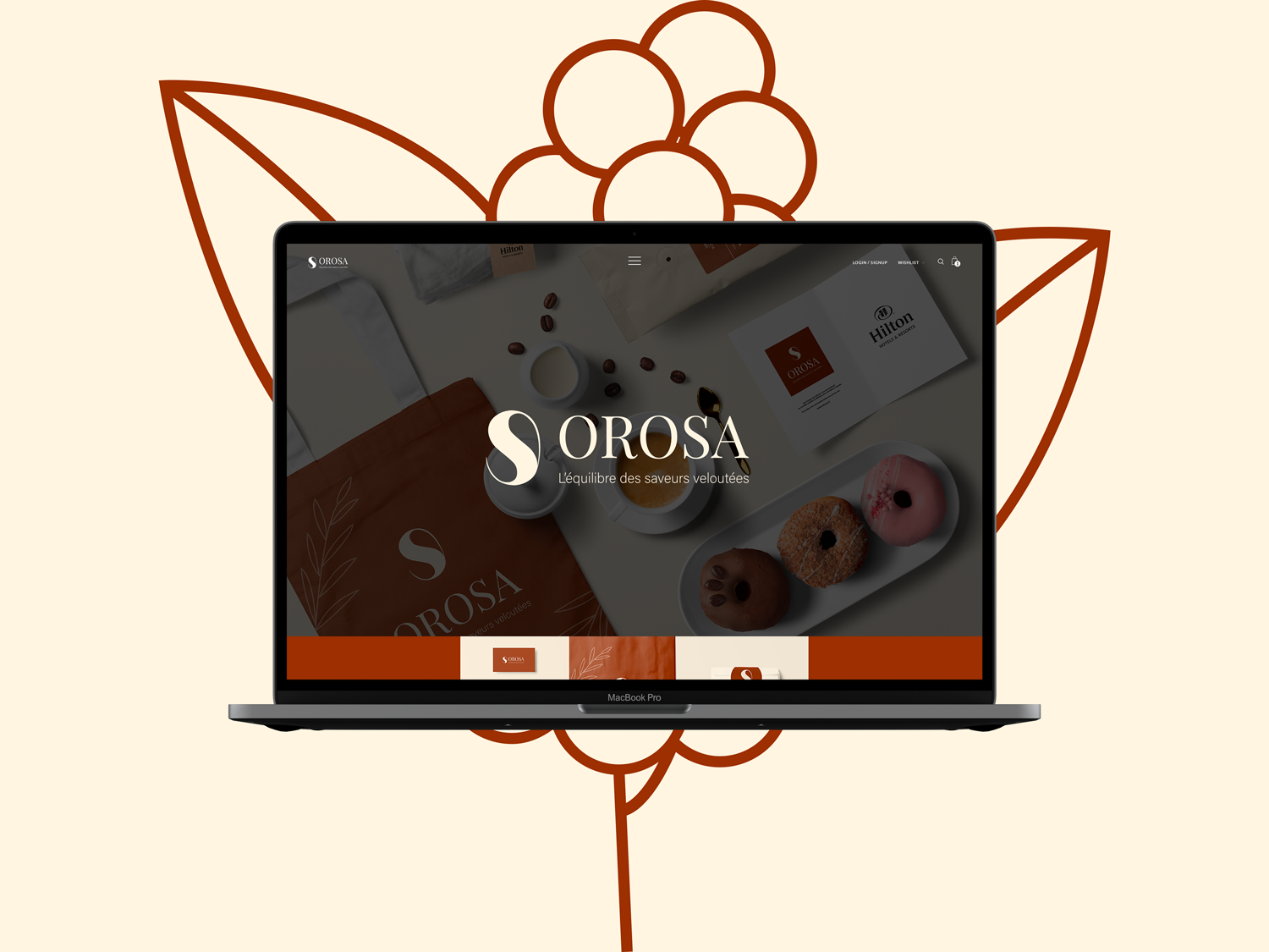
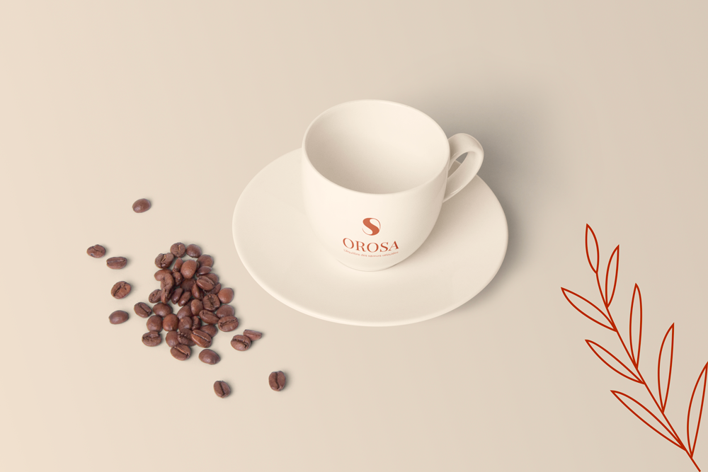
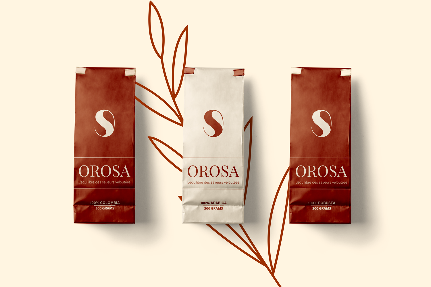
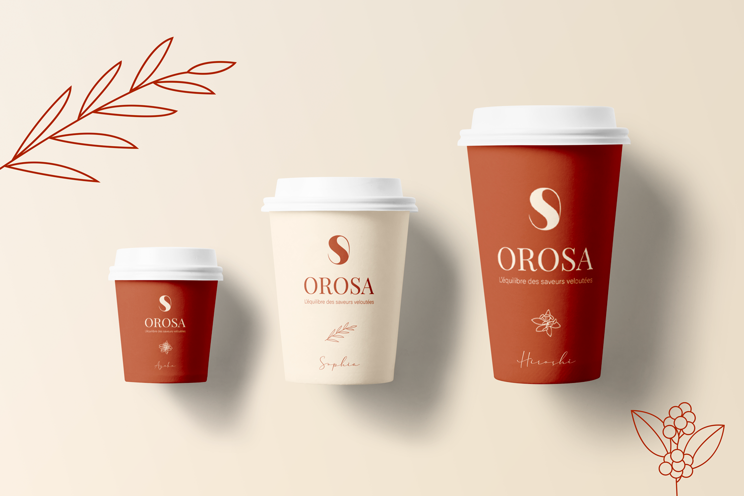
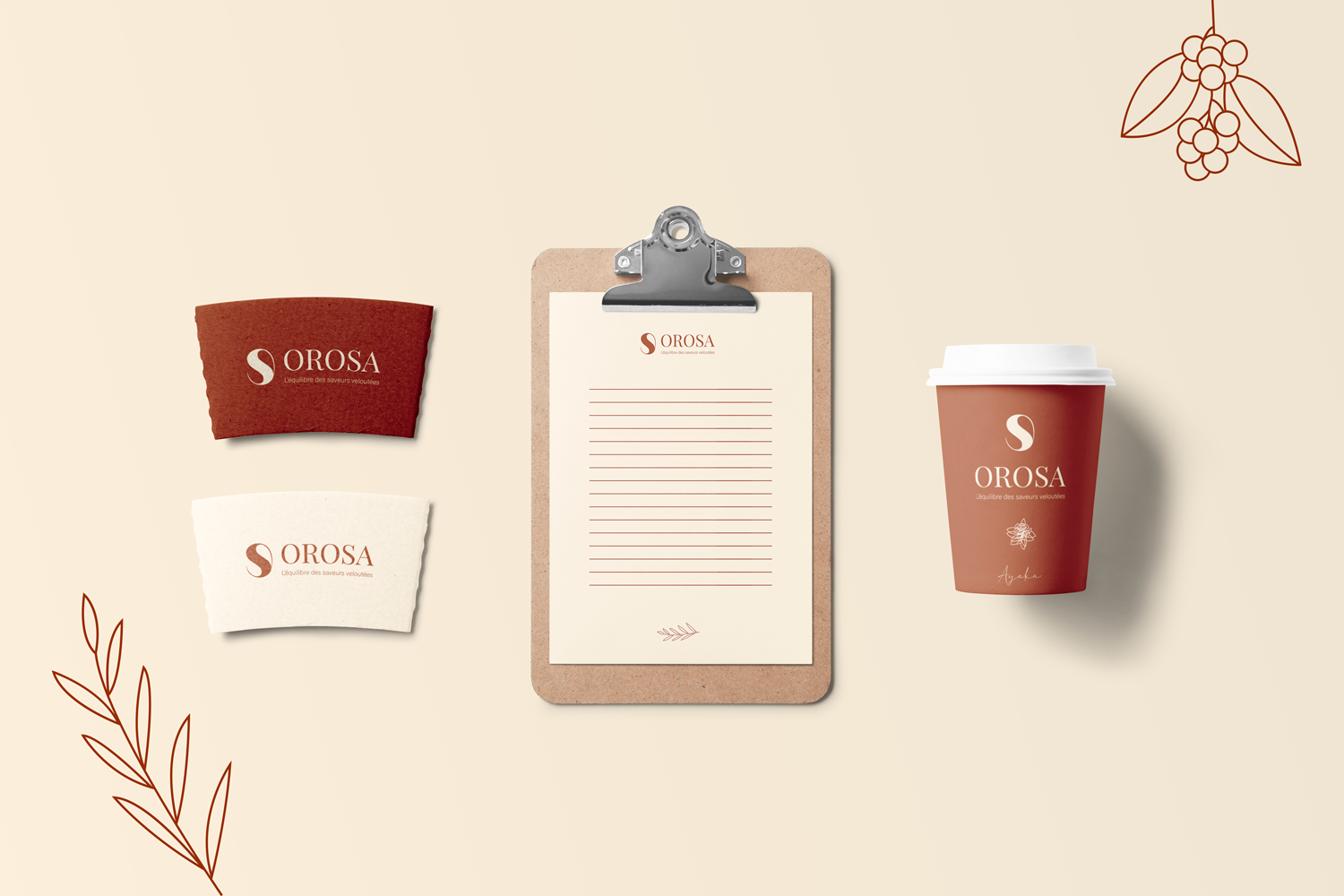
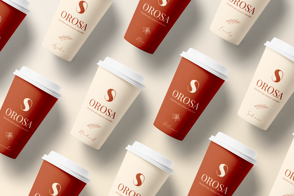
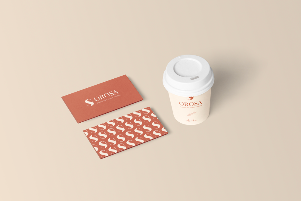
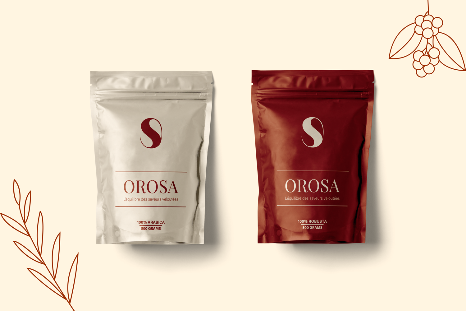
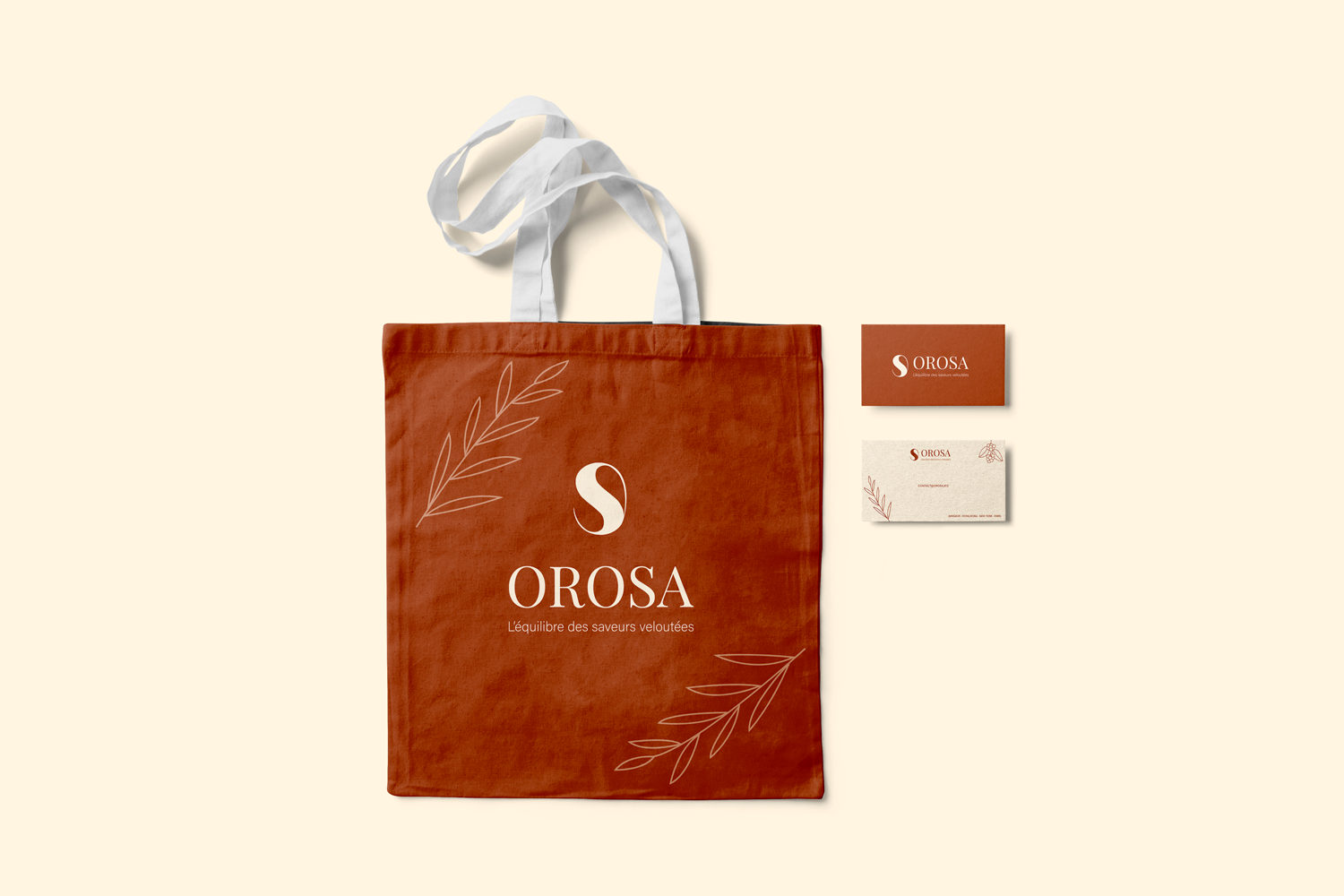
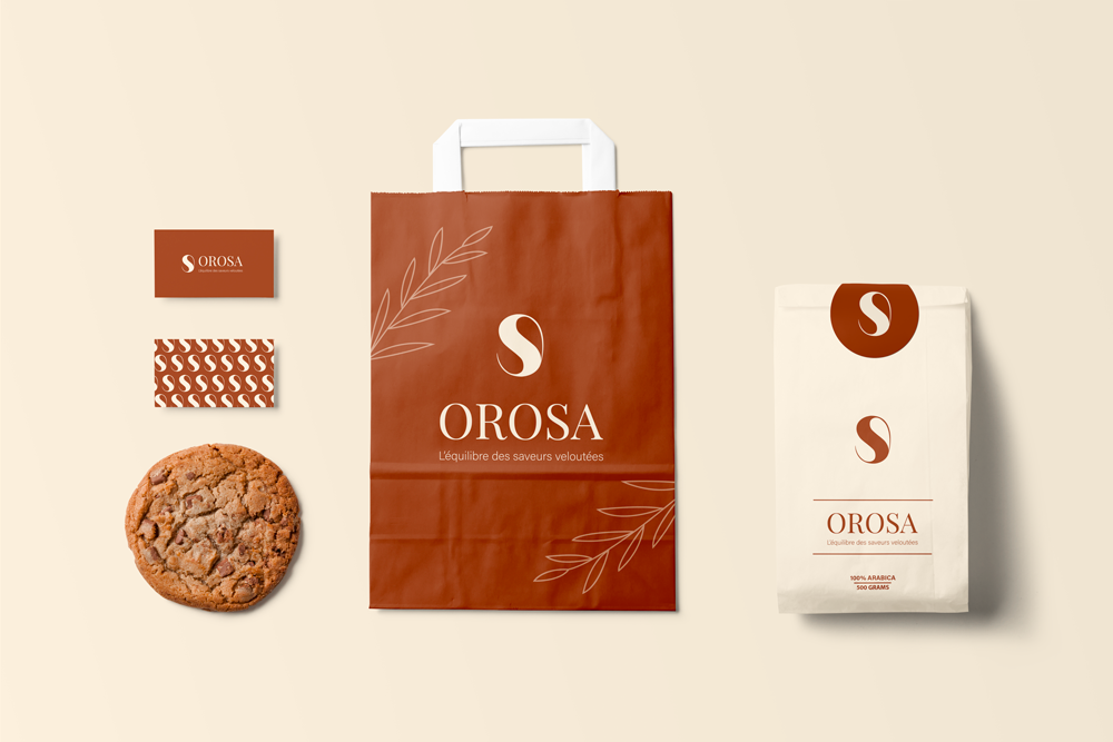
Started with the sensory experience of coffee: velvety texture, warmth, richness, subtlety. Researched high-end coffee branding (Blue Bottle, Intelligentsia, Stumptown) for codes of elegance and minimalism. Chose a palette of soft beige and cream as the foundation, representing the gentle side of coffee, then added copper as a metallic accent for warmth and luxury. Sketched multiple coffee bean logos, moving away from realistic beans toward a stylized, almost abstract mark smooth curves, elegant proportions, maybe a subtle split to suggest a bean. Selected a refined serif typography (e.g., Garamond, Didot, or a custom serif) to reinforce the timeless, classic feel. Designed packaging: matte beige bags with copper foil stamping of the logo, cream-colored labels with serif typography for tasting notes. Created a brand story around the idea of “coffee as a quiet luxury moment.” Applied the identity to a website mockup, coffee bags, cups, and promotional materials. Delivered a brand where every cup of OROSA feels like a small, sophisticated ritual subtle, refined, and beautifully packaged.

Social Media

  • Design & Branding
  • Ticker Image
  • Logo Design
  • Ticker Image
  • Prototyping
  • Ticker Image
  • Design & Branding
  • Ticker Image
  • Logo Design
  • Ticker Image
  • Prototyping
  • Ticker Image

©2026 Laurine Robinn, All Rights Reserved.

en_USEN_US