COLLABORATION SUPREME X QUICK: THE SUPREME BURGER PROJECT. The collaboration between Supreme, the iconic streetwear brand, and Quick, the fast-food chain making its big return to France, aims to blend urban boldness with fast-food accessibility. This partnership gives birth to Quick’s Supreme Burger, presented as a meal set with an original glass and a small finger skateboard toy. Each element integrates the bold, minimalist styles of both Supreme and Quick, creating a shared and reinvented visual identity.
Client
What If: Collection
Role
Graphic Designer
Services
Branding, Prototyping
The collaboration merges Supreme’s urban aesthetic with Quick’s vibrant, energetic appeal. The meal set includes three key elements. The Menu features a strong graphic identity with clear, modern typography for easy reading. Packaging is made from quality materials such as cardboard or recyclable paper, highlighting quality and durability. The design incorporates elements from both brands to create a coherent and elegant heritage that reflects their shared values. The Original Glass combines functionality and style, with colors and patterns reminiscent of both brands, creating a unique piece that is not overly flashy perfect for beverages, blending aesthetics and practicality. The Finger Skateboard Toy serves as a promotional object: compact, decorative, and playable. Featuring the Supreme logo and brand colors while subtly integrating Quick’s aspects, it symbolizes the collaboration and is designed to be portable, offering a nod to the partnership. Together, these elements embody a harmonious fusion of both brand identities, resulting in a visually appealing and exclusive design.
Balancing Supreme’s bold, minimalist, streetwear aesthetic with Quick’s fast-food, family-friendly, energetic identity. Designing a cohesive visual language across three different objects (burger box, glass, finger skateboard) while keeping each distinct. Avoiding a design that feels too “loud” or too “generic” finding the sweet spot where both brands are equally represented. Ensuring the finger skateboard toy feels collectible and on-brand for Supreme’s skate culture roots, while still being accessible to Quick’s audience.
Create a unified visual identity for the Supreme x Quick collaboration. Design a menu package with clear typography and sustainable materials. Develop an original glass that is stylish, functional, and subtly branded. Produce a finger skateboard toy that is portable, decorative, and playable, featuring Supreme’s logo and Quick’s color cues. Ensure every item reflects the shared values of urban boldness, quality, and exclusivity.
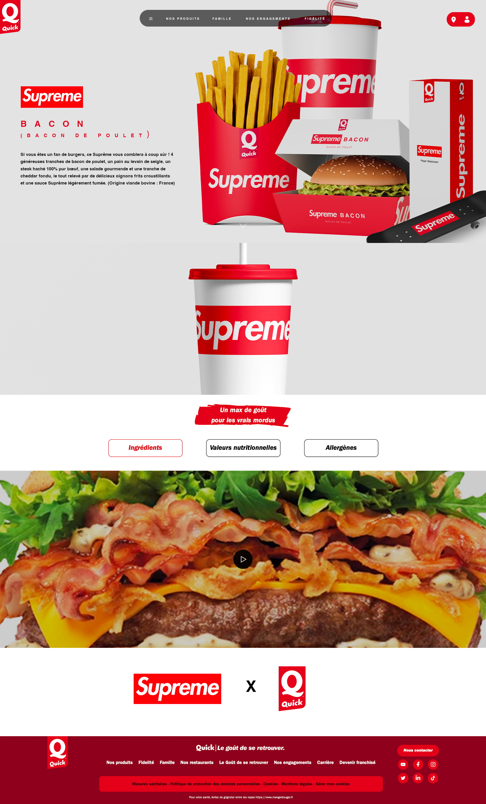
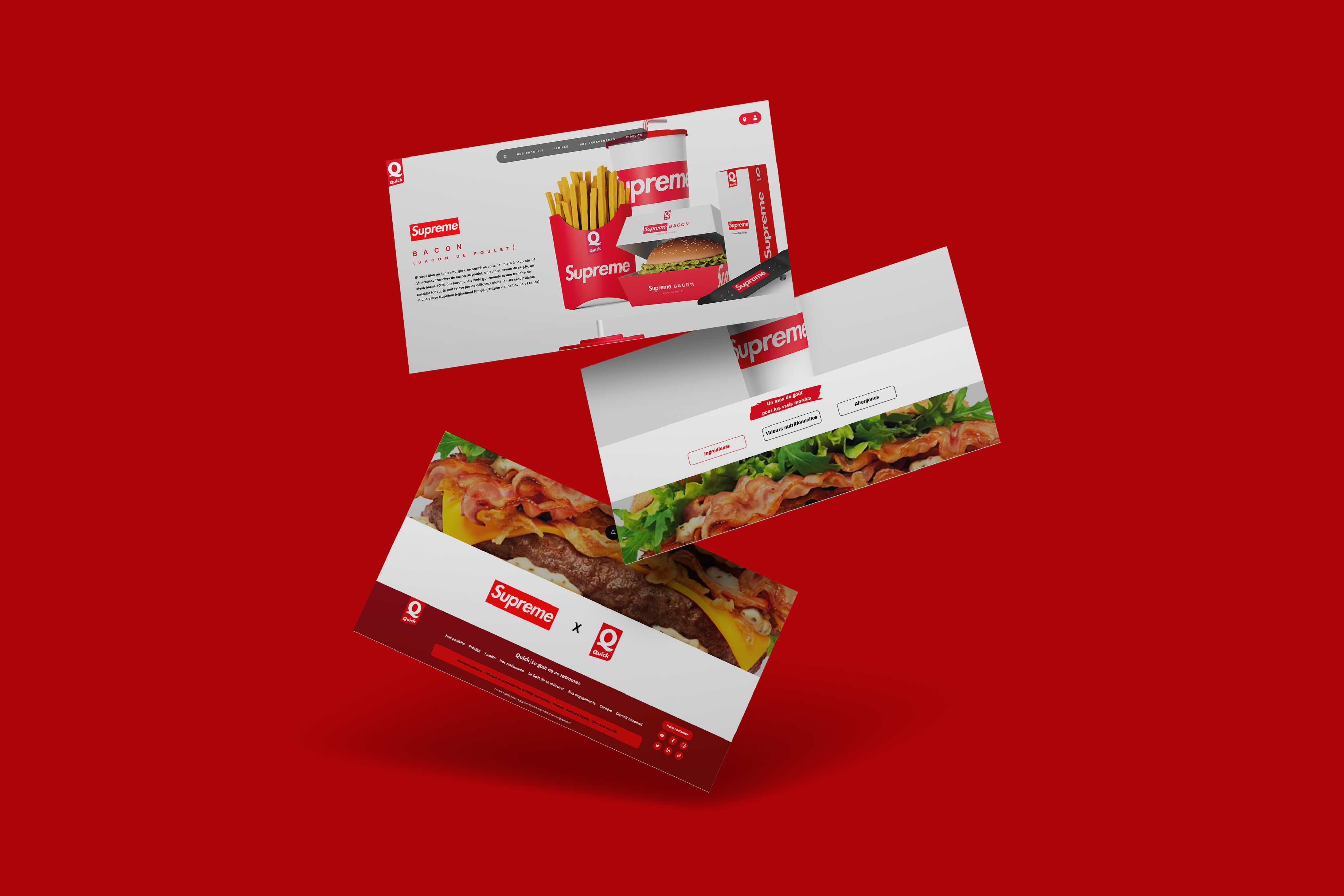
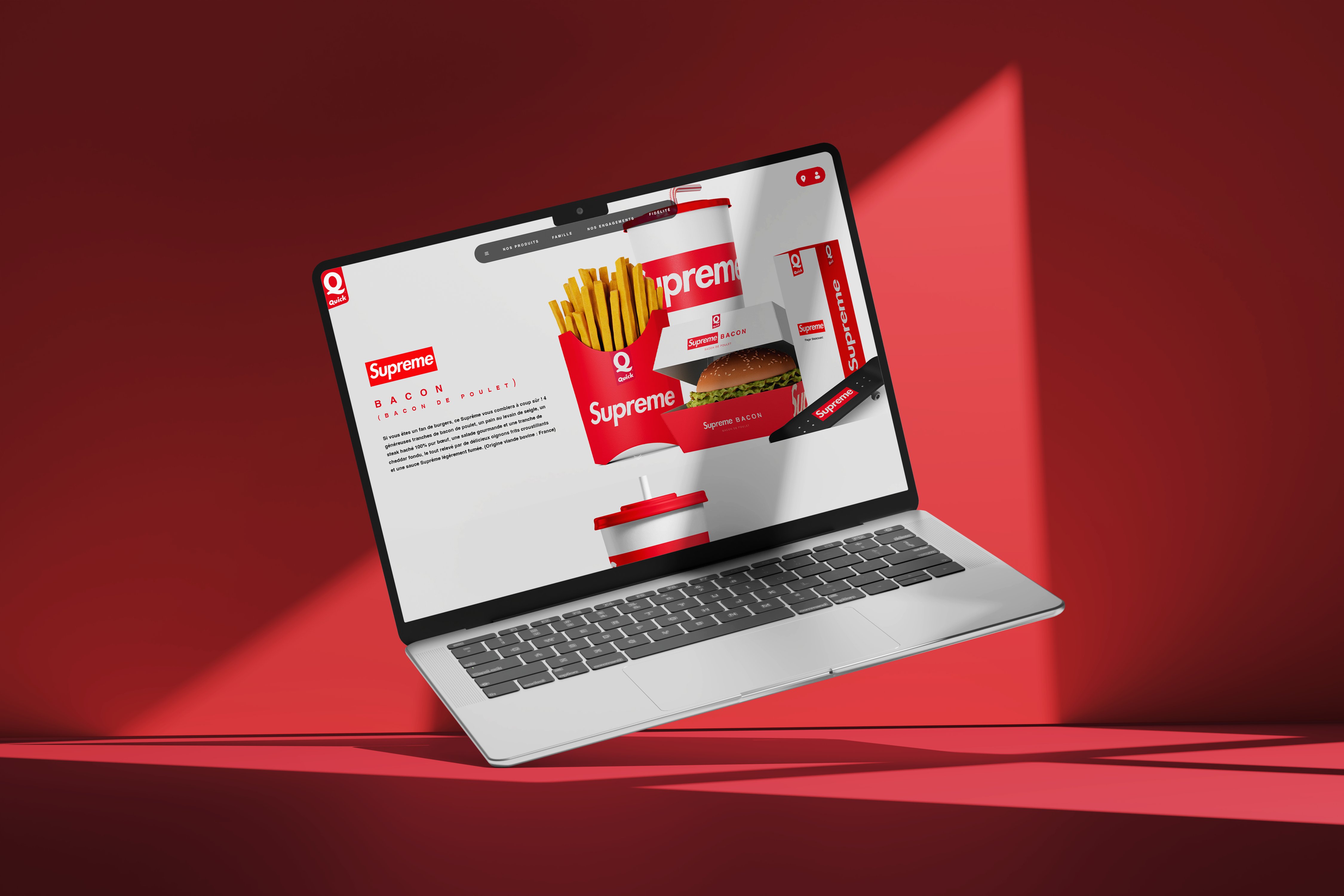
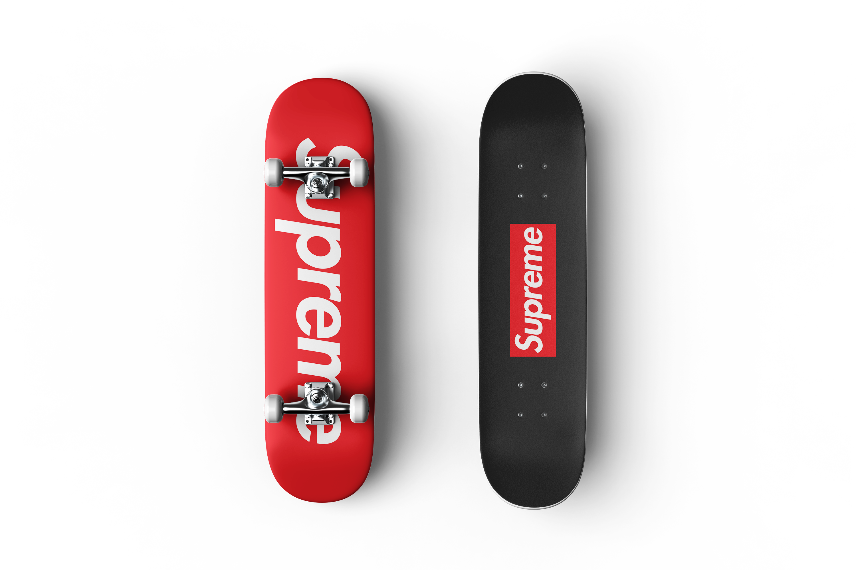
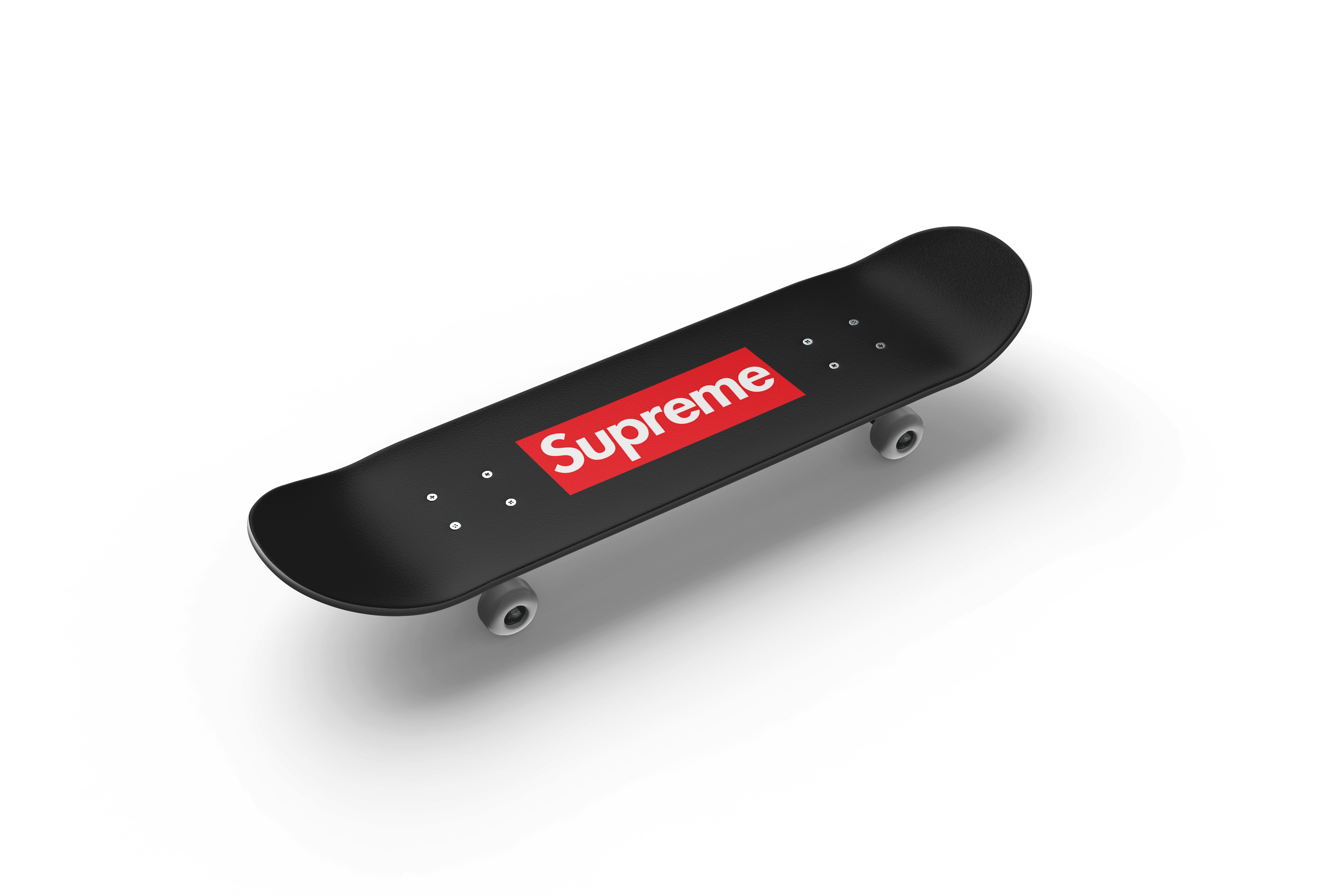
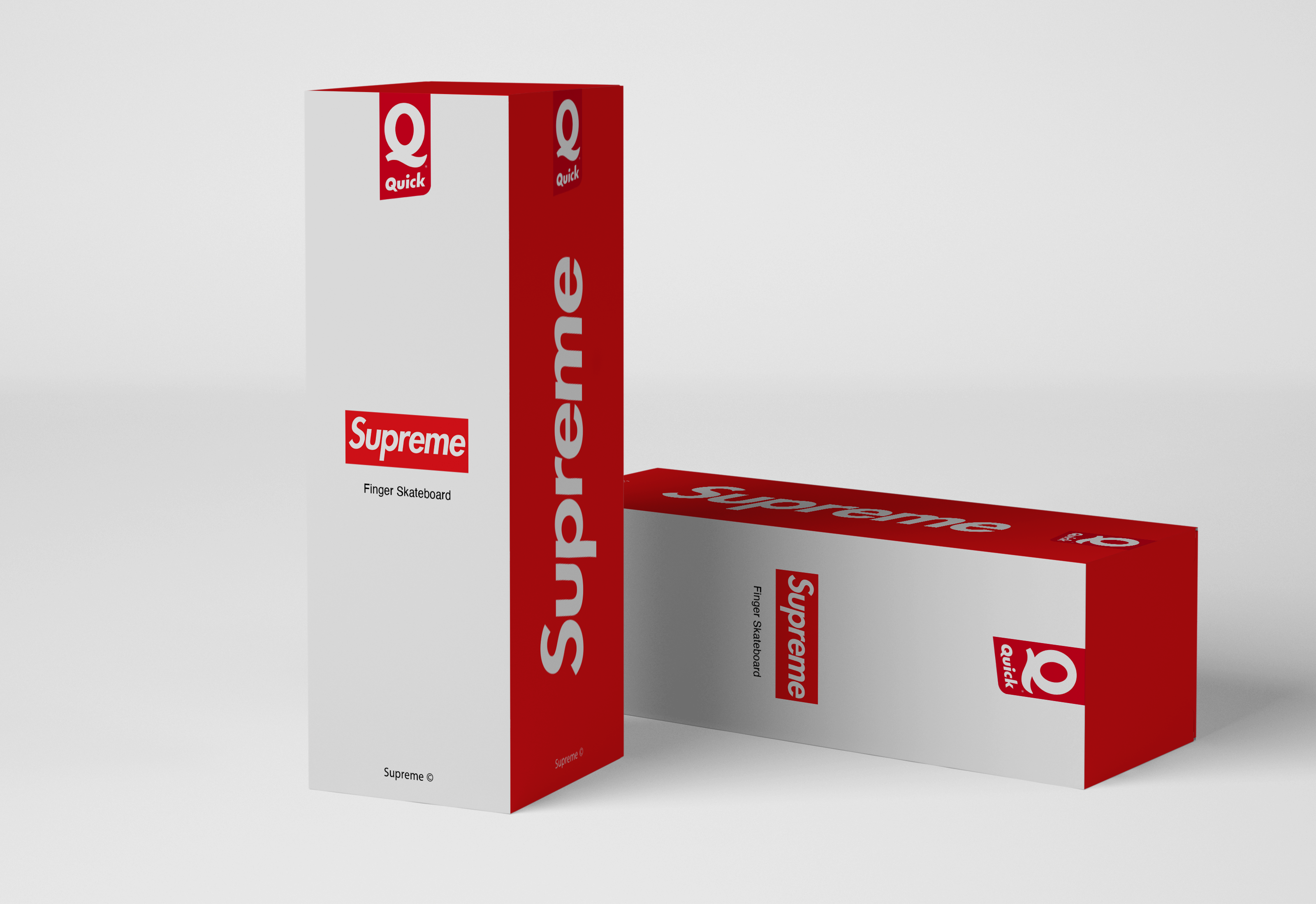
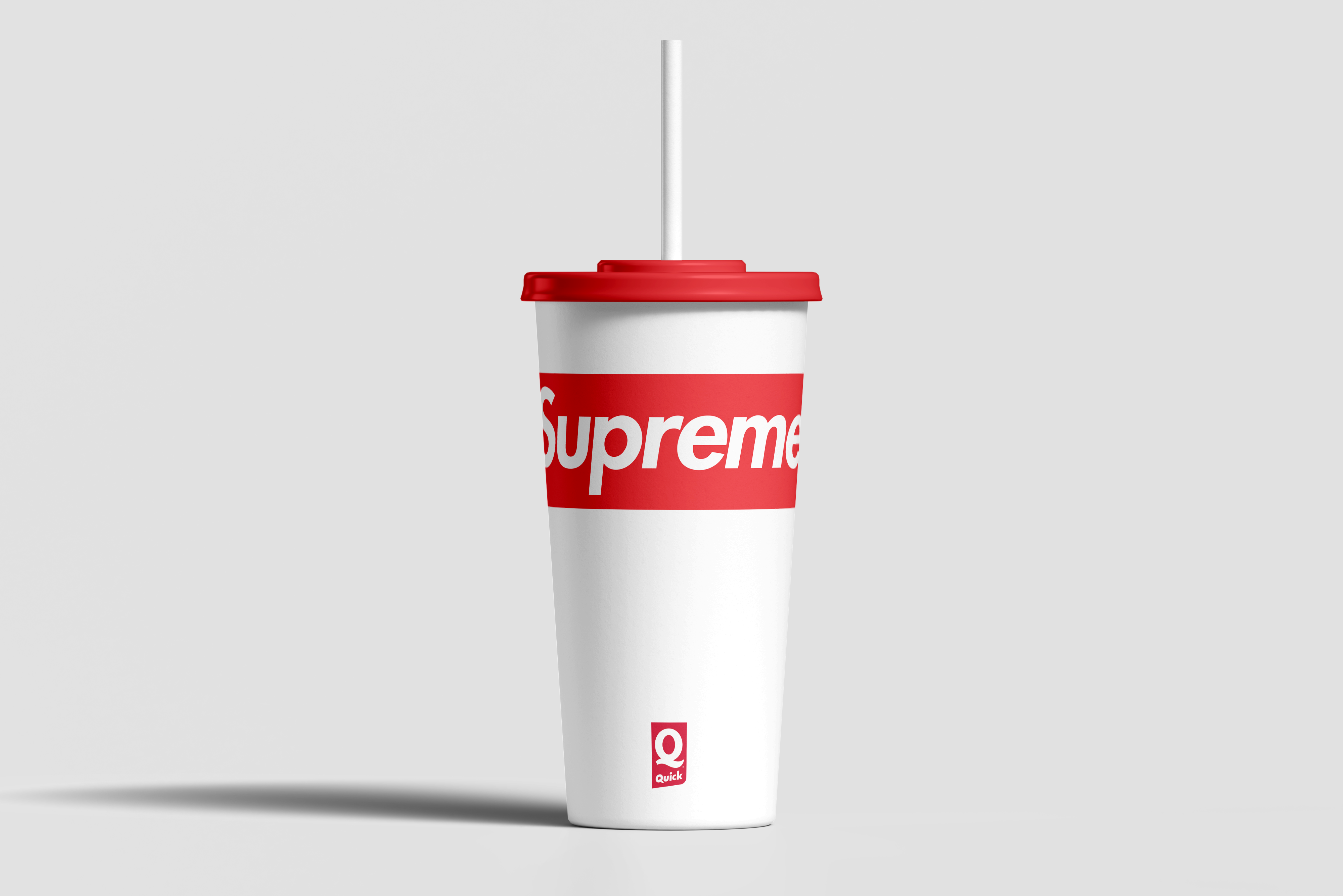
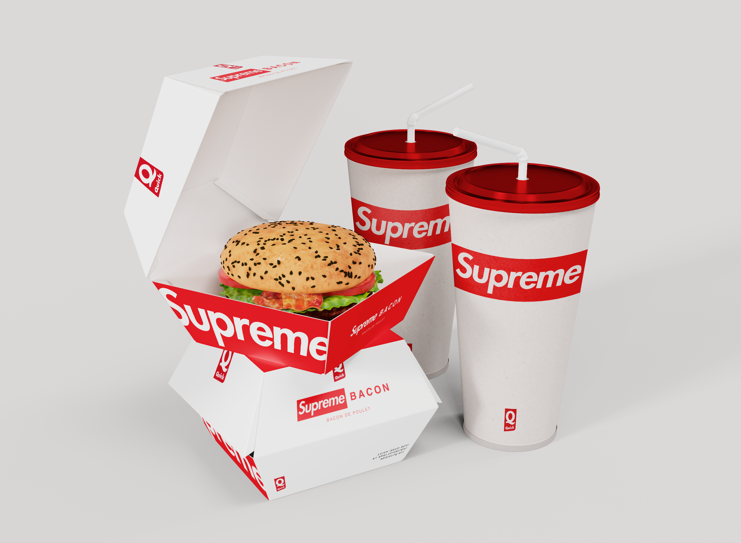
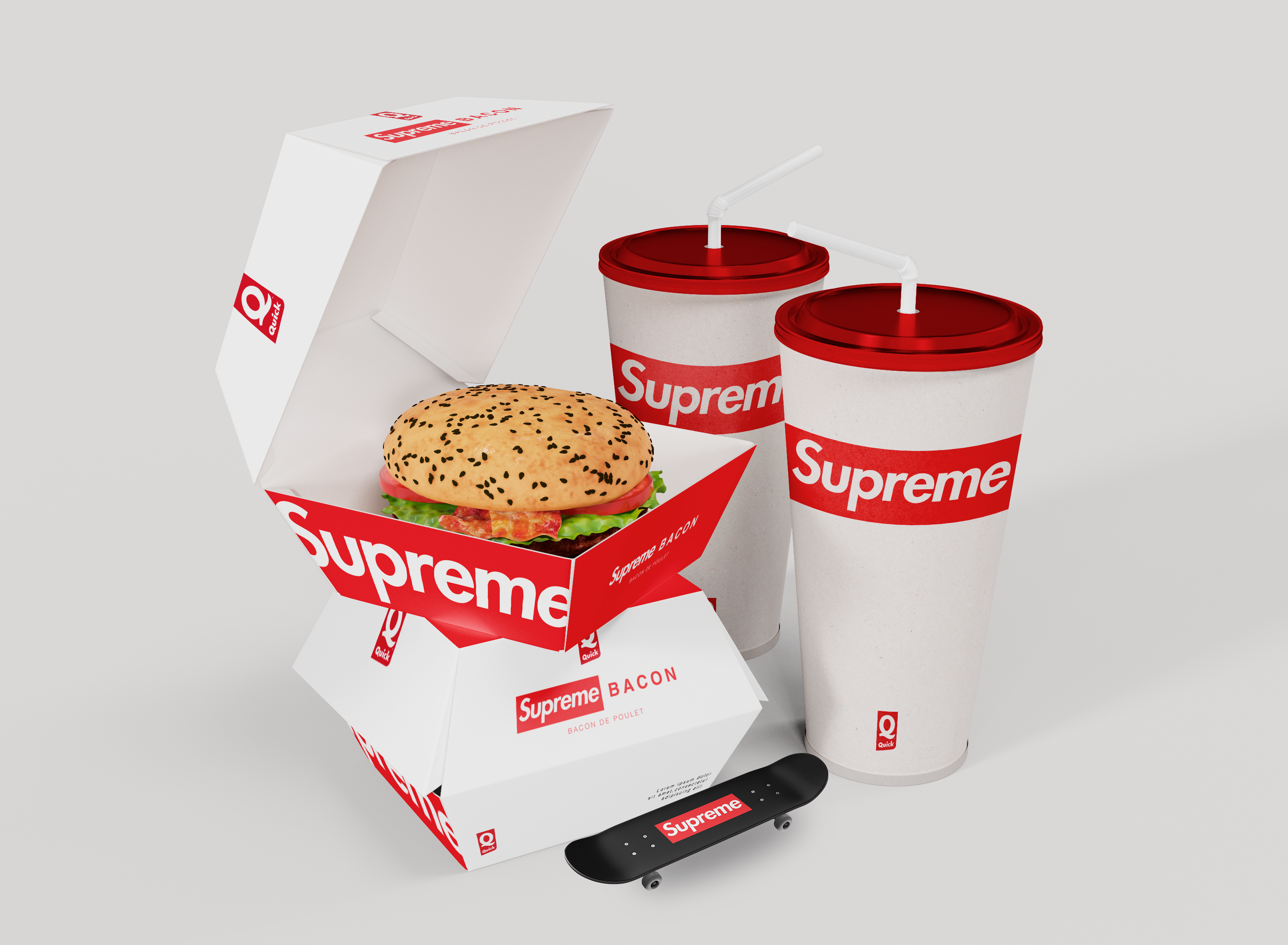
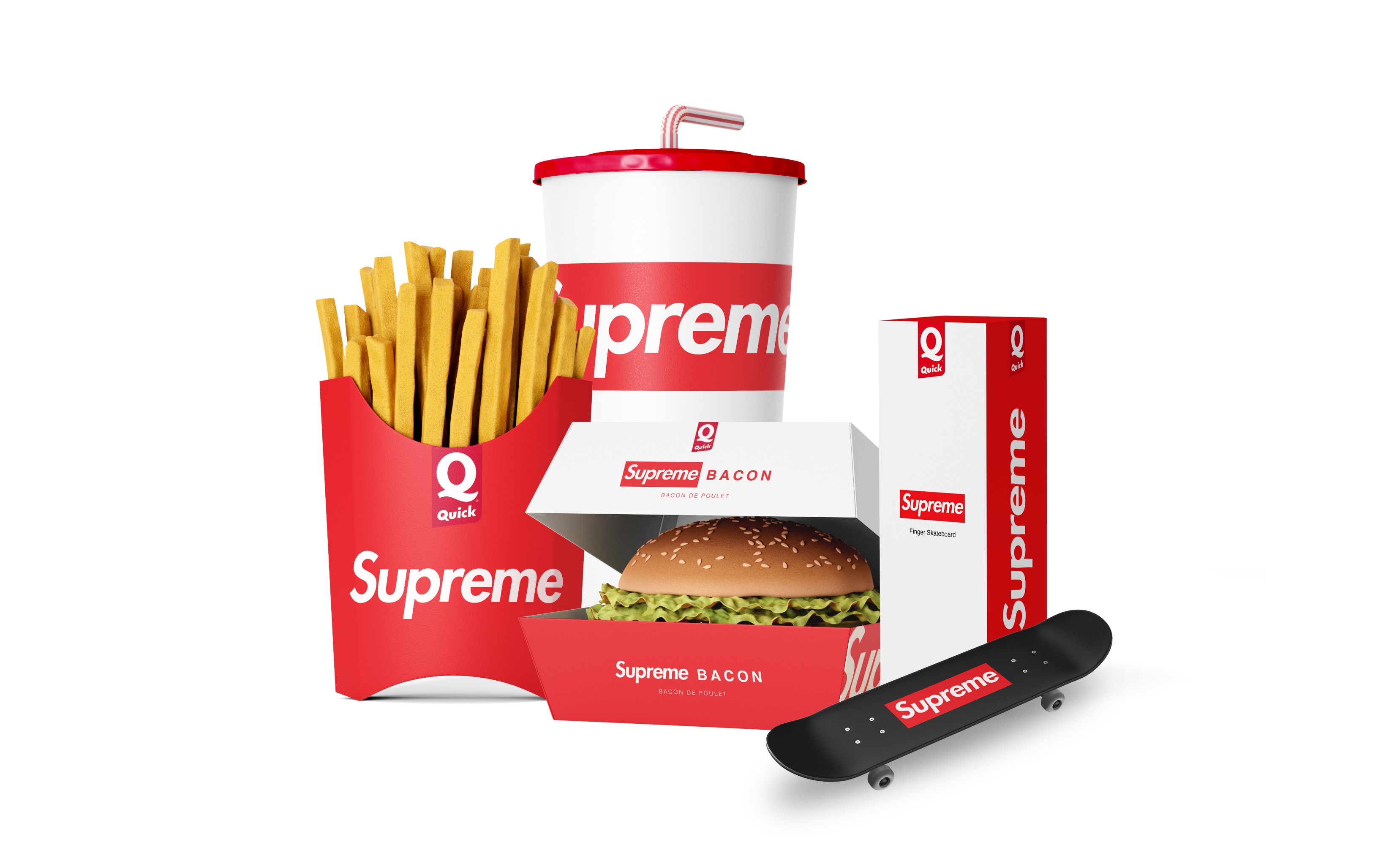
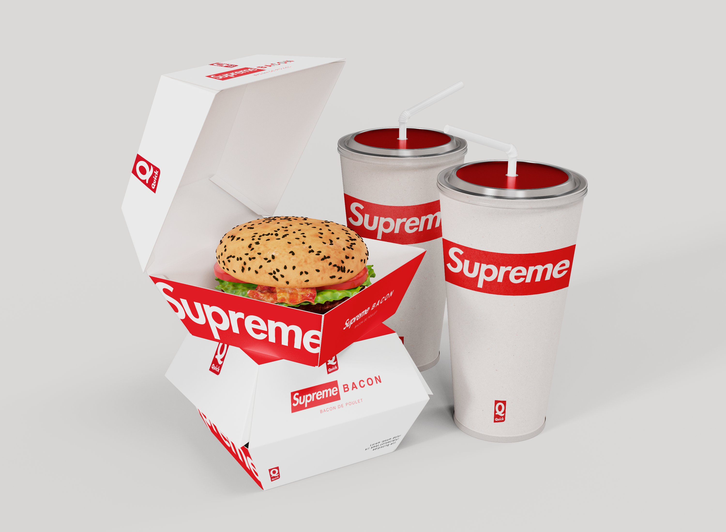
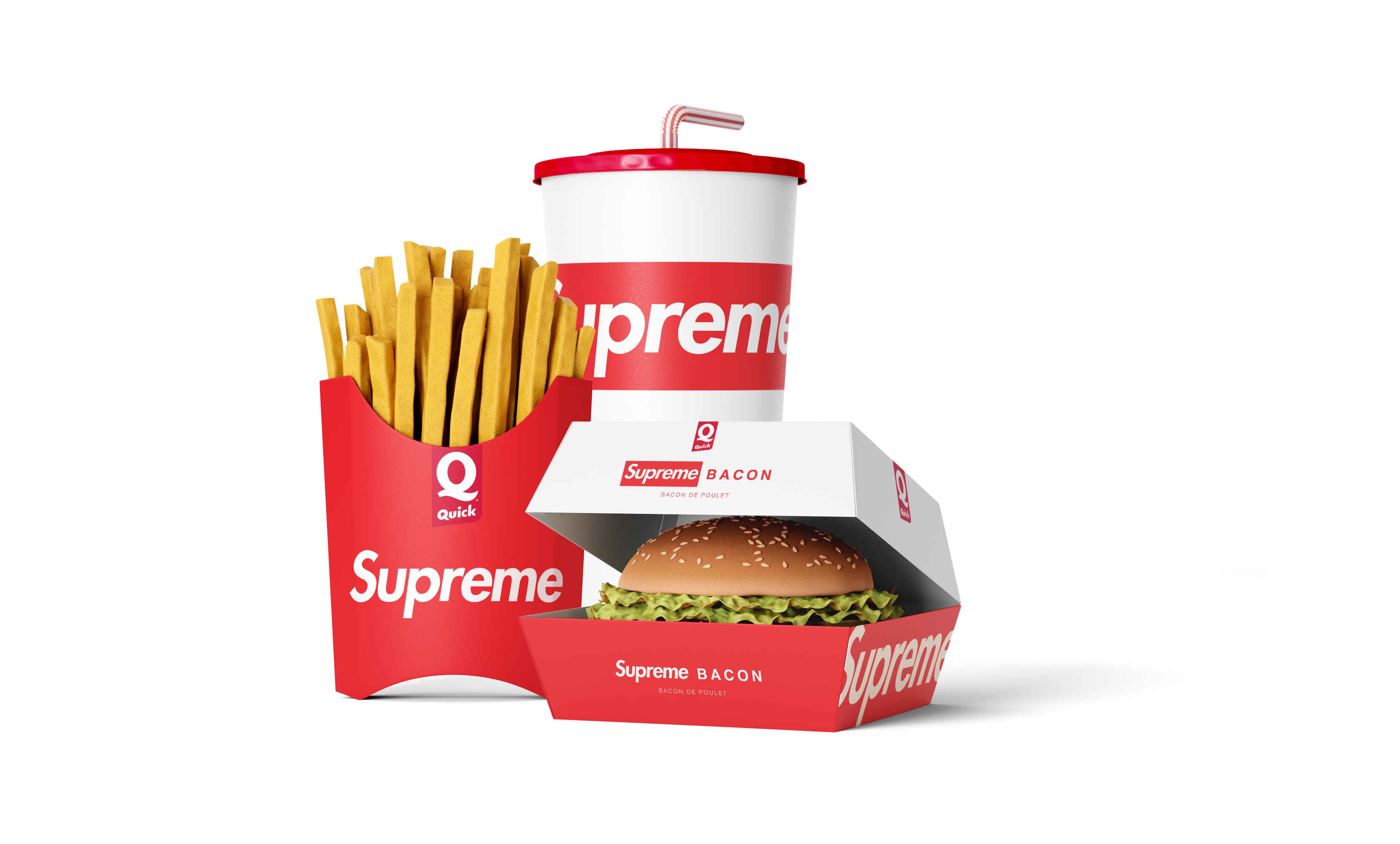
Started with research on both brands’ visual DNA: Supreme (bold red, white box logo, sans-serif typography, skate culture, minimalist streetwear) and Quick (vibrant colors, playful energy, fast-food accessibility, French market nostalgia). Explored how to merge a white box logo with Quick’s brand mark. Sketched packaging layouts using Supreme’s red and white as the base, adding Quick’s accent colors (maybe yellow, orange, or green) for energy. Designed the burger box: matte or glossy finish, co-branded logos, clean typography for menu items, recyclable cardboard. Created the glass: clear or tinted glass with screen-printed logos and patterns a subtle all-over print of Supreme’s red box and Quick’s burst or swoosh. Designed the finger skateboard: miniature deck with Supreme’s classic red box logo on top, Quick’s colors or logo on the grip tape or underside, tiny wheels with branded details. Ensured all three items felt part of a set through consistent color palette, typography, and pattern usage. Tested the designs for shelf appeal, unboxing experience, and collectibility. Delivered a collaboration menu that streetwear fans and fast-food lovers alike would queue up for bold, playful, and unmistakably Supreme x Quick.