Larode

Creating a brand identity that reflects a commitment to purity and luxury. Soft hues and botanical elements intertwine to embody their values and highlight the beauty of natural skincare. Welcome to a world where indulgence meets integrity.

Client

Personal

Role

Art Director

Services

Branding, Design

Challenges & Objectives

/ Project Overview

The creation of a brand identity for a luxury cream and skincare line rooted in gentle, botanical principles involves blending elegance with a sense of nature. The branding evokes tranquility and sustainability, using a color palette that harmoniously blends warm oranges (symbolizing gentle warmth and vitality) with cool tones like greens (embodying serenity and freshness). Typography is both refined and accessible sophisticated yet relatable to the soothing qualities of the products. Visual elements such as botanical illustrations and minimalist packaging reinforce the brand’s commitment to natural ingredients, ensuring every touchpoint reflects the luxurious, enriching experience consumers can expect from the skincare line.

/ Challenges

Balancing luxury (richness, exclusivity) with purity (simplicity, natural ingredients). Using warm oranges and cool greens together without clashing or feeling chaotic. Making typography feel both refined (luxury) and accessible (friendly, approachable). Avoiding a clinical or medicinal look that often plagues natural skincare brands.

/ Objectives

Create a harmonious color palette blending warm oranges (vitality, warmth) and cool greens (serenity, freshness, nature). Design typography that is sophisticated yet warm and approachable. Incorporate botanical illustrations that feel artistic, not generic. Develop minimalist packaging that highlights natural ingredients and luxury quality. Ensure every brand touchpoint feels tranquil, sustainable, and indulgent.

Creative
Process

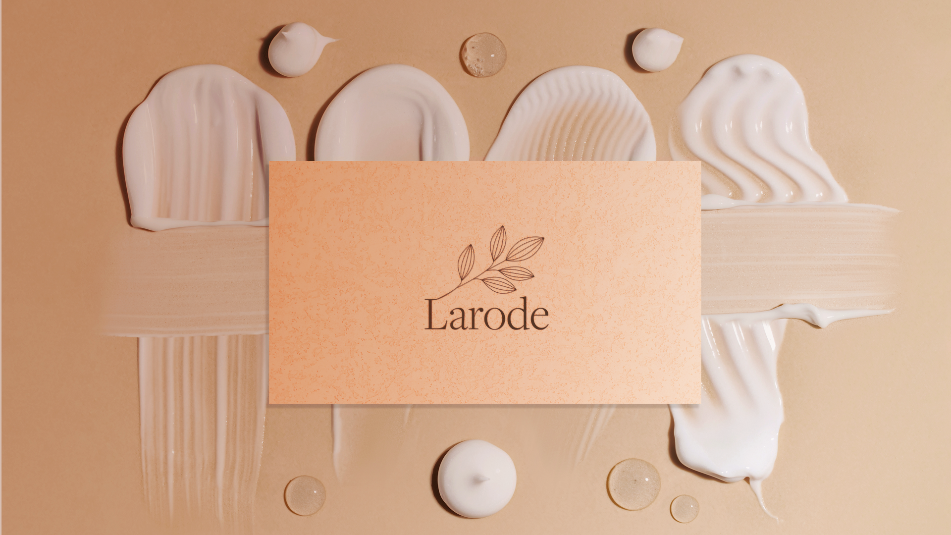
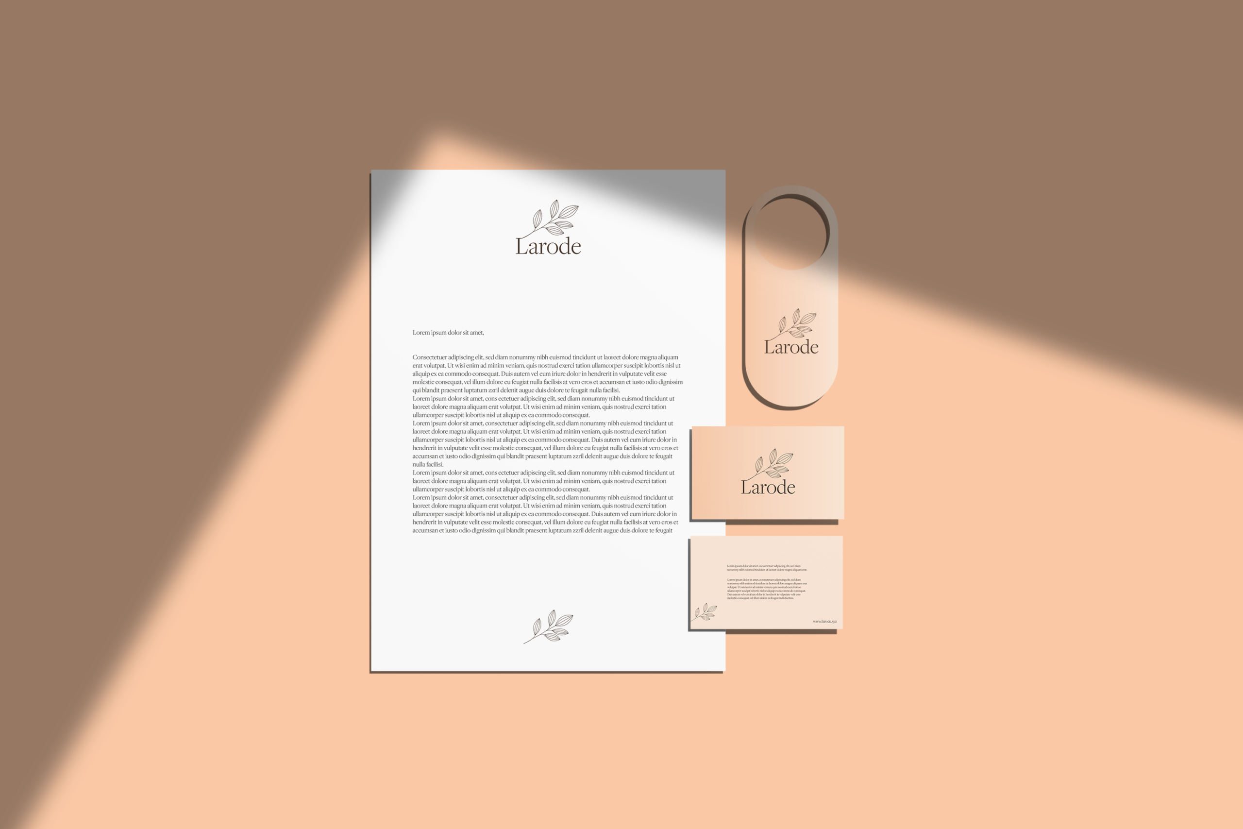
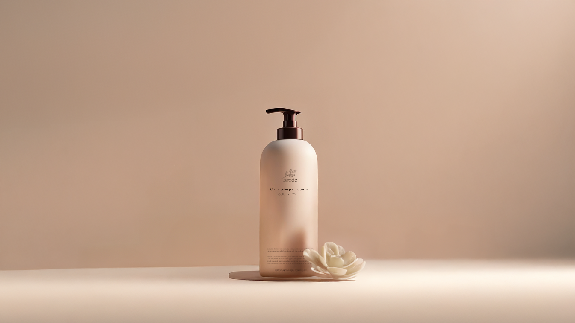
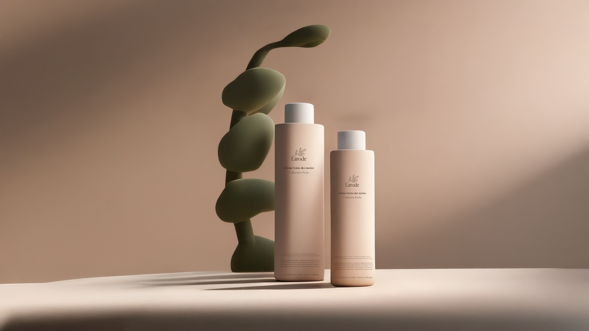
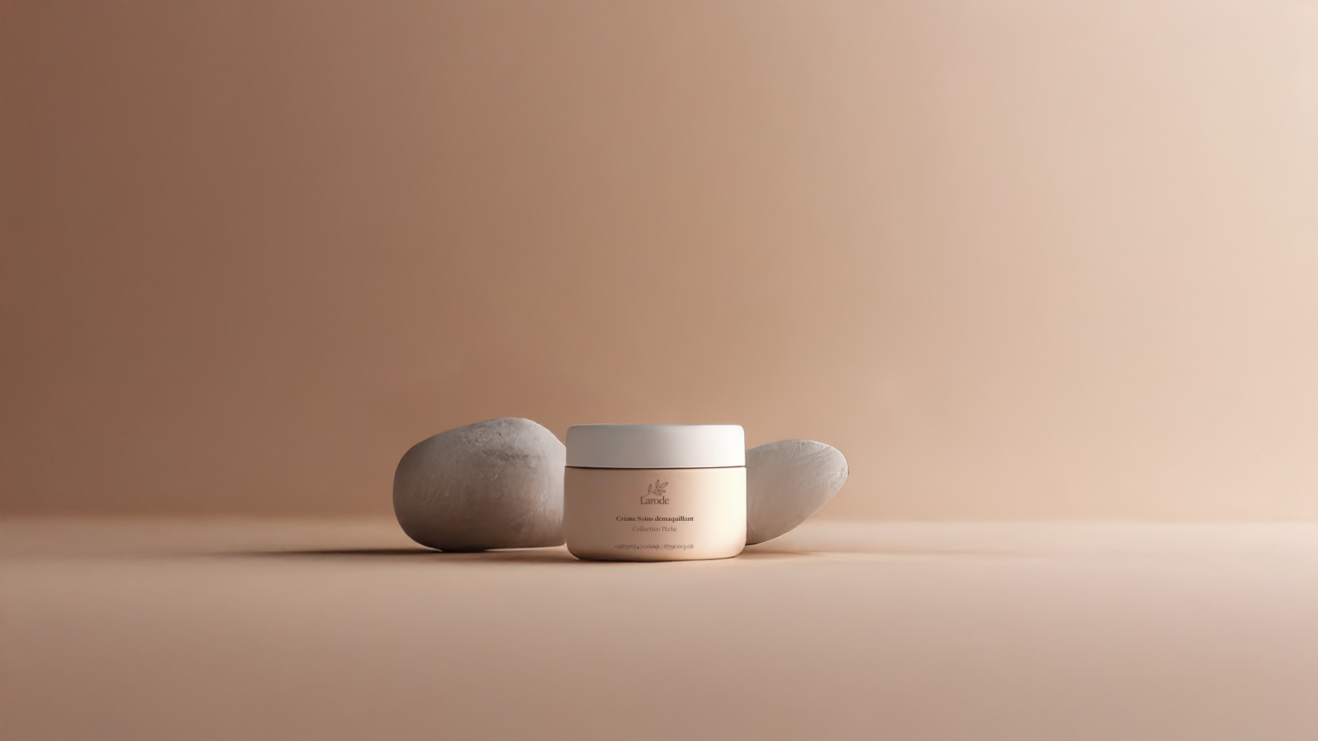
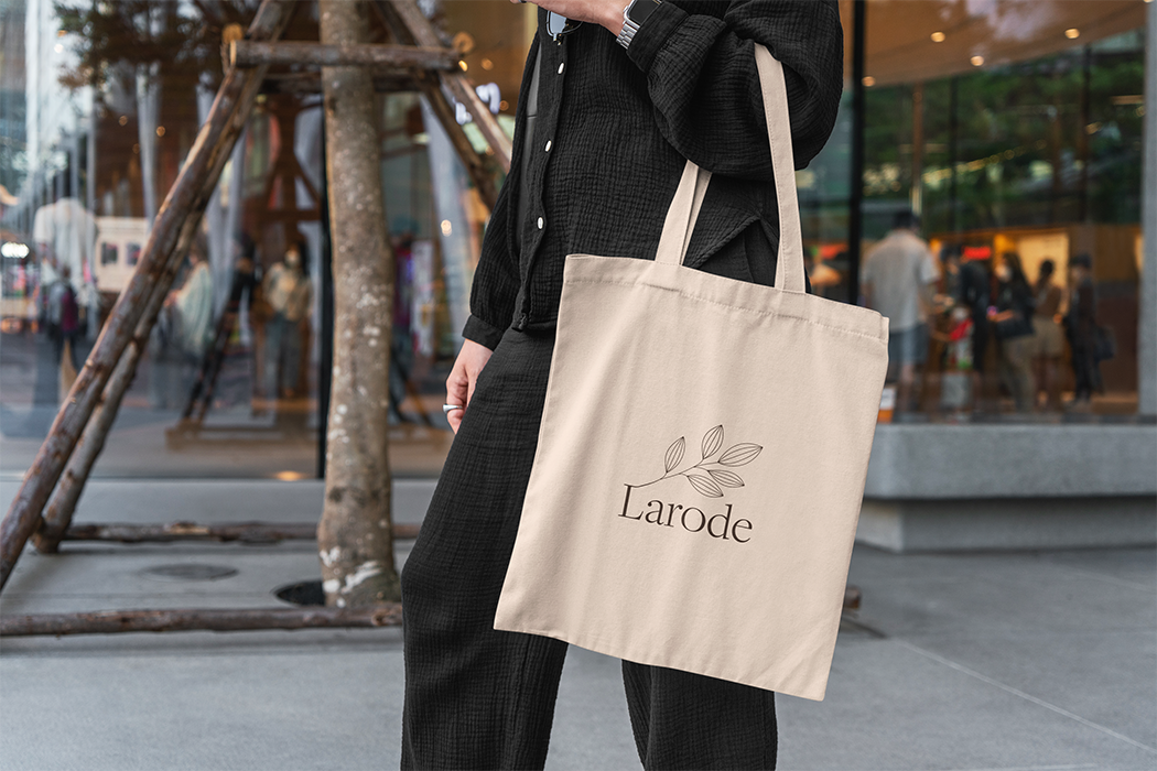
Started with core values: purity, luxury, nature, tranquility, integrity. Researched high-end natural skincare brands (Aesop, Tata Harper, Grown Alchemist) for inspiration on minimalism and botanical cues. Developed a dual-temperature color palette: soft apricot and terracotta oranges for warmth and vitality, paired with sage and eucalyptus greens for calm and freshness. Selected a refined serif or modern serif typography with rounded edges to feel both elegant and gentle. Commissioned or sourced delicate botanical illustrations (leaves, flowers, herbs) in line-drawing or soft watercolor style. Designed minimalist packaging: frosted glass or soft-touch matte containers, cream labels with ample white space, small botanical accents. Created a visual system where the warm orange appears on accents (caps, tags, boxes) and green dominates the main surfaces (bottles, jars, bags). Applied the identity to product labels, outer packaging, a website mockup, and in-store displays. Delivered a brand where every cream, every jar, every illustration whispers: indulgence and integrity can coexist, naturally.

Social Media

  • Design & Branding
  • Ticker Image
  • Logo Design
  • Ticker Image
  • Prototyping
  • Ticker Image
  • Design & Branding
  • Ticker Image
  • Logo Design
  • Ticker Image
  • Prototyping
  • Ticker Image

©2026 Laurine Robinn, All Rights Reserved.

en_USEN_US