Discover an identity creation project for the Château Vallorine brand. We designed elegant labels and packaging for their red and rosé wines, reflecting the brand’s essence and wine quality. Simplicity, sophistication, and tradition are at the heart of this visual identity.
Client
Personal
Role
Graphic Designer
Services
Prototyping, Design
We are delighted to present the result of our exceptional collaboration between artist NINALY and our design team to create an identity for Château Vallorine. Together, we designed unique labels and packaging for their red and rosé wines, using NINALY’s iconic artistic style to illustrate the Vallorine estate. NINALY’s detailed illustrations and fine lines captured the essence of the Château Vallorine estate, starting from its historic building. This visual identity perfectly reflects the brand’s essence and wine quality, highlighting tradition, sophistication, and simplicity. Simplicity, sophistication, and tradition are at the core of this visual identity, which appears on elegant, refined labels and packaging. The colors, typography, and patterns were carefully selected to evoke the feelings and emotions that drive Château Vallorine’s identity.
Translating a historic wine estate (tradition, heritage) into a modern artistic collaboration without losing authenticity. Merging NINALY’s detailed, fine-line illustrative style with wine label conventions (legibility, hierarchy, regulatory information). Balancing simplicity (minimalist layout) with sophistication (elegant details) and tradition (heritage cues). Creating a cohesive system that works for both red and rosé wines while maintaining distinct personalities.
Design wine labels and packaging featuring NINALY’s detailed illustrations of the Château Vallorine historic building. Use a color palette that reflects the estate’s identity and distinguishes red from rosé. Select typography that feels elegant, traditional, and legible at small sizes. Build a visual identity where simplicity, sophistication, and tradition coexist harmoniously. Create an aesthetic and sensory experience that enhances the wine-tasting journey.
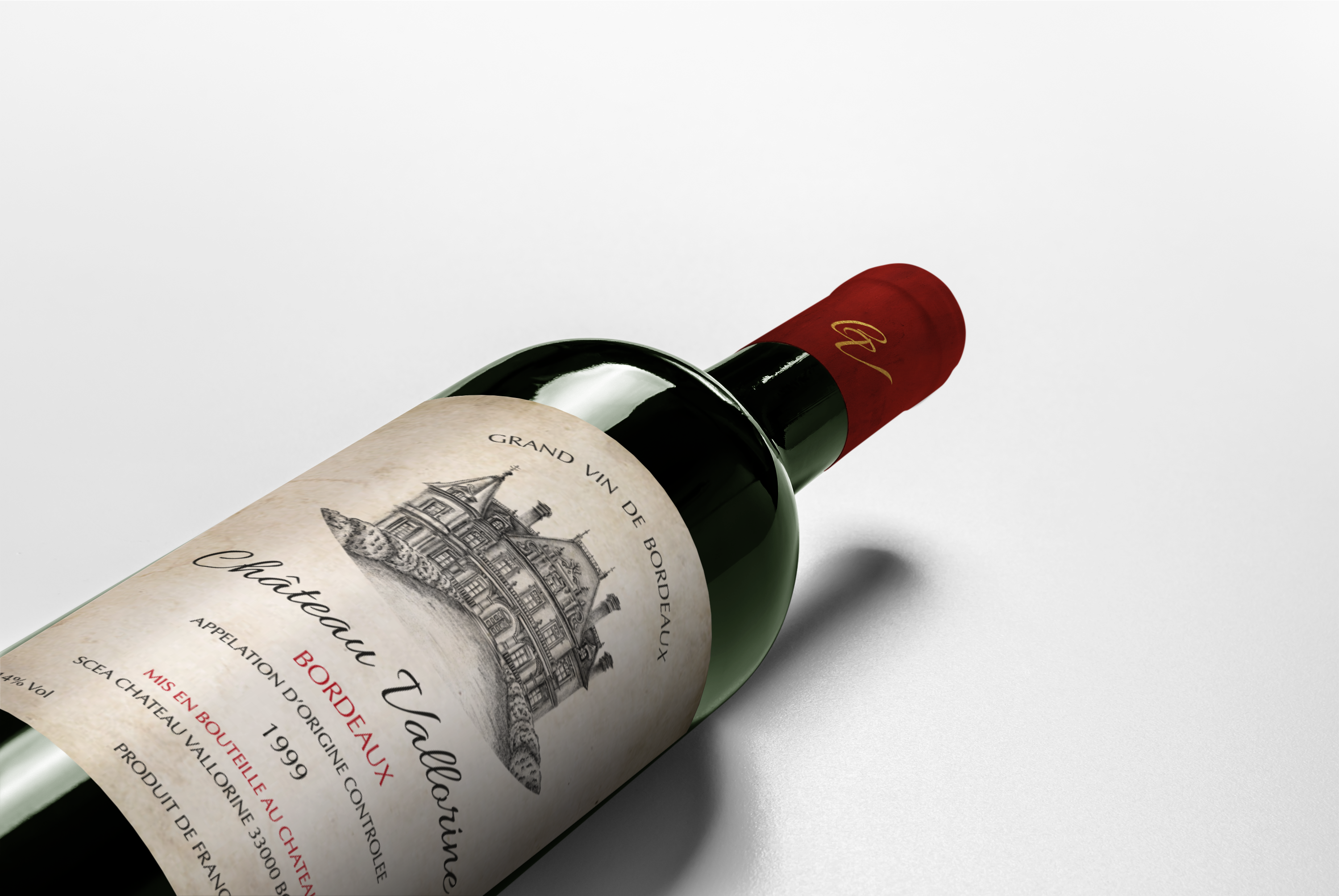
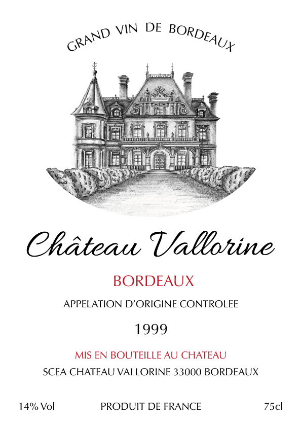
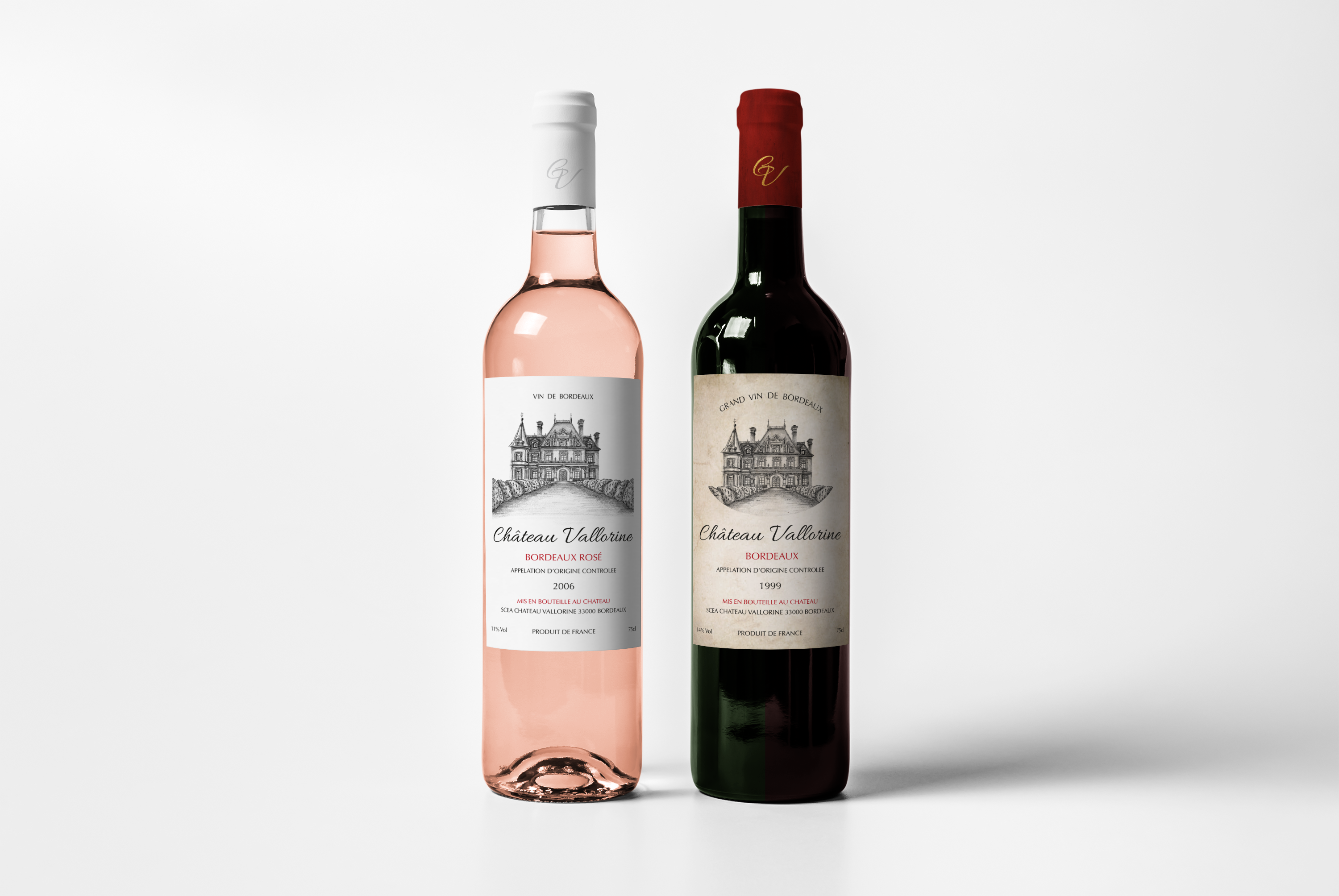
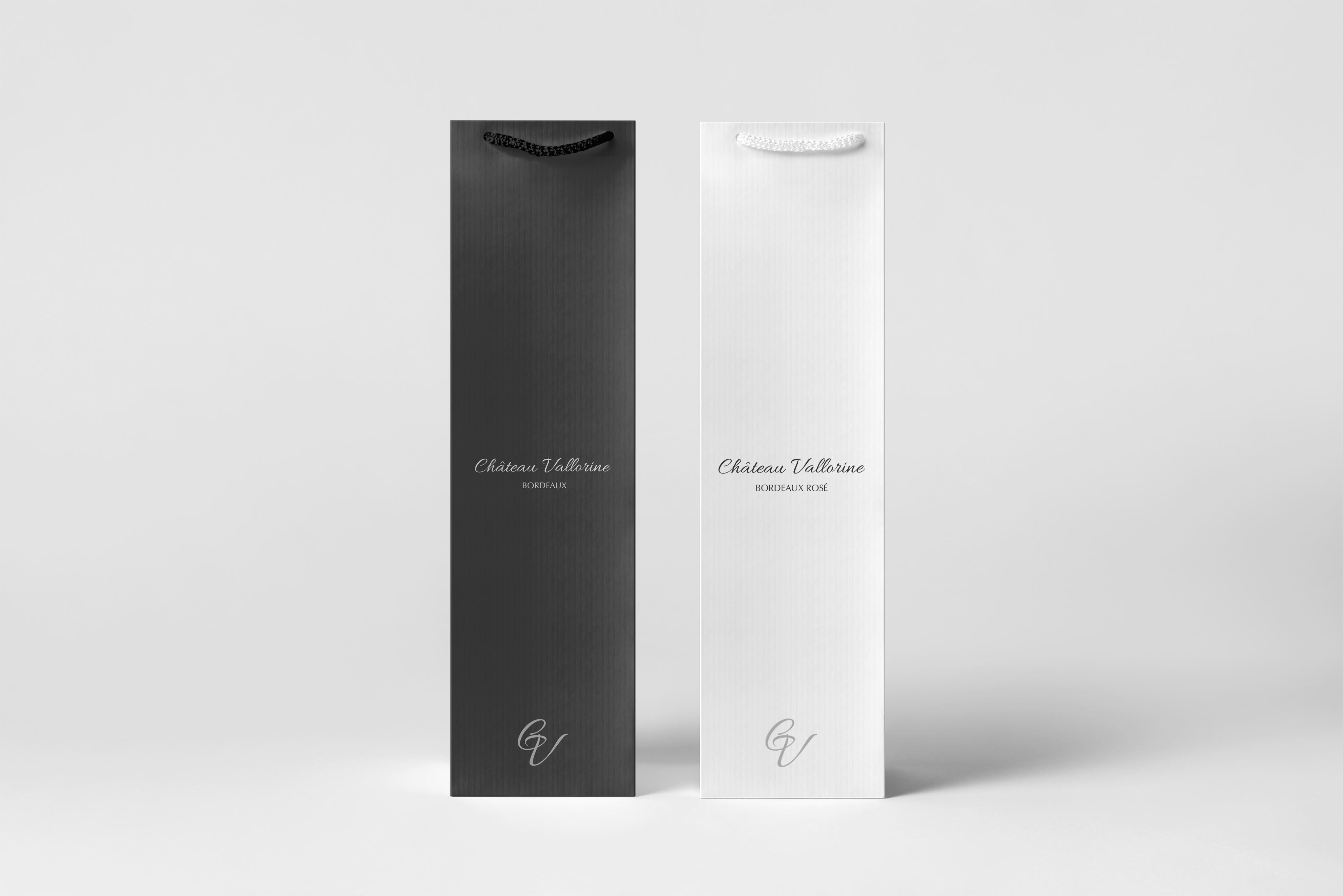
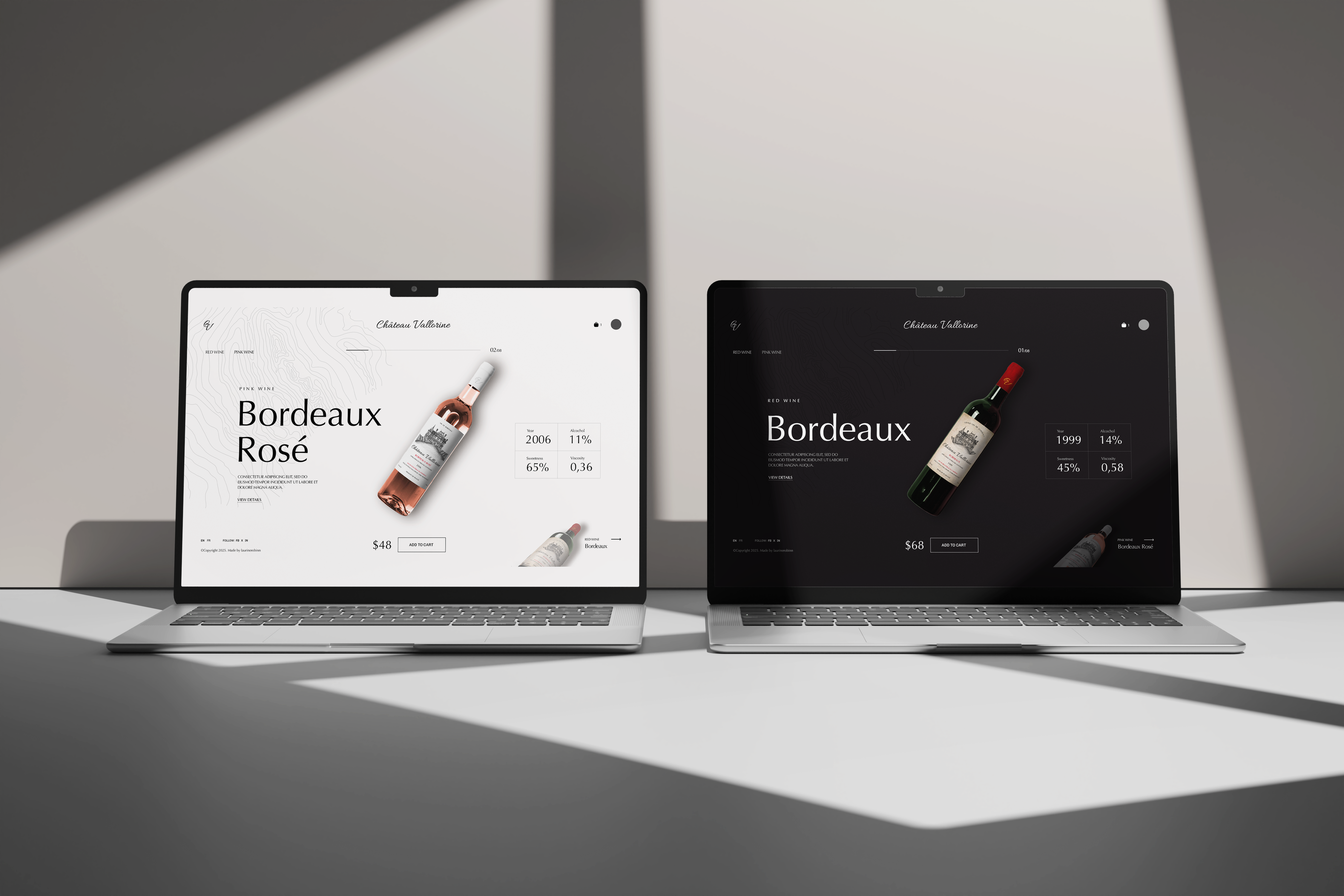
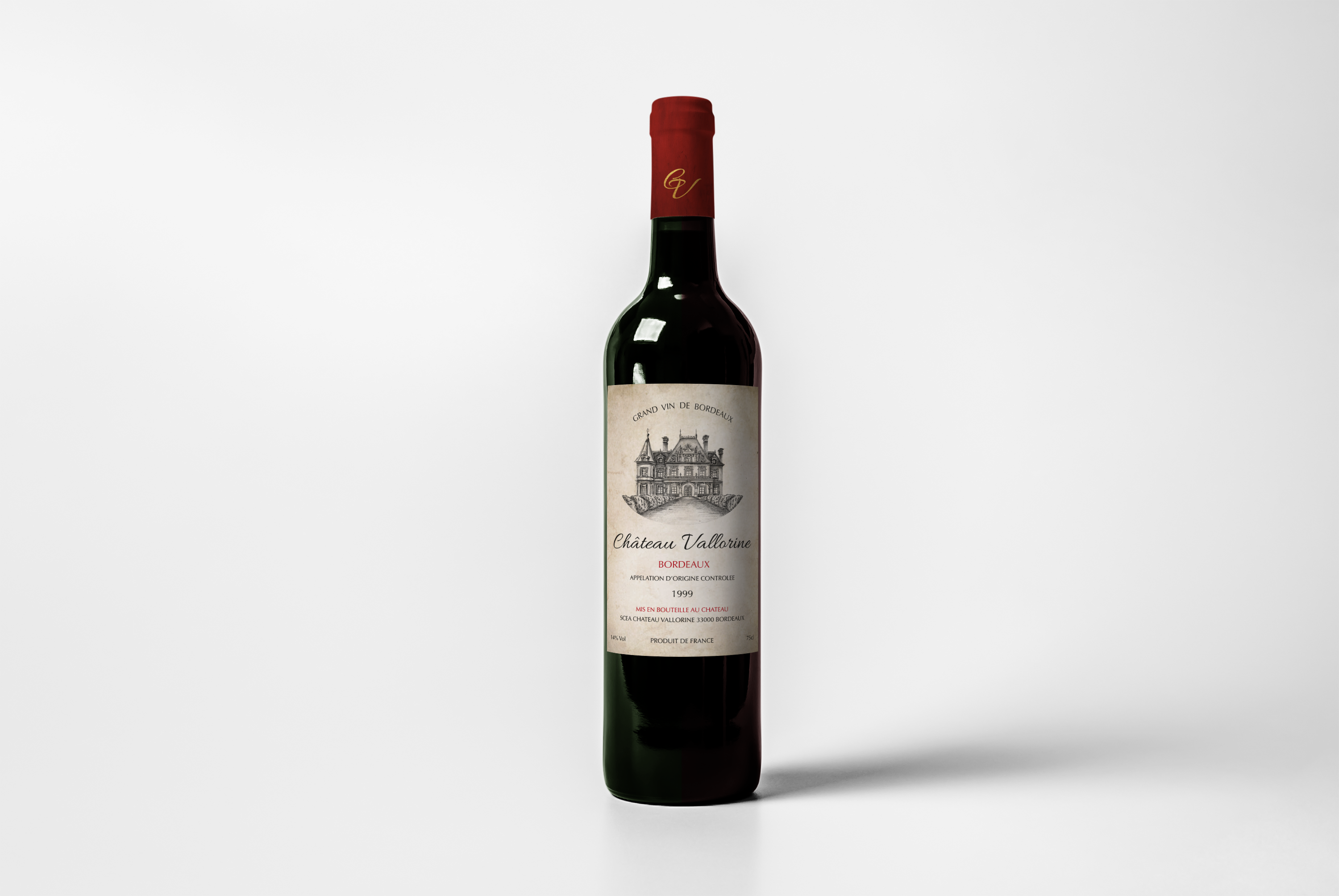
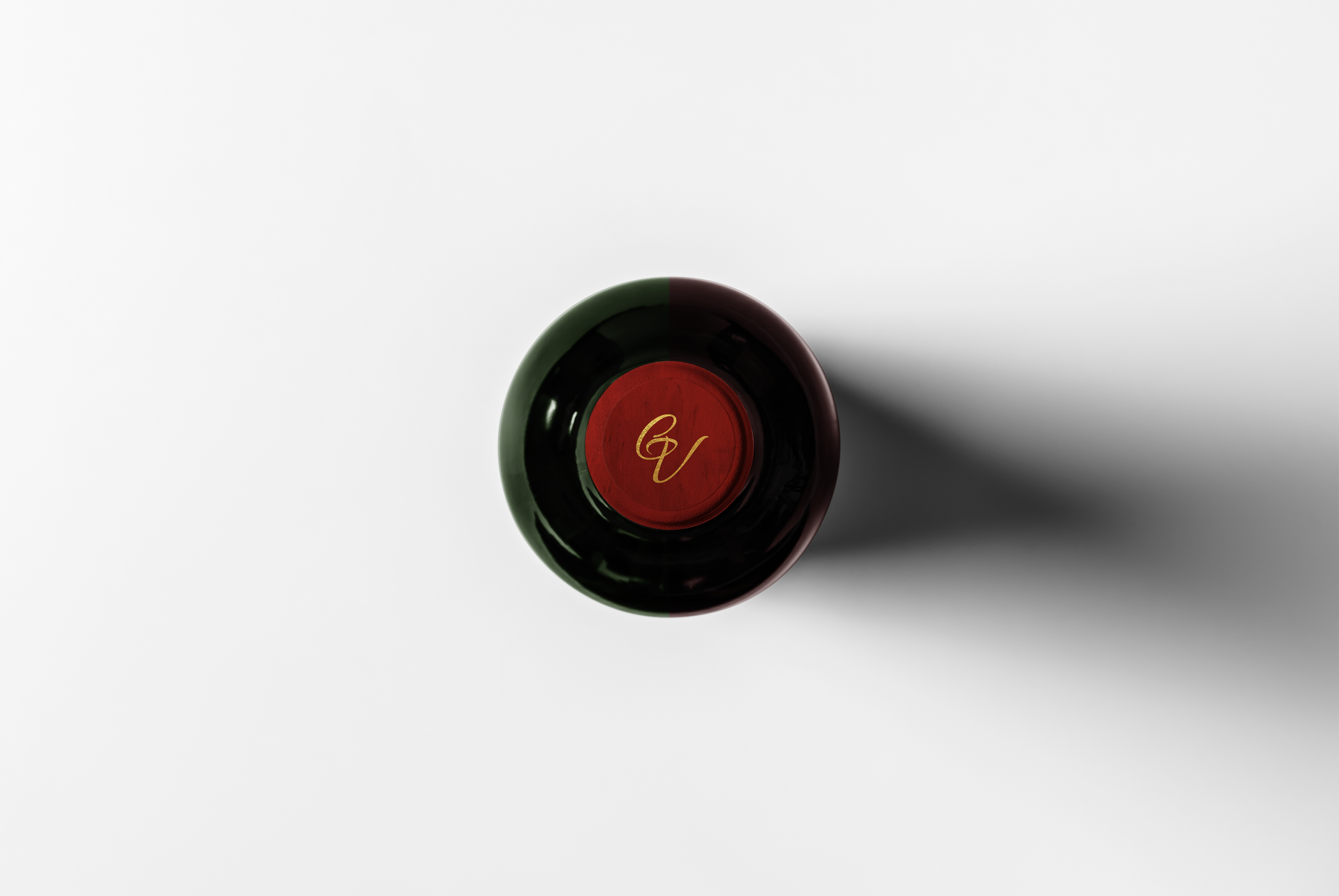
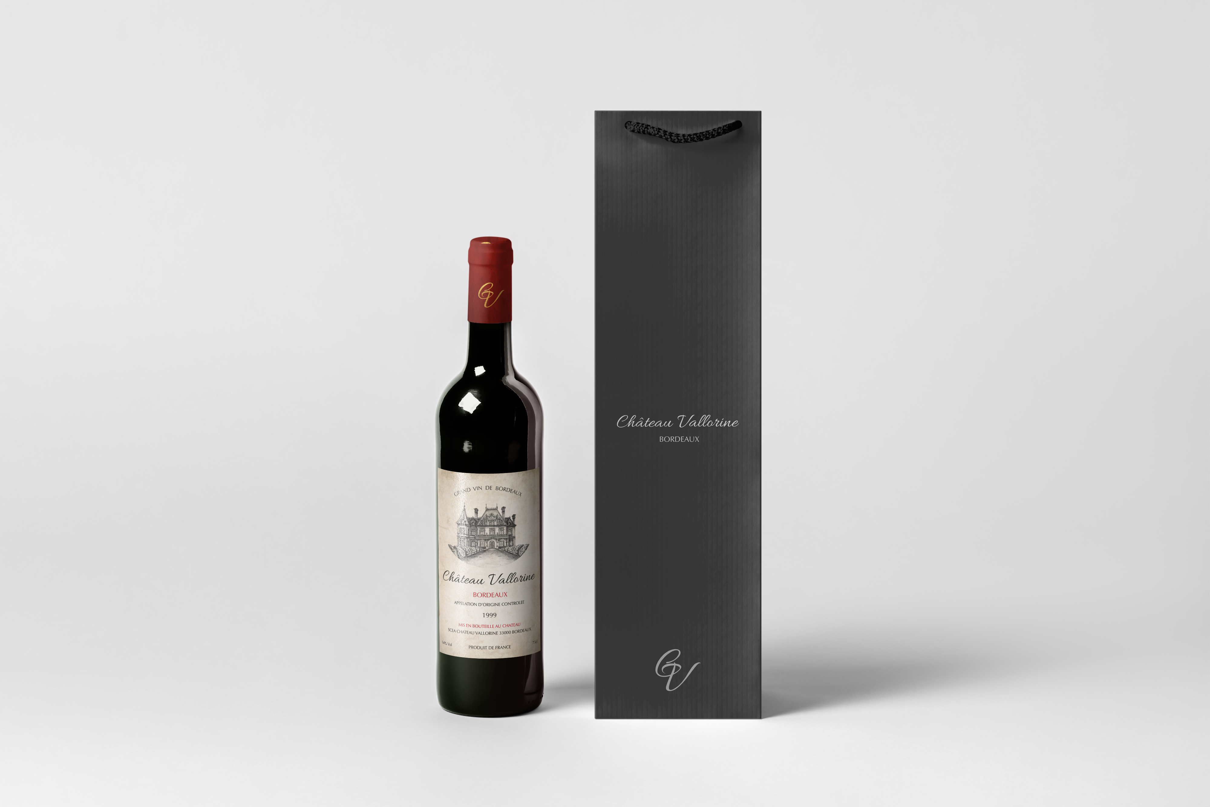
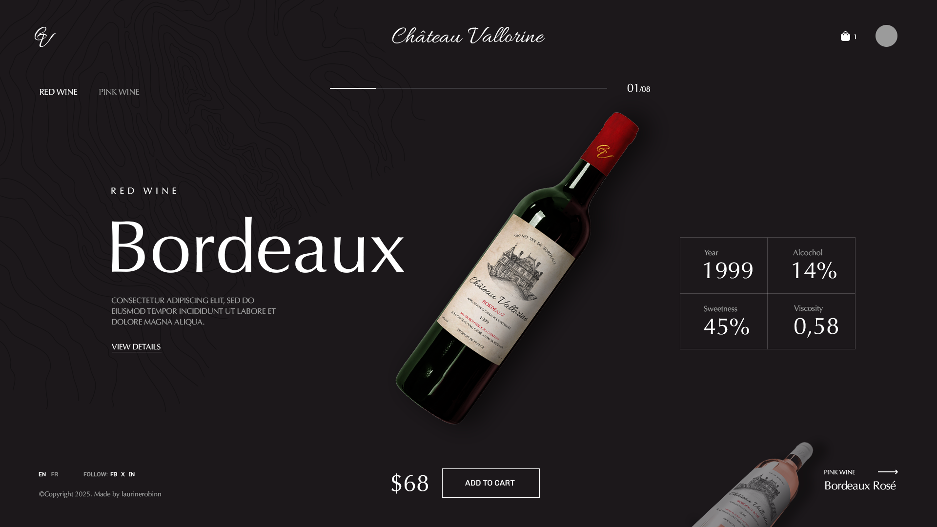
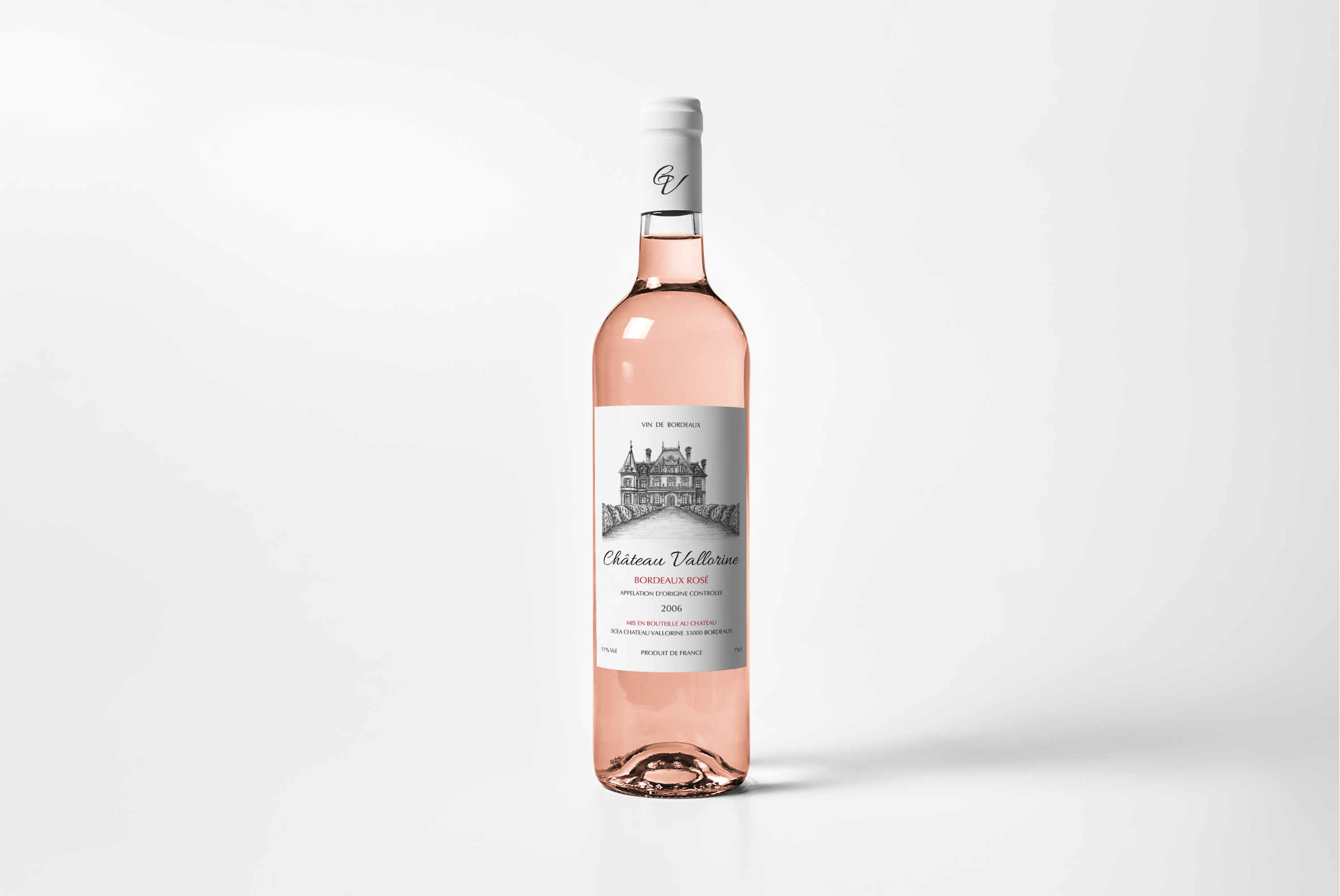
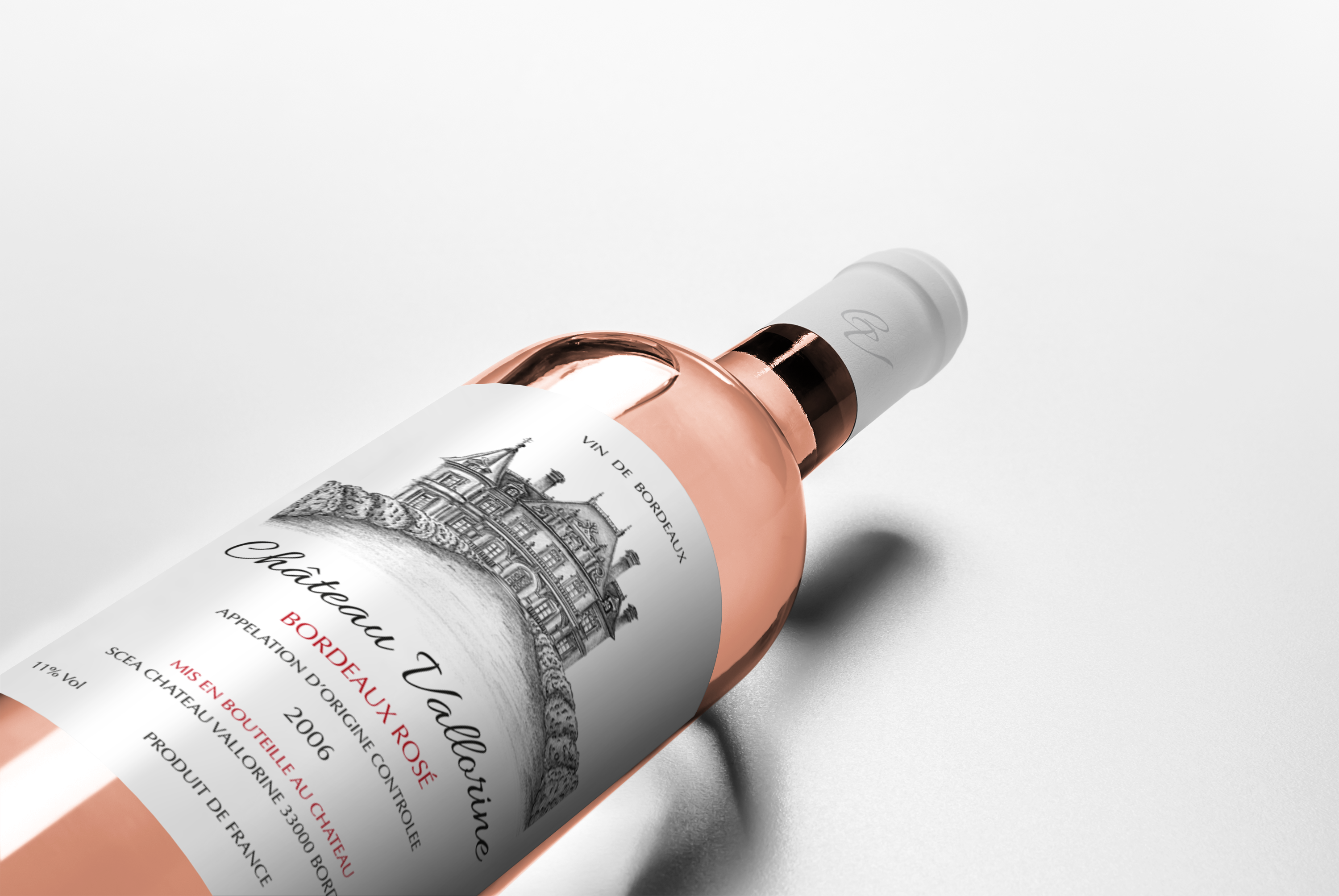
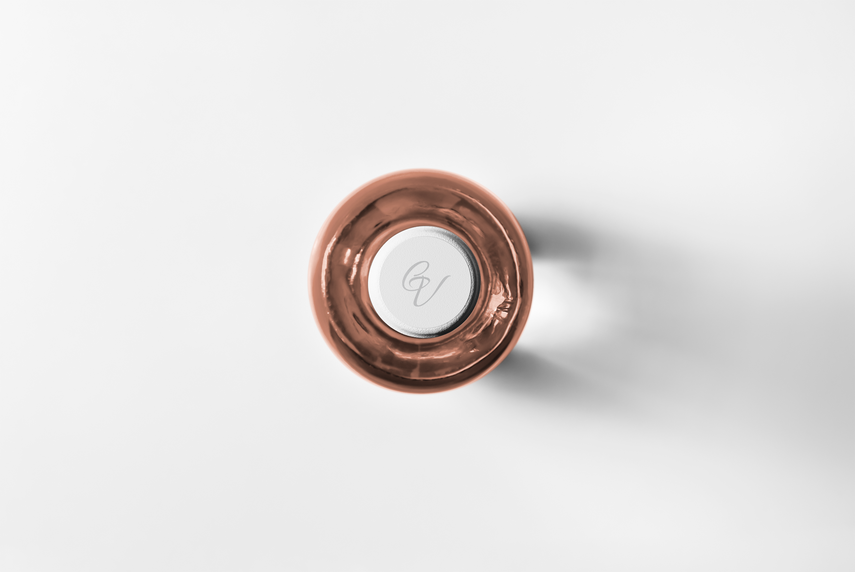
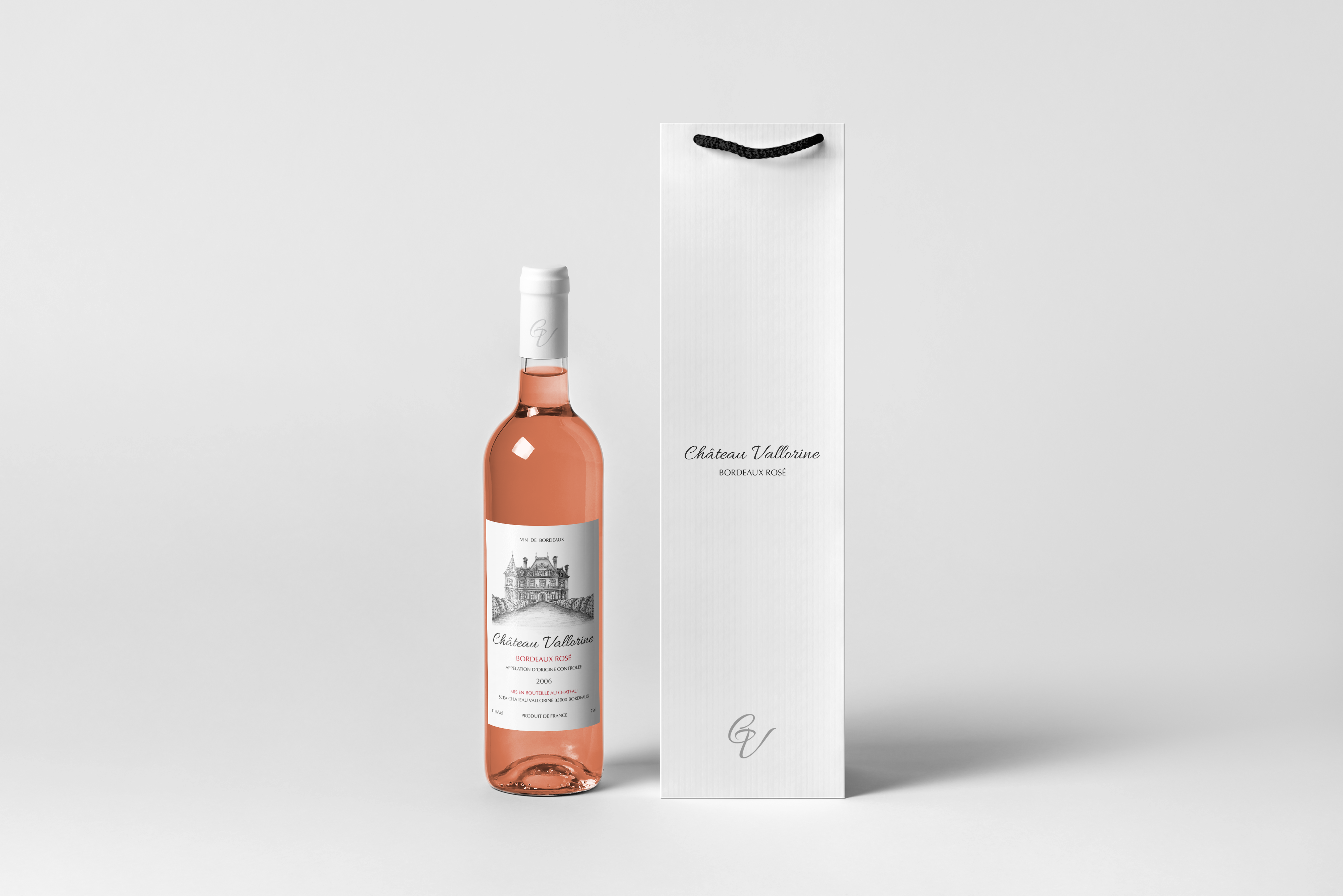
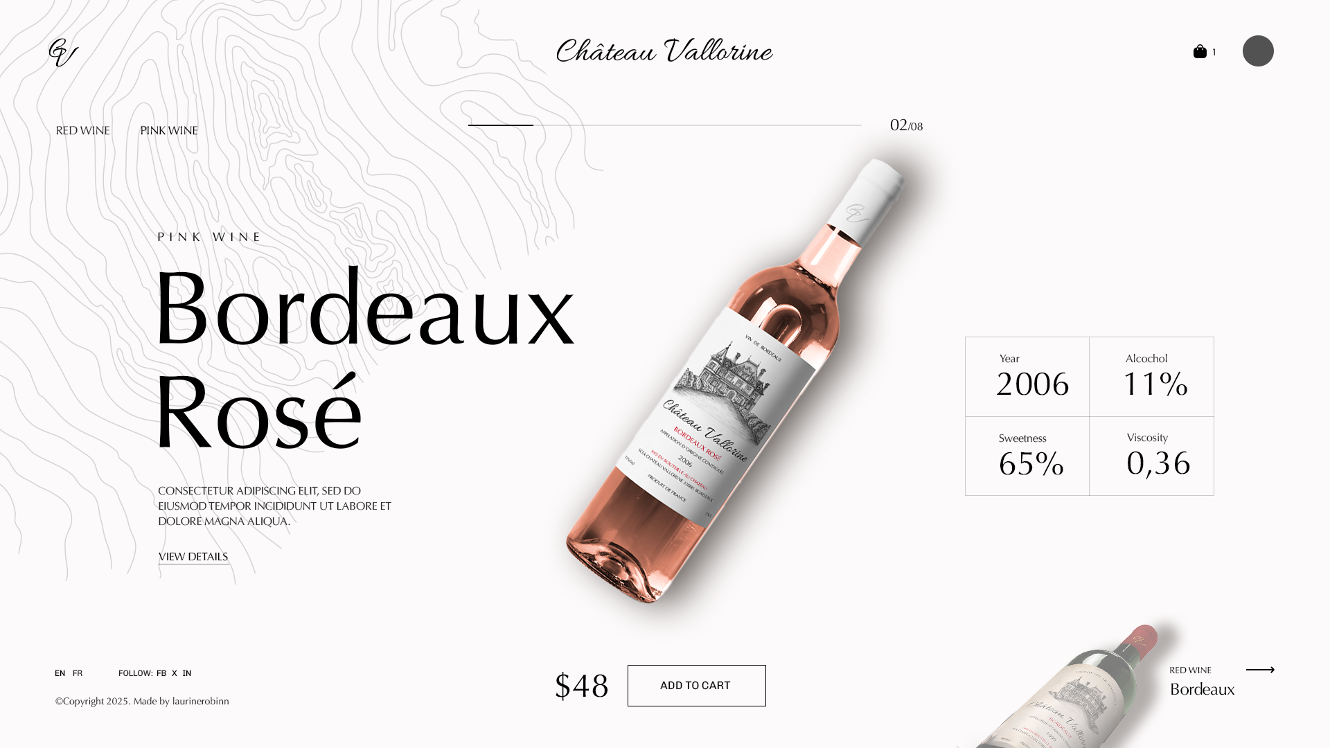
Started with research on Château Vallorine’s heritage: its historic building, vineyard landscape, and winemaking traditions. Collaborated with artist NINALY to create detailed, fine-line illustrations of the estate’s architecture and surrounding vines. Developed a dual color system: deep burgundy or rich red for the red wine labels, soft blush or pale pink for the rosé both grounded in earthy neutrals (cream, taupe, charcoal). Selected a classic serif typography for the brand name and vintage, paired with a clean sans-serif for regulatory text to maintain legibility. Designed label layouts with ample white space to let NINALY’s illustrations breathe. Added subtle embossing or foil accents (gold or copper) for a premium, tactile finish. Extended the identity to packaging: rigid boxes, tissue paper, and maybe a branded wooden crate for gift sets. Tested the labels on bottles to ensure the illustrations remained visible and striking at actual size. Delivered a wine identity where every bottle tells the story of Château Vallorine through art and every sip feels like a toast to tradition, simplicity, and sophistication.