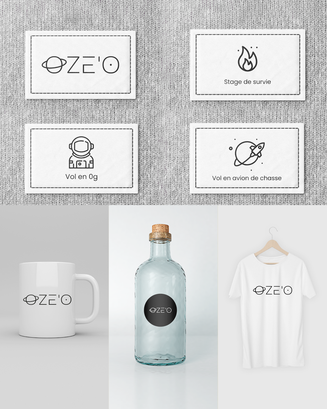
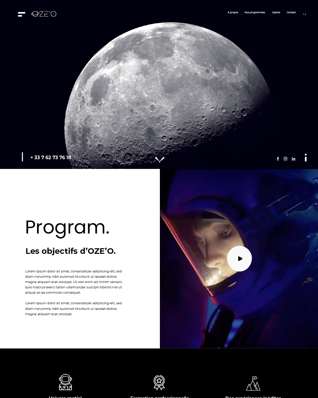
Created a brand identity for Oze’o, a space training experience that helps companies develop stress management, team cohesion, and leadership through astronaut-inspired immersion. The visual universe is clean, black & white, built on geometric layouts professional, timeless, and just bold enough.
Client
OZE’O
Role
Art Director
Services
Visual Identity
Challenges
& Objectives
/ Project Overview
Oze’o offers immersive astronaut training to address corporate HR challenges: communication, conflict resolution, and pushing limits. I designed a complete visual identity that reflects the duality of space and human growth. The result is a stark, minimalist graphic world where black and white create energy and clarity made to last as the brand evolves.
/ Challenges
Translating the intensity of space training into a simple, elegant visual language. Balancing professionalism (for HR buyers) with a sense of adventure and wonder (for participants). Making sure the identity works across both corporate decks and immersive event materials.
/ Objectives
Create an identity that says “out of comfort zone” without shouting. Use geometry and contrast to build a timeless, scalable system. Embed key themes space, astronauts, training, experience into every detail, from the logo to layout.
Creative
Process
Started with keywords: space, formation, astronaut, expérience, aventure. Explored geometric grids and high-contrast monochrome palettes. Designed a logo that bridges professional training and space exploration. Refined layouts for clarity and dynamism. Delivered a complete graphic universe that will grow with Oze’o’s future needs.