Here we go for a project as soft as a mochi! Imagine cute candles with a soft, silky mochi-like texture, ready to brighten your interiors. Each candle is handcrafted with love to offer you a unique, decorative, and enchanting object you’ll want to bite into. Discover this new visual identity for these little luminous treats.
Client
Personal Project – Coming Soon
Role
Art Director, Graphic Designer
Services
Branding, Prototyping
The brand Bougimochi is a concept inspired by traditional Japanese iconography and mochi pastry. These candles irresistibly evoke the soft, chewy texture of mochi, built around a cute, sweet visual universe filled with softness and joy. The brand image is gentle, playful, and warm. The visual identity highlights pastel pink and green tones, combined with floral and natural details, to create a soothing and comforting world. The rounded, soft shapes of the logo and illustrations reinforce the sweet and cute aspect of the candles. The logo is a minimalist drawing of a mochi-shaped candle. Pink and green tones intertwine to form a recognizable and warm icon. The packaging features the logo prominently, adorned with floral motifs or pastel-toned illustrations. The natural and artisanal feel is enhanced by matte finishes and soft color blocks. The brand’s goal and message is that mochi candles offer a moment of softness and indulgence through scent. They evoke the feeling of biting into a soft, sweet pastry with a creamy, comforting texture. Each candle is handmade with love to bring a soft light and cozy atmosphere to the home. In short, Bougimochi’s visual identity is soft, playful, and warm. Mochi candles invite you to relax and surrender to moments of sweetness and tranquility.
Translating the texture and taste of mochi (soft, chewy, sweet) into a visual and olfactory candle experience. Using pastel pink and green without looking too childish or generic. Balancing cuteness (kawaii) with sophistication enough for adult interiors. Making handmade candles feel artisanal but not rustic. Ensuring the packaging reflects the softness of the product while protecting it.
Design a minimalist logo featuring a mochi-shaped candle with intertwined pink and green tones. Create a pastel color palette (soft pinks, mint or sage greens) with floral and natural accents. Develop packaging with matte finishes, soft color blocks, and floral or mochi illustrations. Build a brand identity that feels gentle, playful, and warm. Convey the sensory message: a candle that smells like biting into a sweet, creamy pastry. Position Bougimochi as a source of cozy, comforting light and quiet moments.
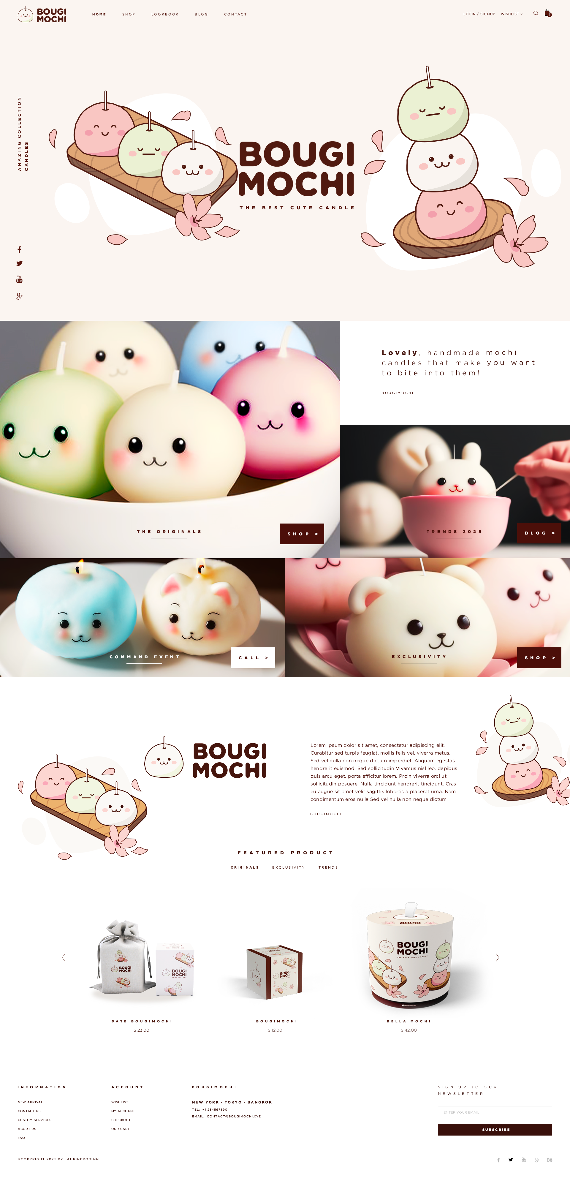
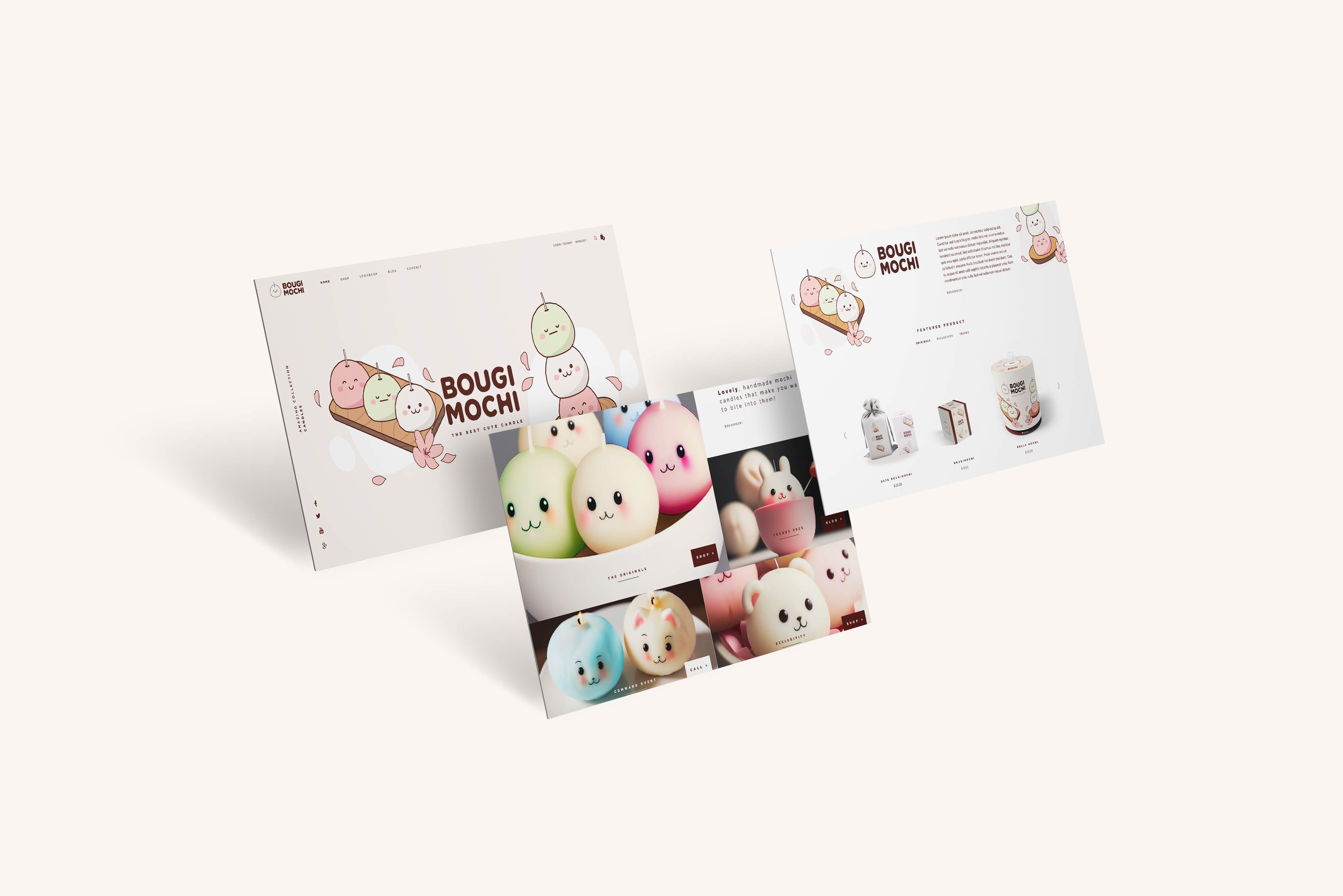
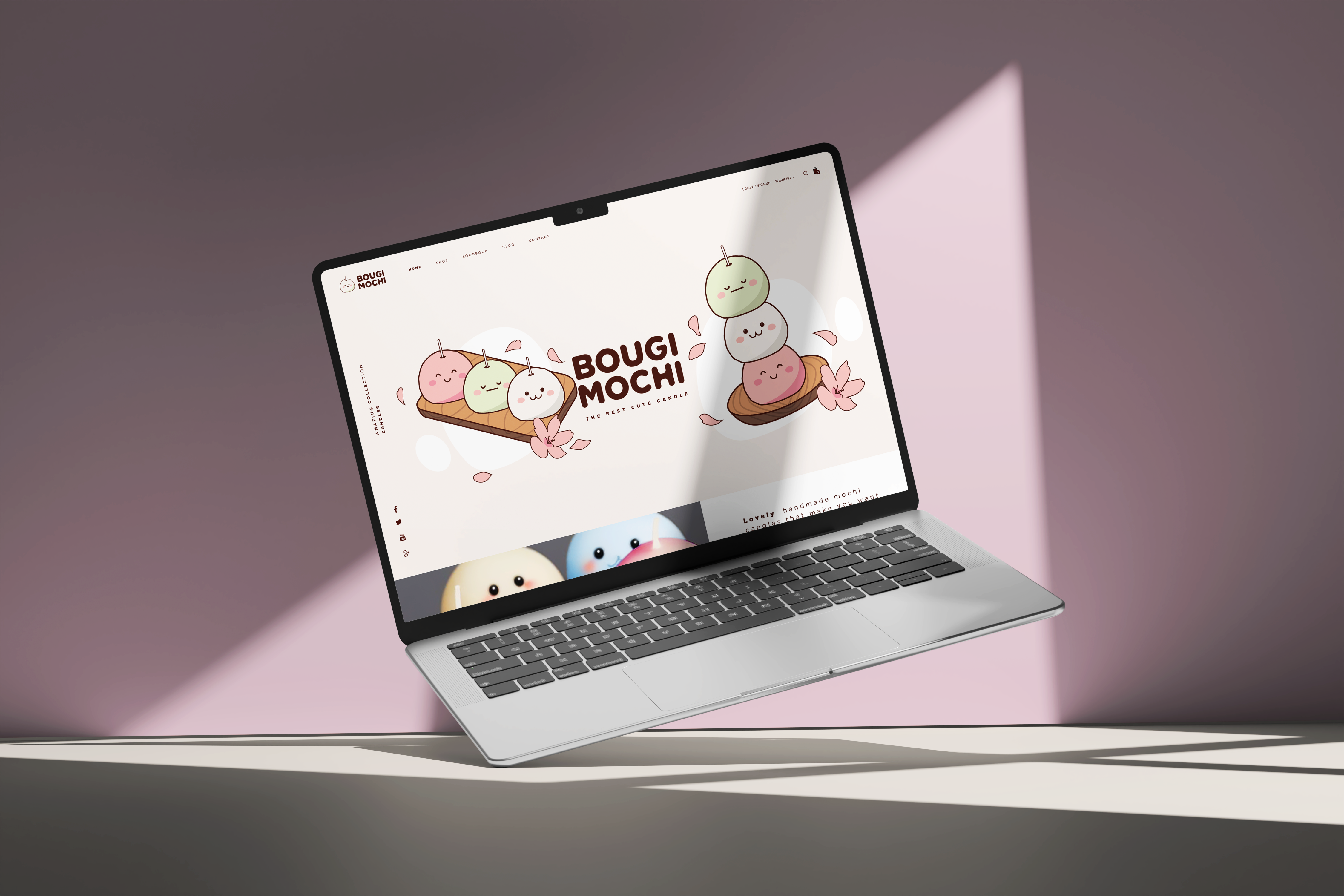
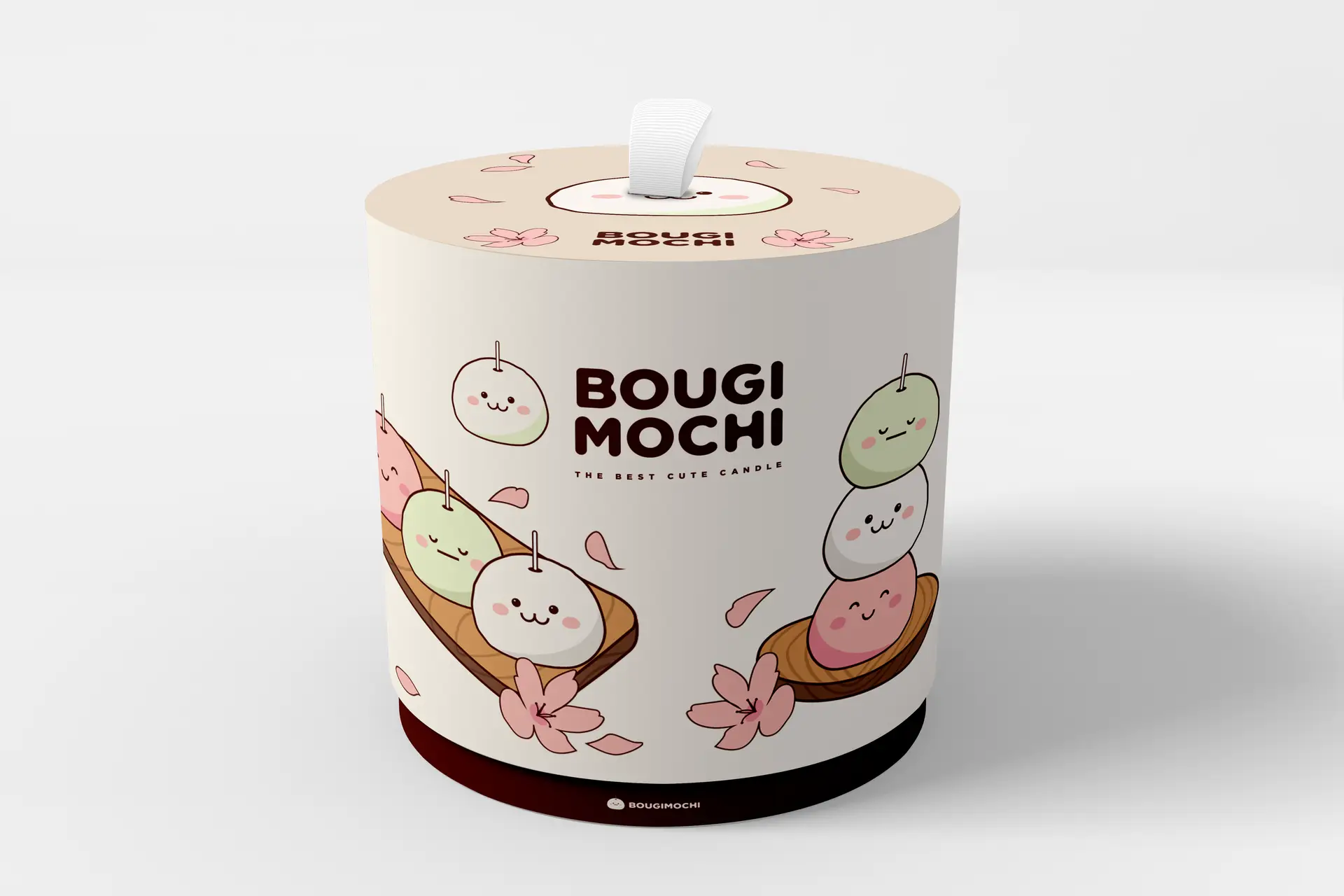
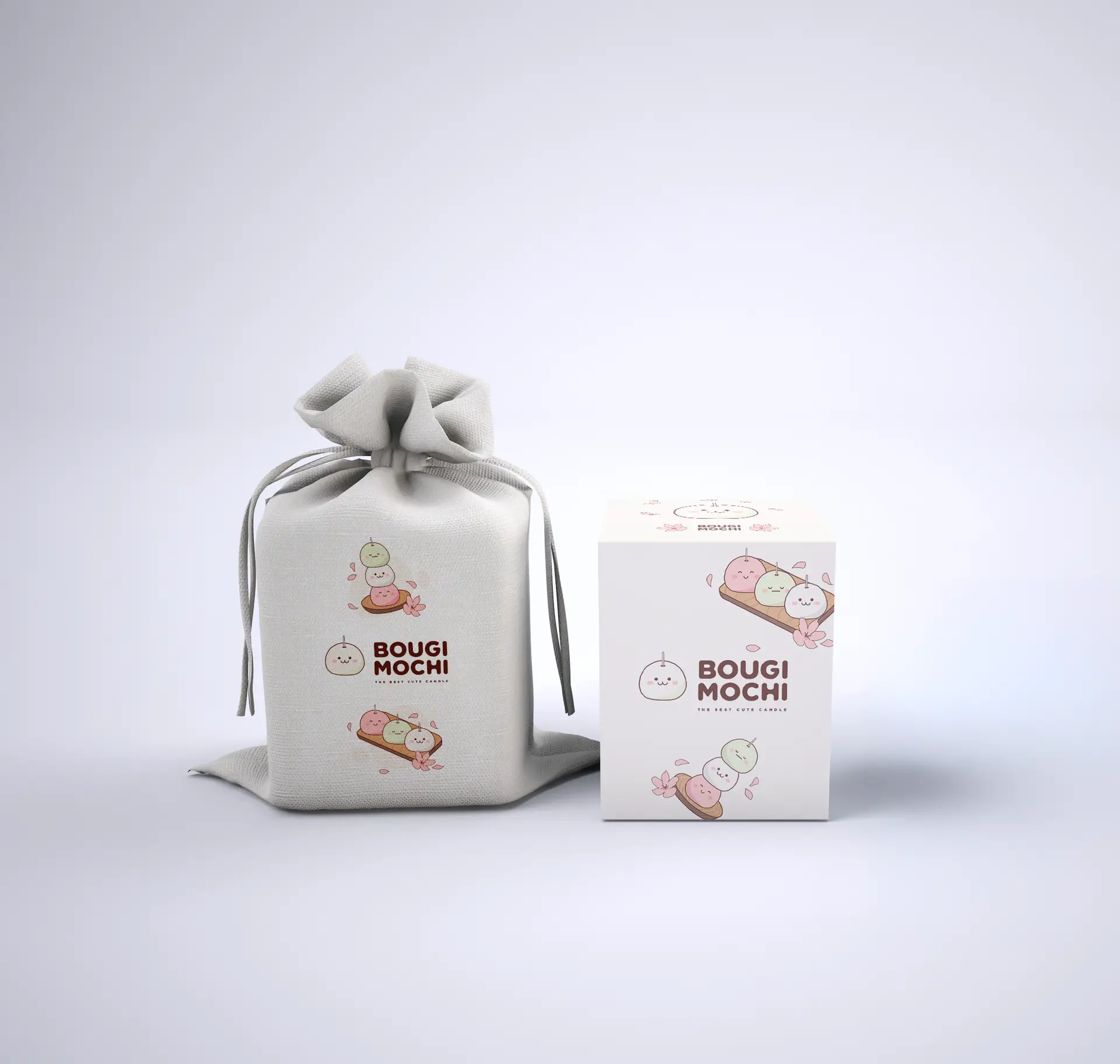
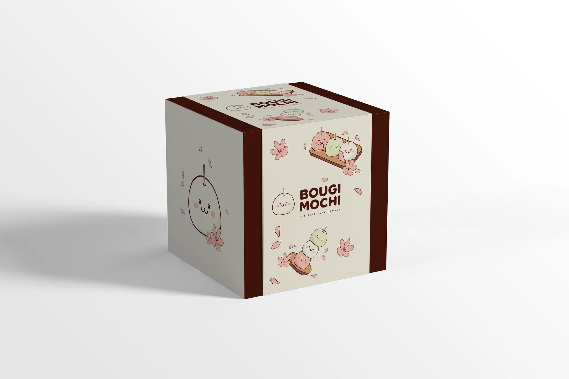
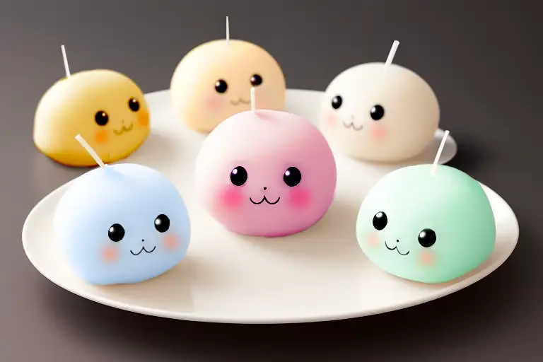
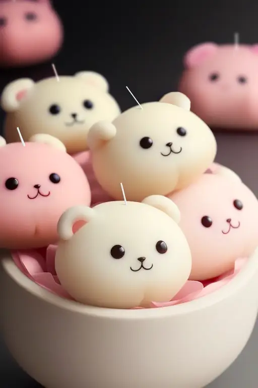
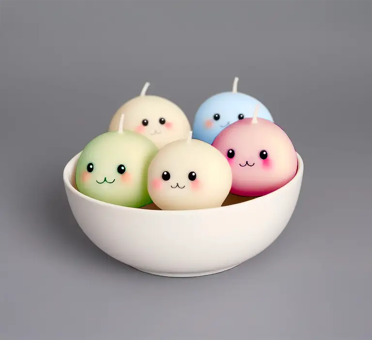
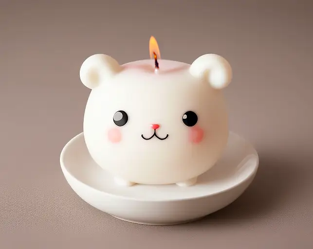
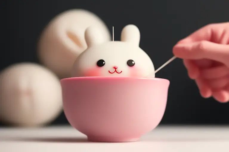
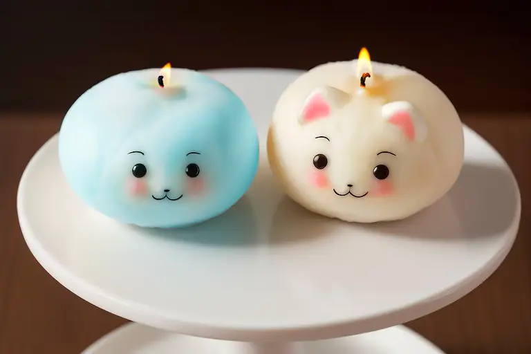
Started with research on traditional Japanese mochi aesthetics (soft curves, rounded forms, pastel colors in wagashi). Also studied kawaii culture and minimalist candle branding. Sketched multiple logo concepts of a mochi-shaped candle, eventually landing on a simple icon where a soft rounded form (mochi) has a tiny flame or wick, using pink and green in harmony. Chose a pastel palette: blush pink, soft rose, matcha green, and cream white. Selected a rounded, friendly sans-serif typography for the brand name, paired with a handwritten-style font for accents. Designed packaging: matte-finish boxes with a central logo, surrounded by delicate floral or mochi texture patterns. Added small illustrations of mochi pastries or cherry blossoms in pastel tones. Created labels for the candles themselves with minimal information to keep the focus on the candle’s shape and texture. Developed a brand voice that is warm, playful, and inviting — using words like “sweet,” “soft,” “cozy,” “bite,” “cuddle.” Applied the identity to a website mockup, social media templates, and a catalog. Delivered a brand where every Bougimochi candle looks good enough to eat, smells like a sweet treat, and turns any room into a cozy, gentle haven.