La Calinésie has launched a call for projects for the design of its universe and visual identity. La Calinésie is the intercommunal aquatic center of the Libournais region, located in Libourne on the shores of Lake Dagueys, open every day. An exemplary aquatic center in terms of ecological performance.
Client
La Calinésie
Role
Art Director
Services
Branding, Prototyping
La Calinésie is a public aquatic center that prioritizes both family-friendly recreation and environmental responsibility. The visual identity needed to reflect the center’s dual mission: professionalism (safety, cleanliness, management) and playfulness (fun, warmth, community). The chosen design features a blue and white universe with a logo composed of two whales forming a circle, using a gradient from dark to light blue. This logo symbolizes harmony, protection (whales as guardians of the water), and the circular flow of water. The overall identity balances ecological commitment with a welcoming, aquatic atmosphere.
Combining professionalism (public facility, safety standards) with playfulness (family fun, children’s activities). Using a whale motif without feeling too childish or too generic. Creating a gradient logo that reproduces well across various media (signage, swim caps, tickets, website). Ensuring the identity reflects ecological performance (water conservation, energy efficiency) without being didactic or heavy.
Design a blue and white color palette that feels fresh, aquatic, and clean. Create a logo featuring two whales forming a circle with a dark-to-light blue gradient. Develop a visual identity that works for both professional audiences (municipal partners, staff) and families (children, casual swimmers). Produce a complete branding package including the logo, mockups, and at least one standalone item (e.g., a swim cap, towel, or entrance ticket). Position La Calinésie as an exemplary ecological aquatic center that is also warm and inviting.
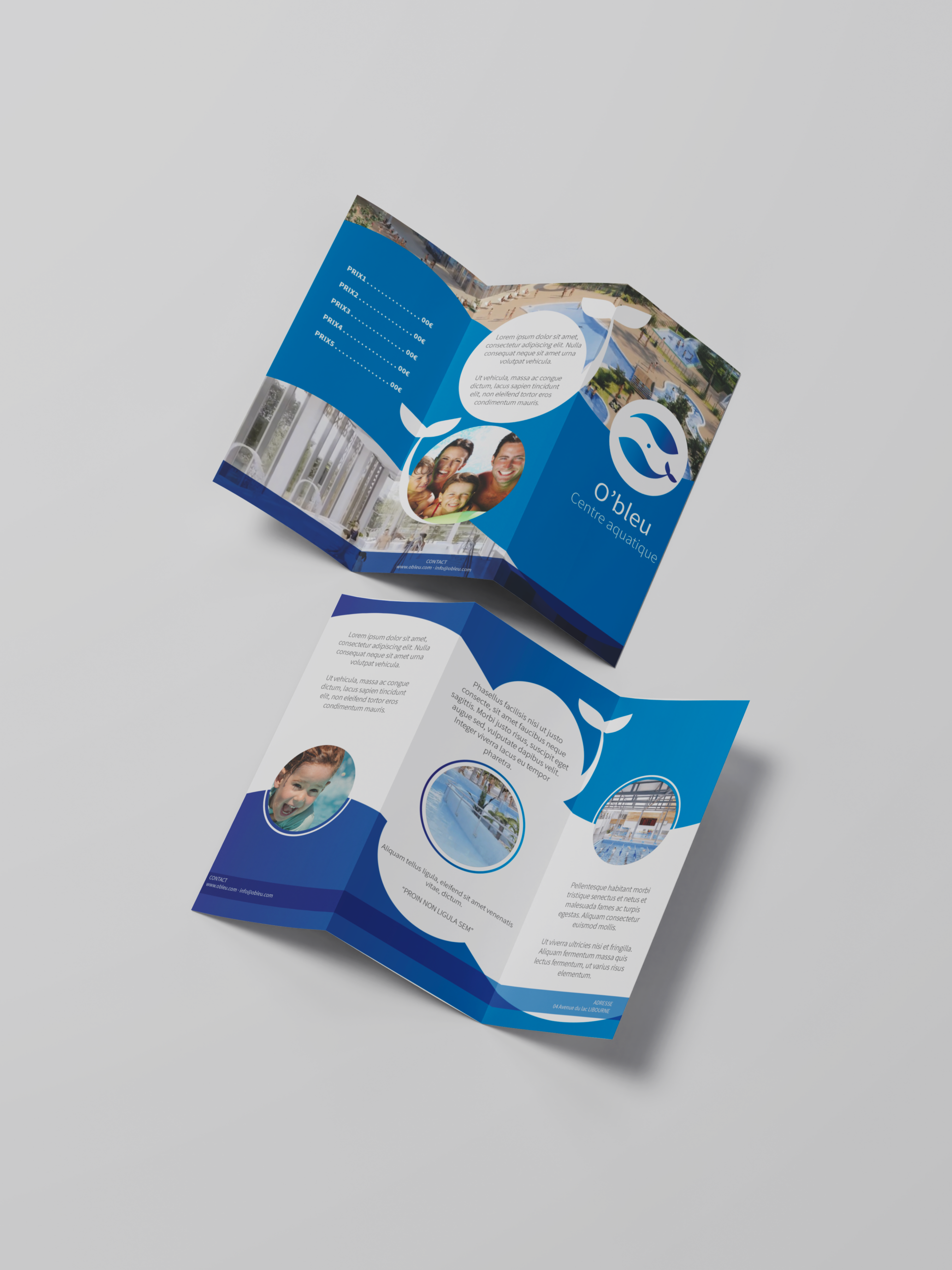
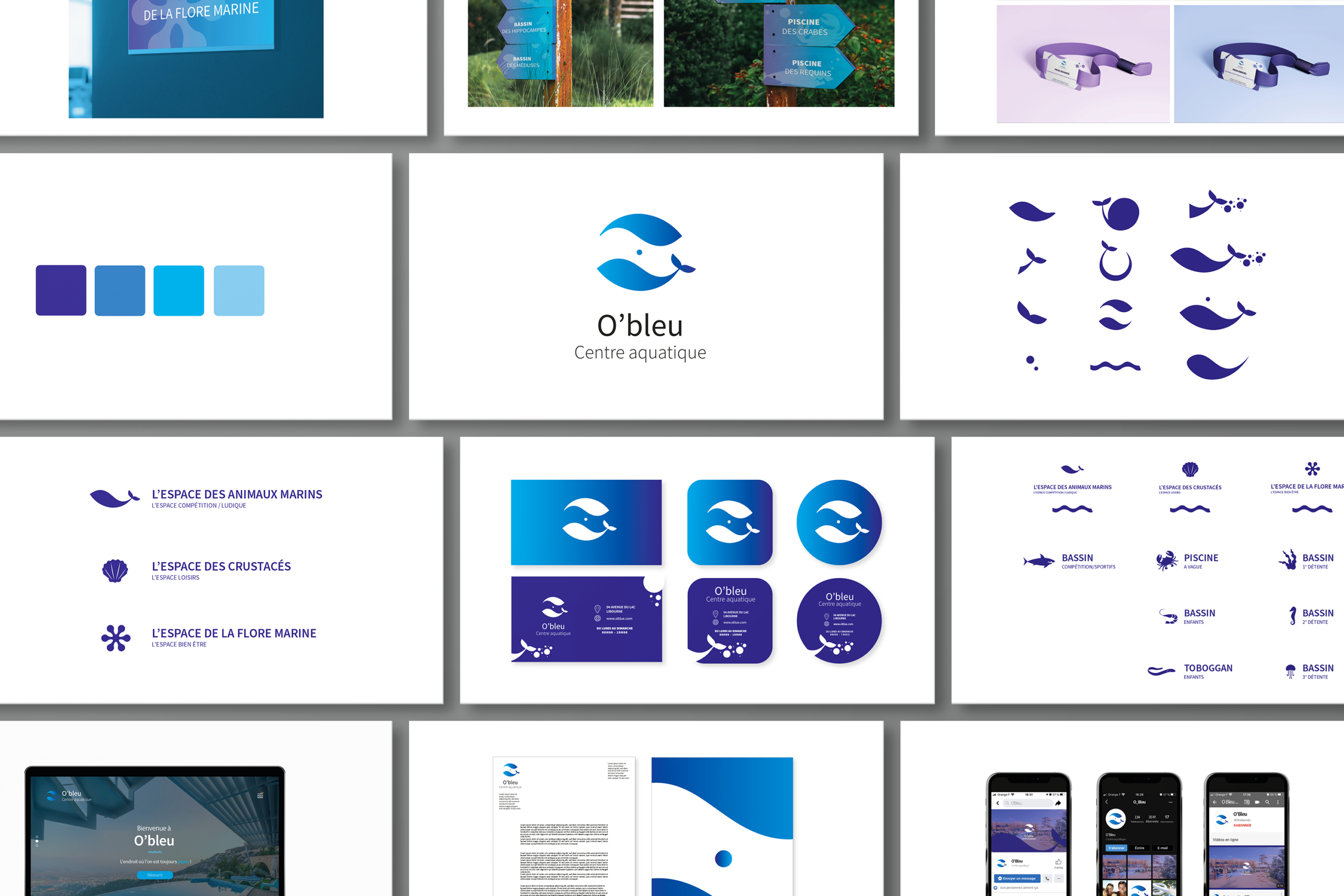
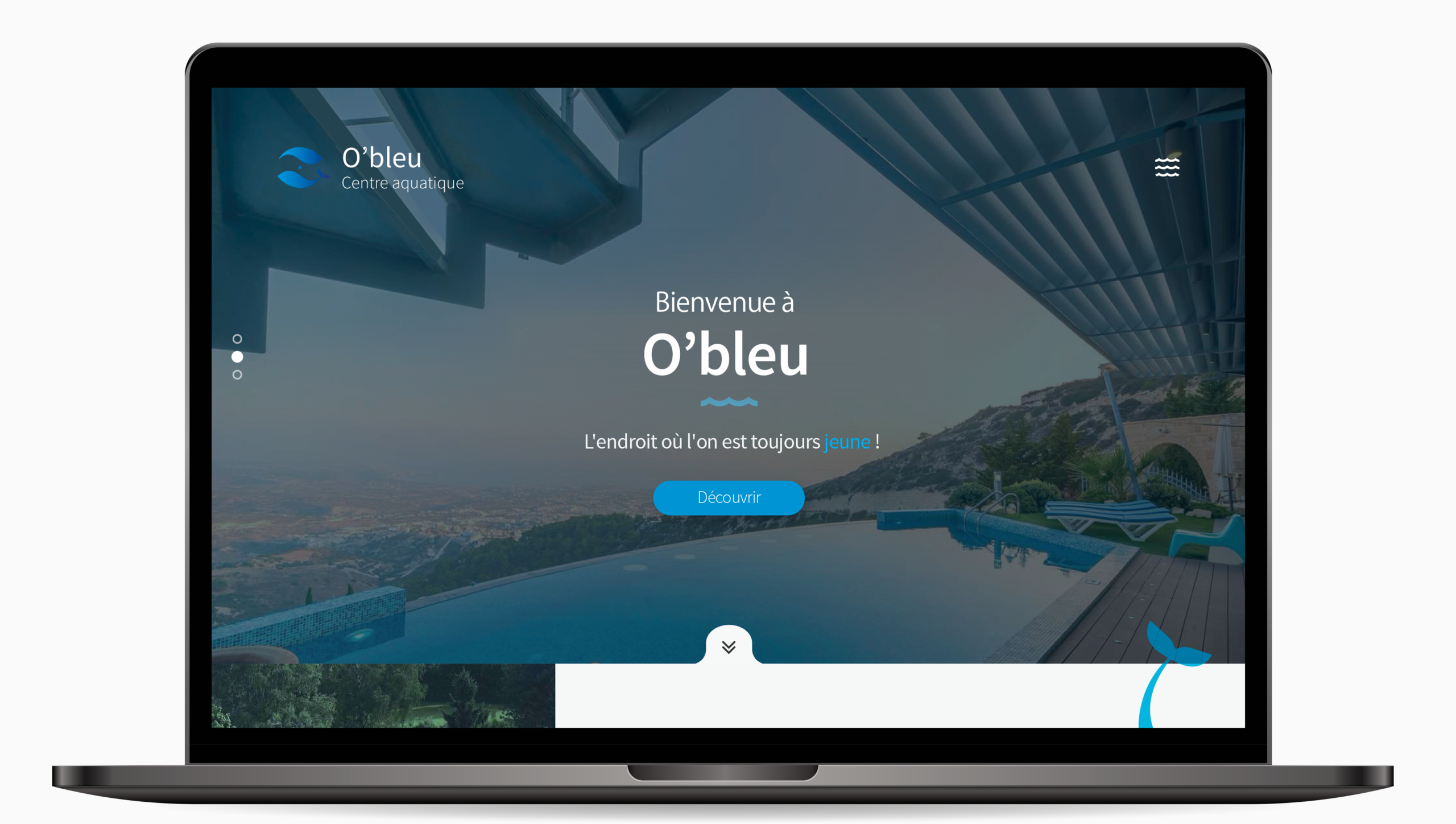
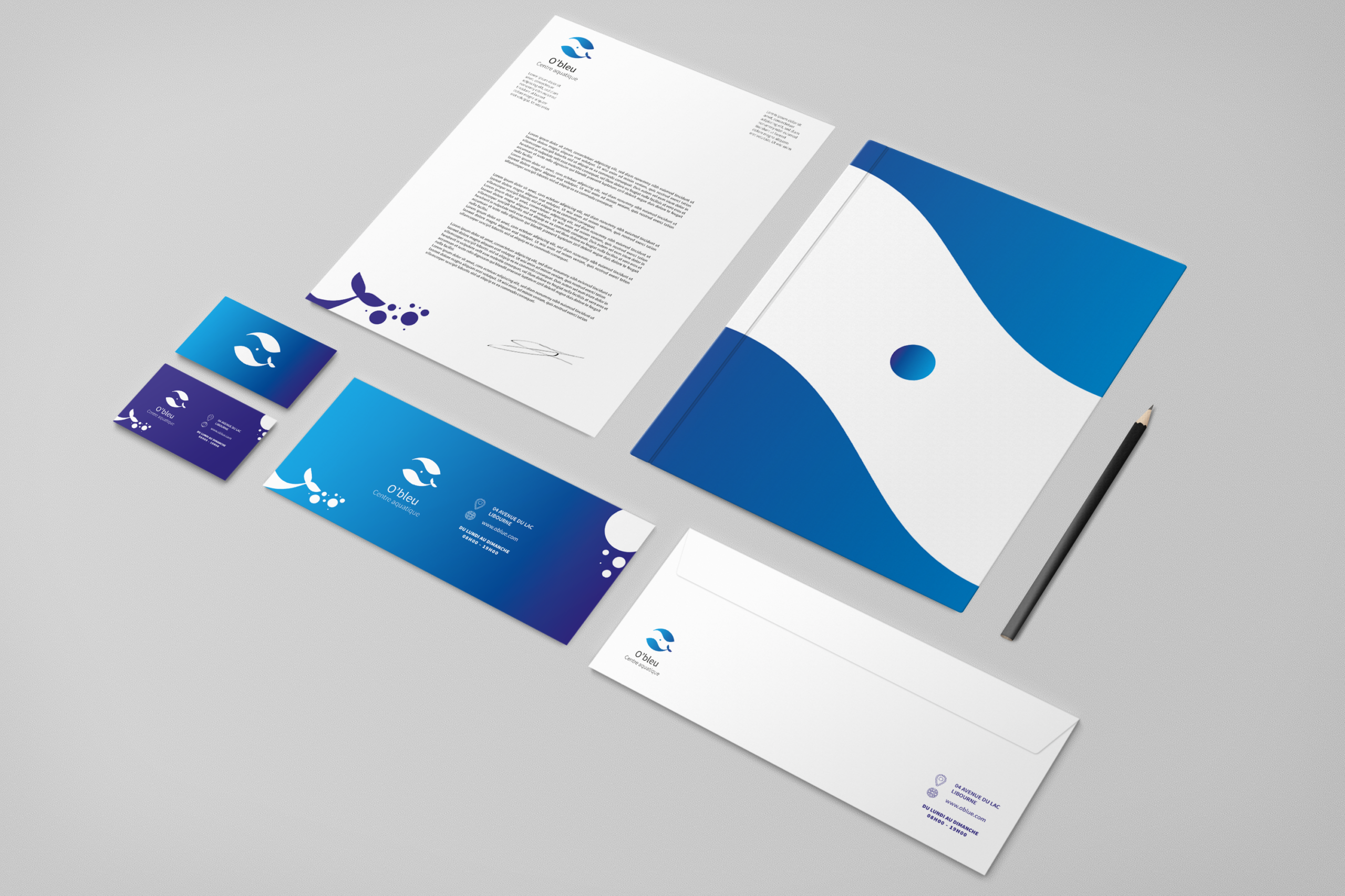
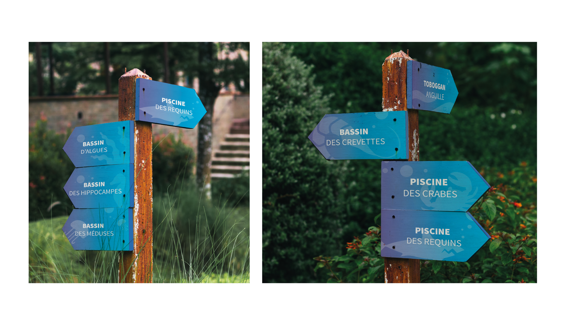
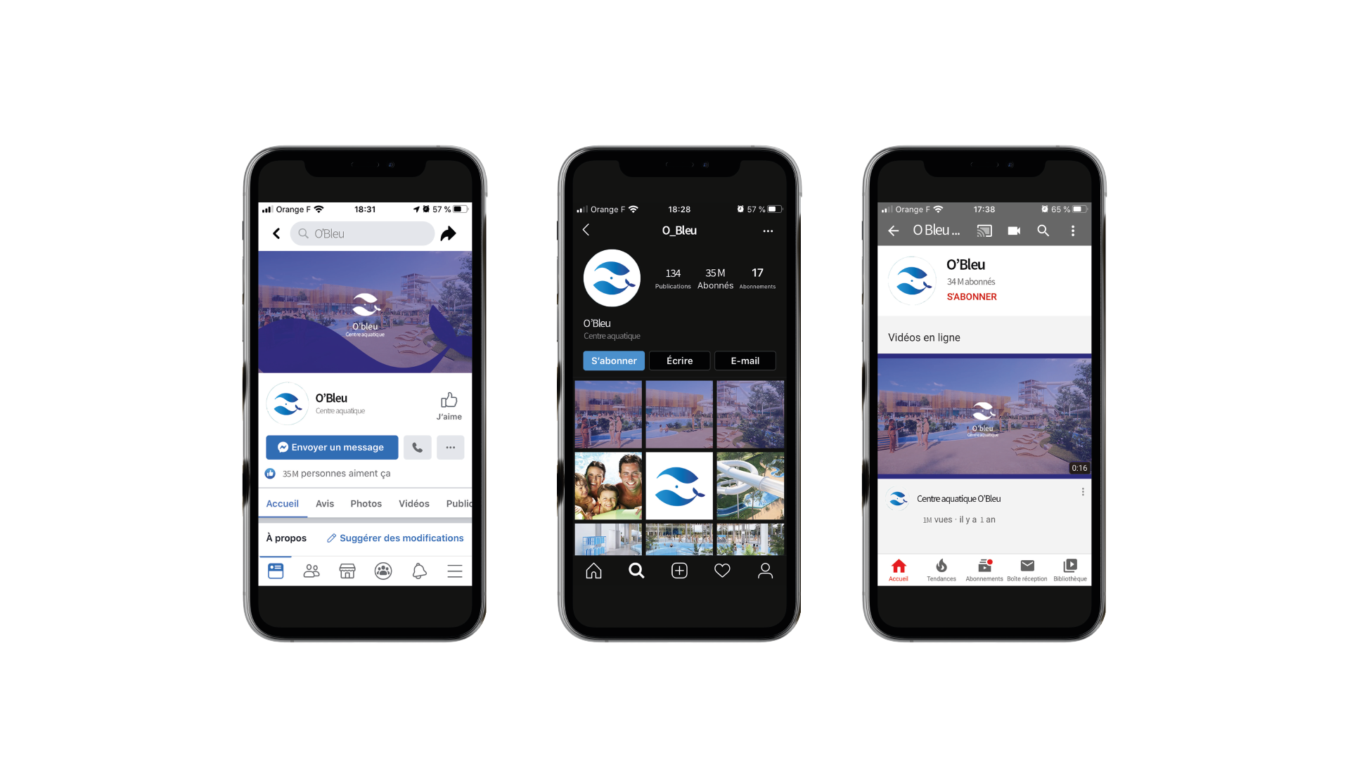
We began with research into the identity of aquatic centers: typically blue, water patterns, waves, safety symbols. We also studied ecological certifications and nature-inspired design. We chose the whale as a central symbol: whales represent grace, ocean protection, and family bonds (mother and calf). We developed the concept of two whales swimming in a circle, creating a yin-yang or infinity shape, with a gradient from deep navy blue to soft sky blue. We selected a complementary palette: pure white, with accents of blue. We created mockups for signage (entrance, pool rules, directional signs), staff uniforms (polo shirt with embroidered logo), stationery, and the website. We chose a sans-serif typography that is both friendly and professional for all communications. We produced the single item (at the client’s request): for example, a reusable swim bag made from recycled materials, prominently featuring the whale logo. We tested the identity with families and municipal stakeholders. We delivered a visual identity for La Calinésie where two whales swim in perfect harmony professional enough for a public service, playful enough for a day at the pool, and always reminding visitors of the beauty and fragility of water. As La Calinésie evolved, ultimately another identity was created.