SEA2C called on our team to create its visual identity, choosing the Visual Identity Pack and the Mockup Pack. SEA2C specializes in electrical heating and air conditioning systems, based in Gironde, offering installation, repair, and maintenance services. Trust SEA2C for efficient, quality solutions in air conditioning and heating.

Client

SEA2C

Role

Art Director

Services

Branding, Prototyping

Challenges & Objectives

/ Project Overview

SEA2C is a local expert in HVAC (heating, ventilation, air conditioning) and electrical systems. The visual identity needed to represent three core elements: heat, cold, and electricity all within an artisanal yet professional universe. The chosen color palette transitions from orange (heat) to blue (cold), symbolizing the brand’s ability to manage both extremes. The identity balances craftsmanship (trustworthy, hands-on, local) with professionalism (reliable, efficient, technical expertise).

/ Challenges

Translating three abstract concepts (heat, cold, electricity) into a single, cohesive visual identity. Using orange and blue together without creating visual conflict or looking like a sports team. Avoiding a generic “HVAC” look (too many flame-and-snowflake logos exist). Conveying both artisanal (small business, personal touch) and professional (certified, high-quality) aspects.

/ Objectives

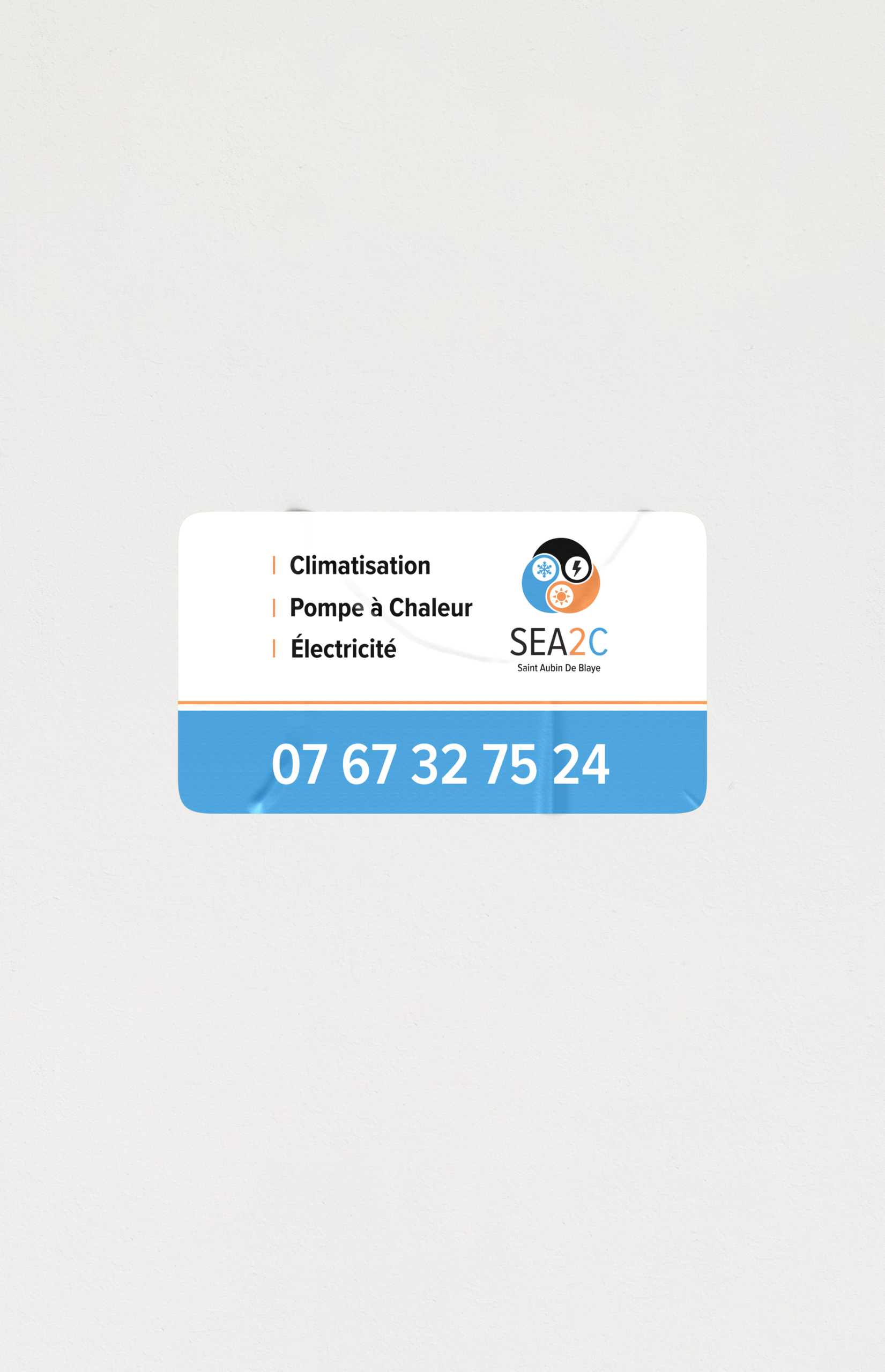
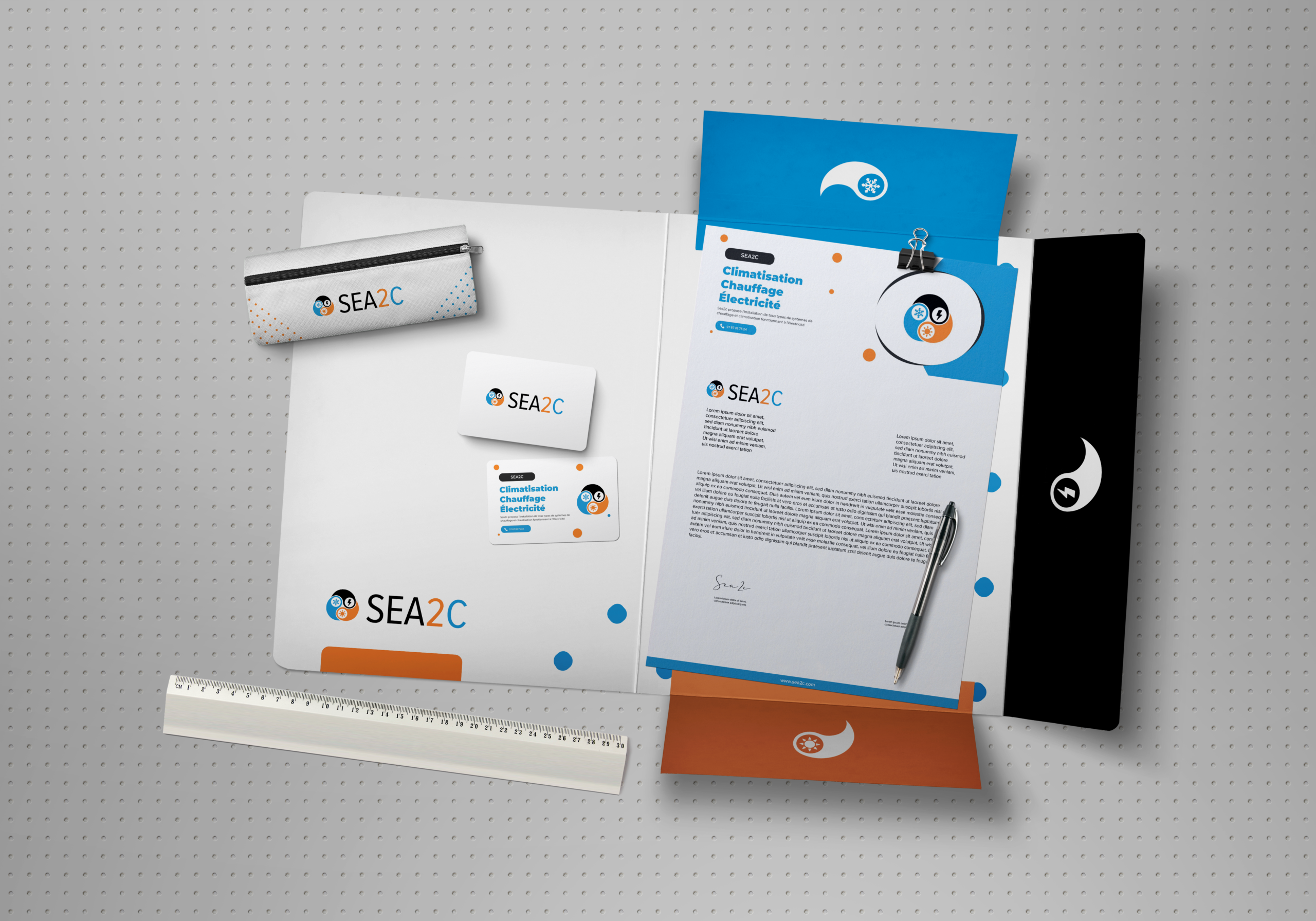
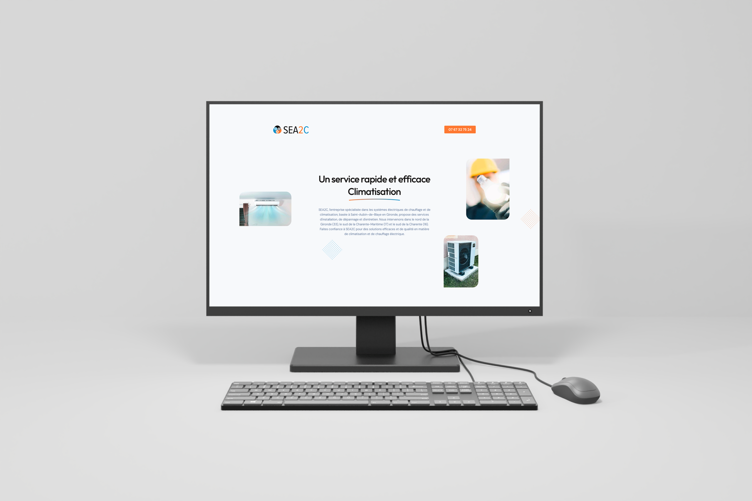
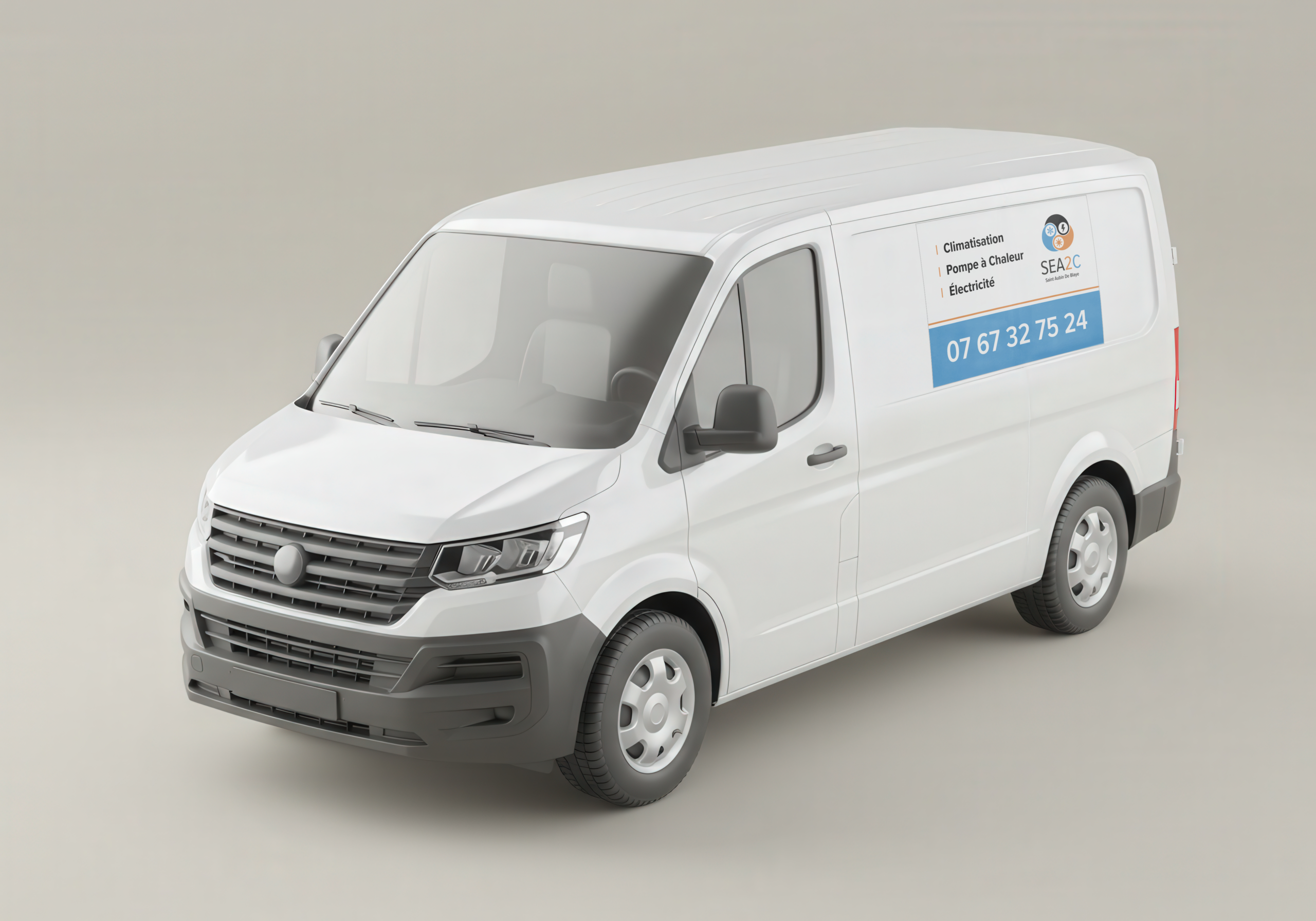
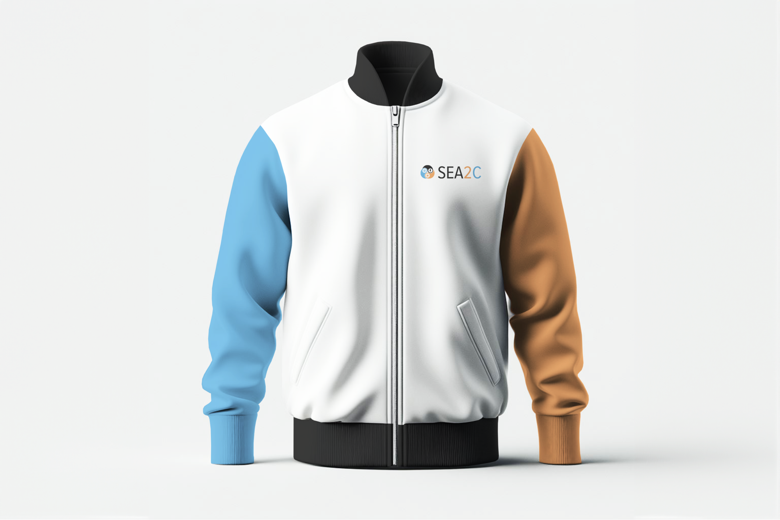
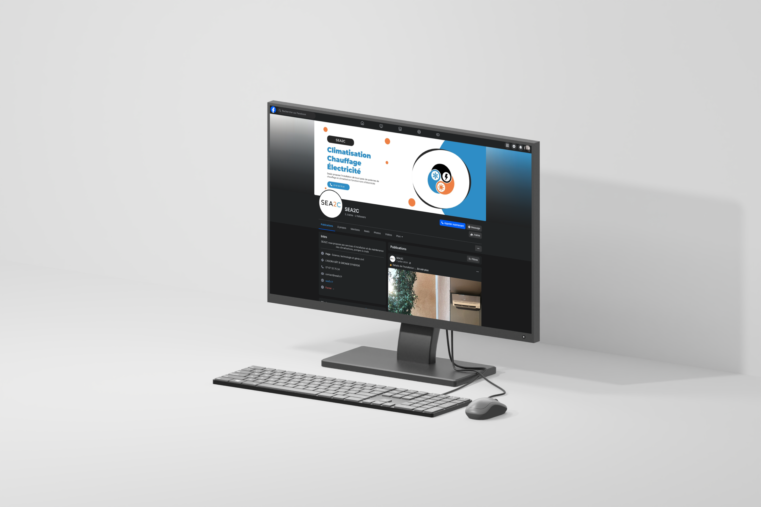
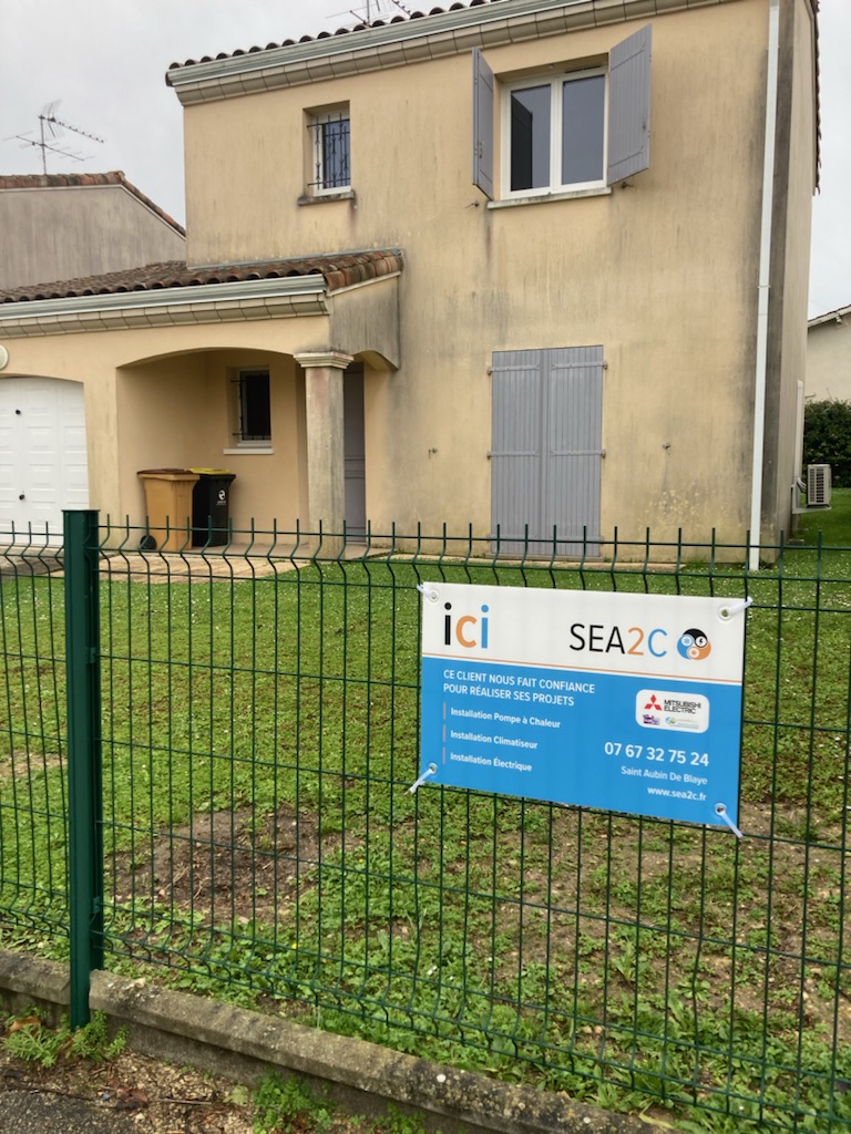
Design a color palette that smoothly transitions from orange (warmth) to blue (cold), with possible neutral or electric accents (gray, white, or a bright electric yellow/cyan). Create a logo that symbolizes the union of heating, cooling, and electricity perhaps an abstract shape combining a flame, a snowflake, and a lightning bolt. Develop a visual identity that feels both local/artisanal (Gironde roots) and technically professional. Produce a complete branding package including logo, mockups (business cards, vehicle signage, uniforms, website). Position SEA2C as the trusted local expert for all heating and cooling electrical needs.

Creative
Process

Started with research on HVAC industry branding: common motifs include thermometers, vents, flames, snowflakes, and wrenches. Looked for ways to avoid clichés. Chose a gradient from warm orange to cool blue as the core visual device representing the range of temperatures SEA2C handles. Added a neutral gray or white for text and backgrounds to keep the design professional. Sketched logo concepts: a stylized electrical plug combined with a flame on one side and a snowflake on the other; or an abstract circular symbol where orange and blue swirl together, with a lightning bolt shape cutting through. Selected a clean, modern sans-serif typography to convey technical reliability. Designed mockups: a van wrap with the orange-blue gradient swoosh and logo, technician uniforms with embroidered logos, a business card with gradient accents, a website header showing the transition from warm to cool. Ensured the artisanal feel came through via subtle textures (like a slight grain) or handwritten-style taglines (“Local experts. Complete comfort.”). Tested the identity with potential customers to ensure it reads as trustworthy and skilled. Delivered a brand for SEA2C where heat and cold meet electricity in perfect balance, from orange to blue.

Social Media

  • Design & Branding
  • Ticker Image
  • Logo Design
  • Ticker Image
  • Prototyping
  • Ticker Image
  • Design & Branding
  • Ticker Image
  • Logo Design
  • Ticker Image
  • Prototyping
  • Ticker Image

©2026 Laurine Robinn, All Rights Reserved.

en_USEN_US