Embrace the unexpected fusion of flavors and colors in our unique visual identity for candy carbonara pasta. Let your memories flow with every bite, as we redefine traditional tastes with a touch of modernity. Be seduced by the art of culinary innovation and savor the sweetness of contrasting candies.
Client
What If: Collection
Role
Art Director
Services
Branding, Design
The visual identity for this pasta and candy carbonara brand artfully blends the essence of Italian cuisine with the playful character of childhood nostalgia. The color palette includes warm, welcoming tones such as creamy yellows and light browns reminiscent of cooked pasta, combined with playful hues like soft pinks and mint greens to evoke the sweet taste of candy. The logo uses a typeface that represents both pasta and candy, conveying warmth and authenticity. The overall visual identity is composed of a mix of flavors and memories, reinforcing the brand’s theme. This identity aims to create a delicious experience that appeals to both taste buds and the heart, inviting consumers into a world where savory and sweet coexist harmoniously.
Merging two opposing culinary worlds (savory pasta carbonara and sweet candy) into a single coherent visual identity. Avoiding a design that feels either too childish or too serious. Making the unexpected combination feel delightful and intentional, not confusing or unappetizing. Balancing Italian culinary heritage (warmth, tradition) with playful nostalgia (bright colors, fun shapes).
Create a warm and playful color palette that references both cooked pasta (creamy yellow, light brown) and candy (soft pink, mint green). Design a custom logo using a typeface that visually blends pasta shapes and candy forms. Build a brand identity that evokes childhood memories and culinary adventure. Invite consumers to embrace the savory-sweet contrast with curiosity and joy.
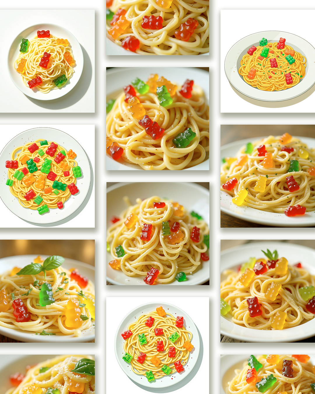
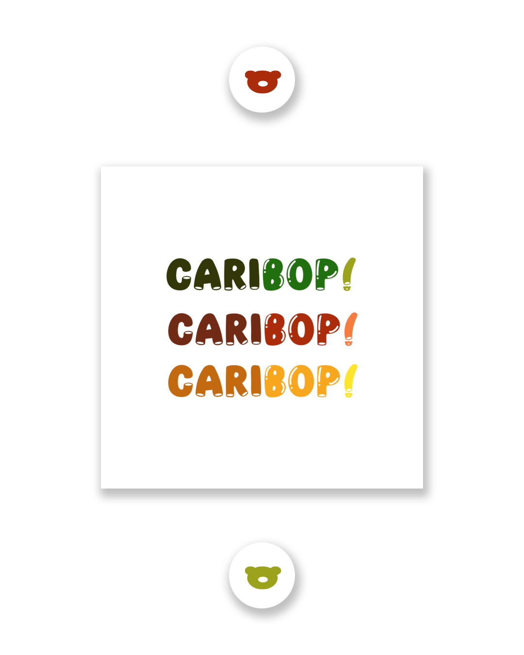
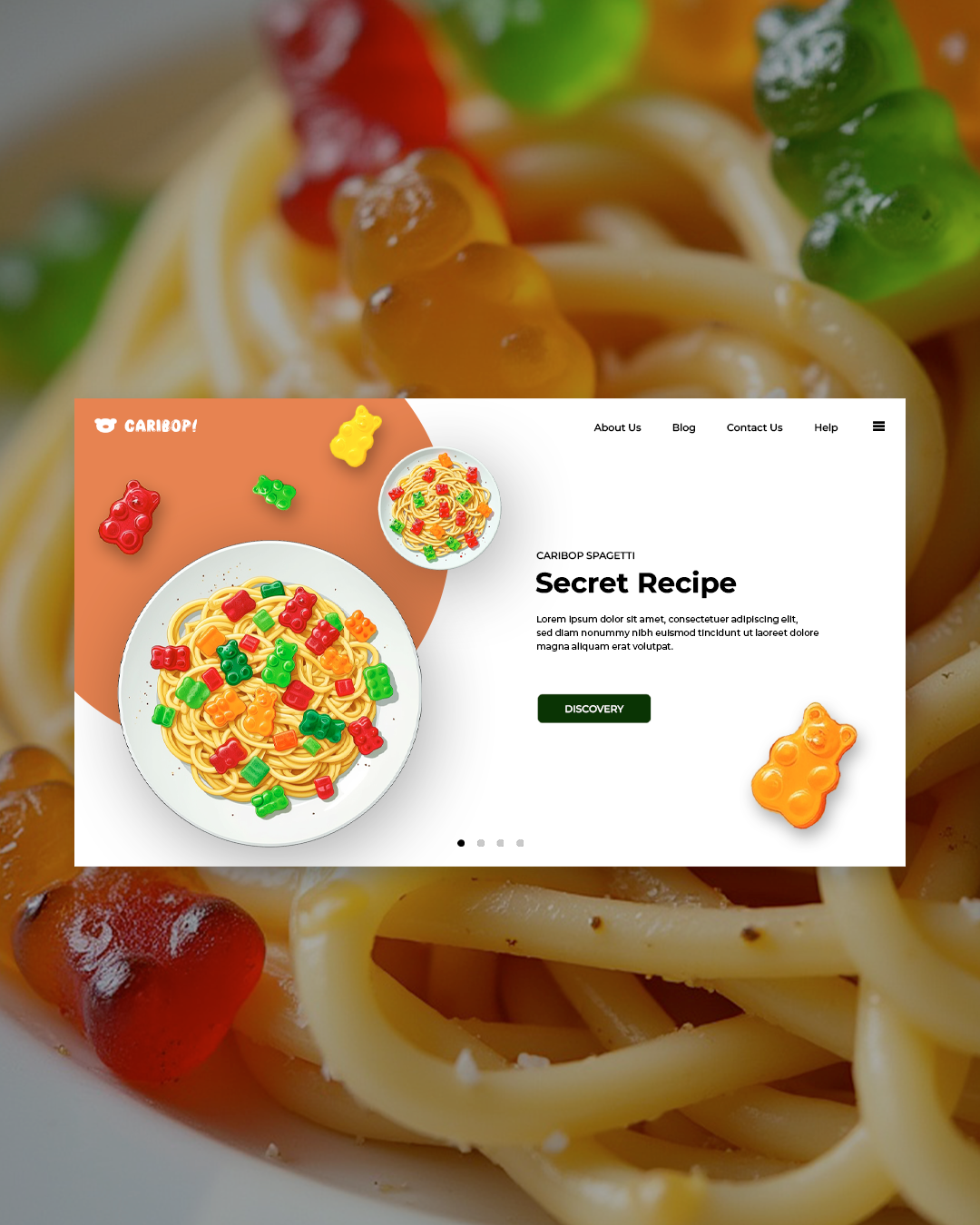
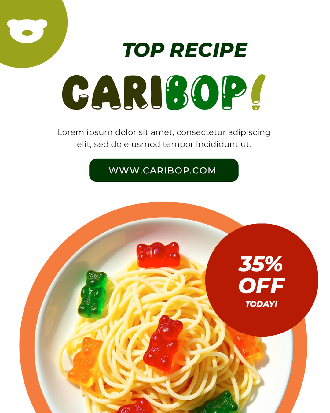
Started with the core concept: unexpected fusion, nostalgia, and contrast. Researched Italian pasta branding (warm, rustic, authentic) and candy branding (bright, fun, whimsical). Developed a hybrid color palette: creamy yellows and light browns for pasta warmth, soft pinks and mint greens for candy playfulness. Sketched logo concepts combining pasta ribbon shapes with candy swirls or dotted textures. Selected a rounded, friendly serif or script typeface that feels both homemade and sweet. Created pattern designs alternating pasta-like curves and candy-like dots. Tested the identity on packaging, social media, and in-store displays. Delivered a visual world where savory pasta and sweet candy live together happily, inviting consumers to take a bite and remember.