IKCC has combined expertise and passion since 2009 to fight kidney cancer. Born from a desire to help patients, IKCC embodies strong values such as professionalism, collaboration, and transparency, with a supportive, inspiring, and informative tone. The International Kidney Cancer Coalition (IKCC) is a global organization dedicated to fighting kidney cancer by supporting patients, raising awareness, and advocating for improved research, treatment, and policy.
Client
International Kidney Cancer Coalition
Role
Art Director, Graphic Designer
Services
Branding, Prototyping
IKCC strives to provide resources and foster a community for those affected by kidney cancer, emphasizing shared experiences and collective support. The organization’s visual identity must symbolize its mission. Health association logos often have specific graphic codes, so IKCC’s identity must fit in while clearly representing its specialization through a kidney, or abstract symbols representing unity and support. The goal is to symbolize kidney cancer research and awareness, conveying commitment to kidney health, advocacy, and patient support. Kidney cancer remains largely unknown, leading to patient isolation. IKCC’s identity aims to counter that through visibility and compassion.
Creating a visual identity that fits health association graphic codes while remaining unique and memorable. Using abstract symbols (kidney, unity, support) without being too literal or clinical. Balancing seriousness (cancer) with hope, warmth, and inspiration. Selecting a color palette of five distinct colors (blue, pastel blue, green, pink, softened black) that work harmoniously across all media. Ensuring typography (Quicksand) conveys warmth, professionalism, comfort, dynamism, and trust.
Design a logo incorporating a kidney or abstract unity/support symbols. Develop a color palette: Indigo Dye blue (confidence, stability), Crystal pastel blue (innovation, progress), Light moss green (solidarity, serenity, empathy), American pink/peach (warmth, hope, life), Chinese black (seriousness, elegance, discretion). Use Quicksand typography for its friendly, rounded, modern sans-serif appearance. Create a brand identity that is professional, informative, inspiring, and empathetic accessible to a wide audience. Ensure the tone of communication is modern, relaxed, open, transparent, positive, and hopeful while handling sensitive topics with genuine compassion.
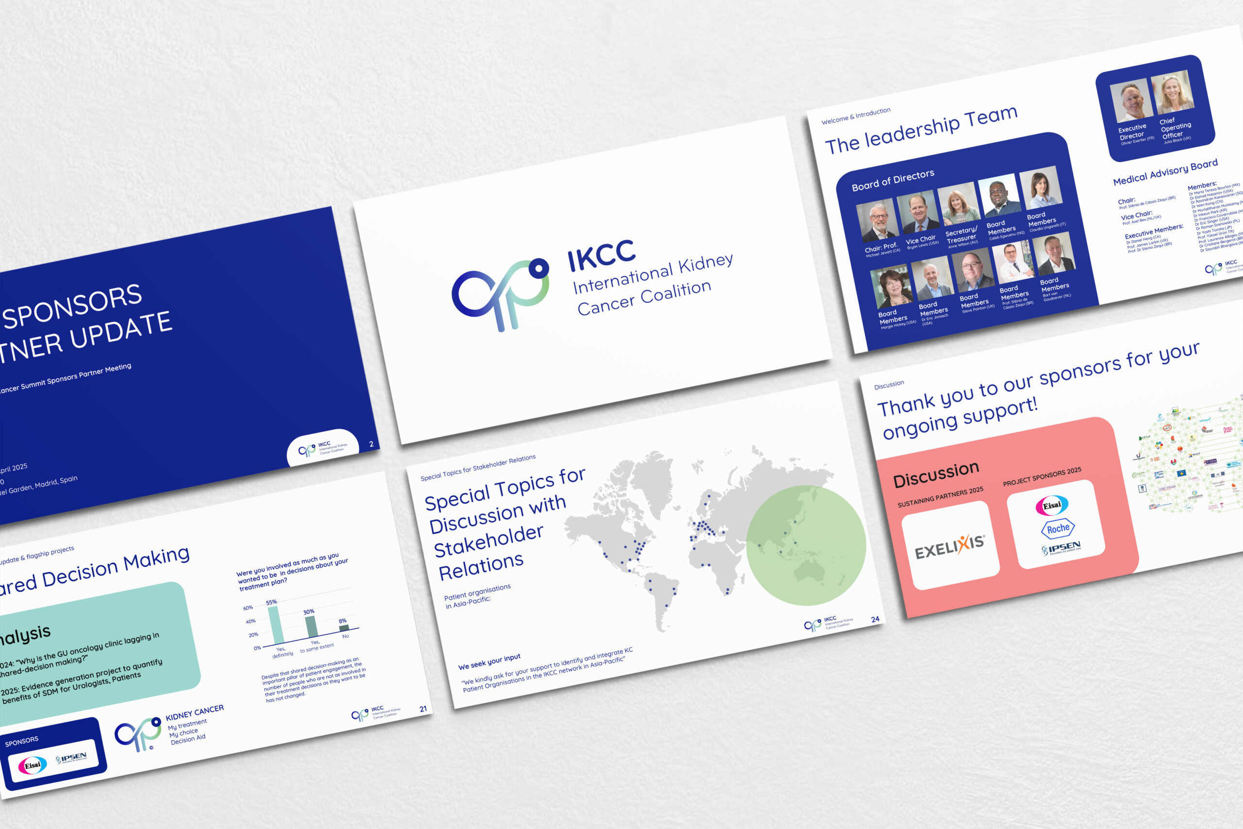
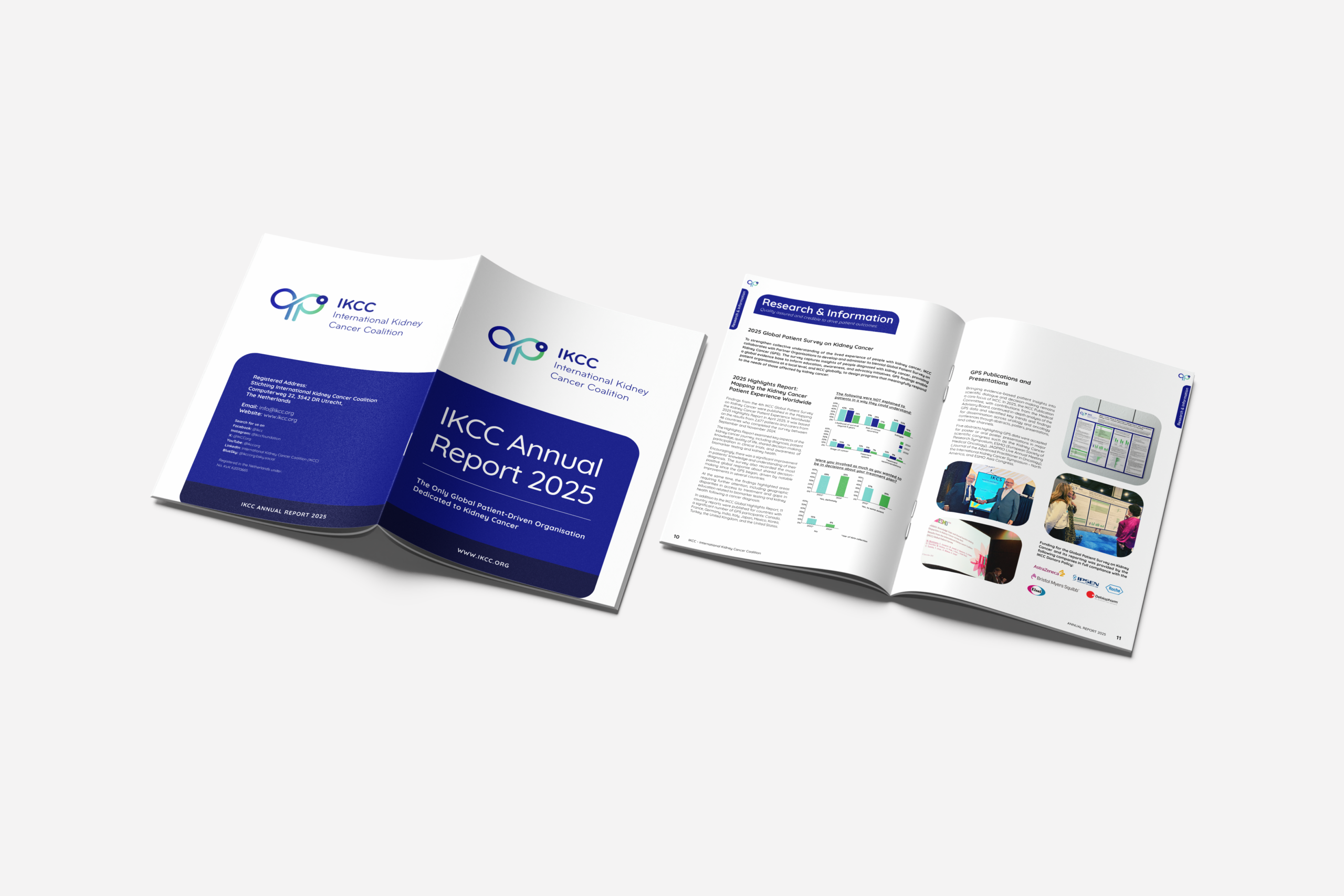
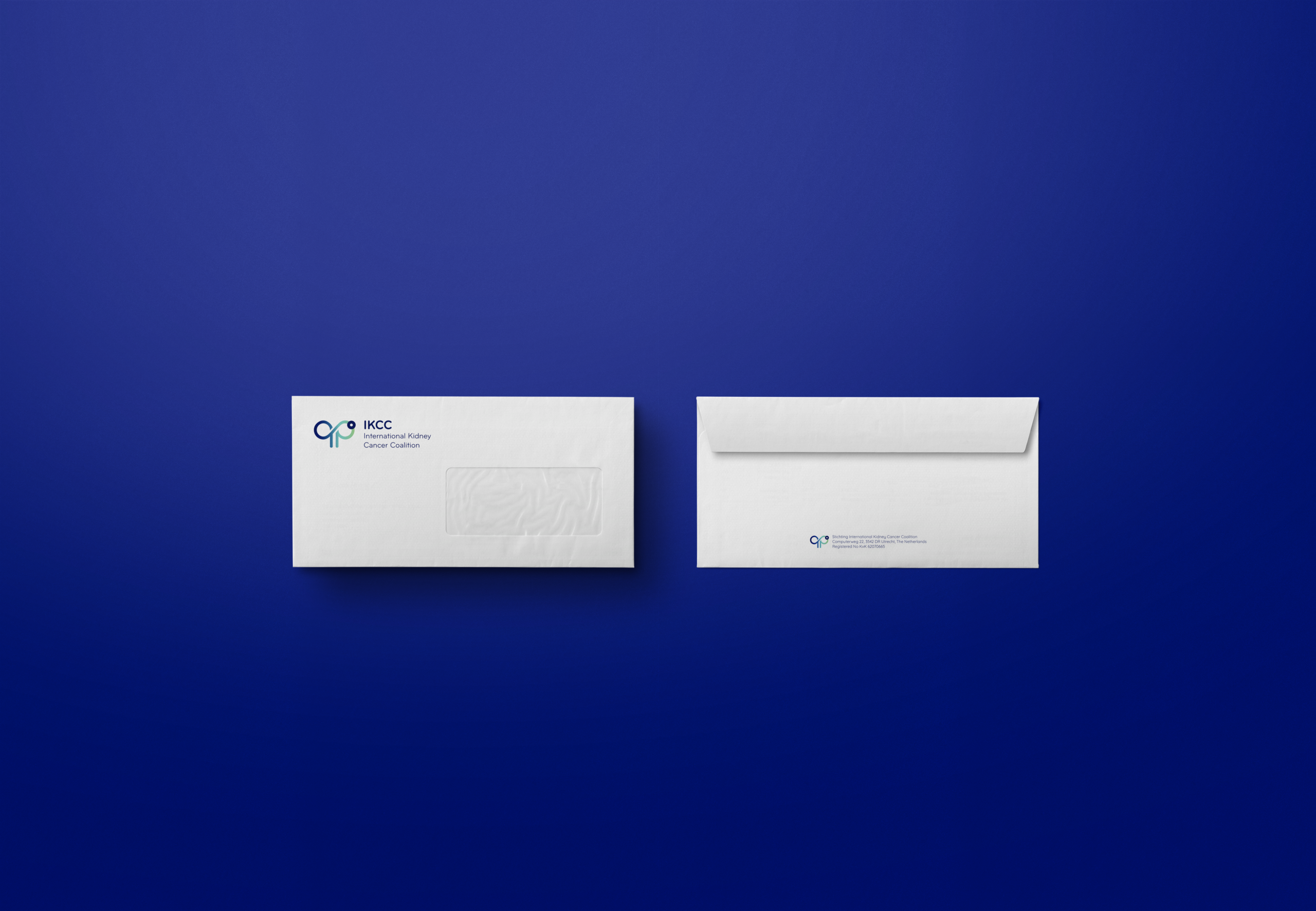
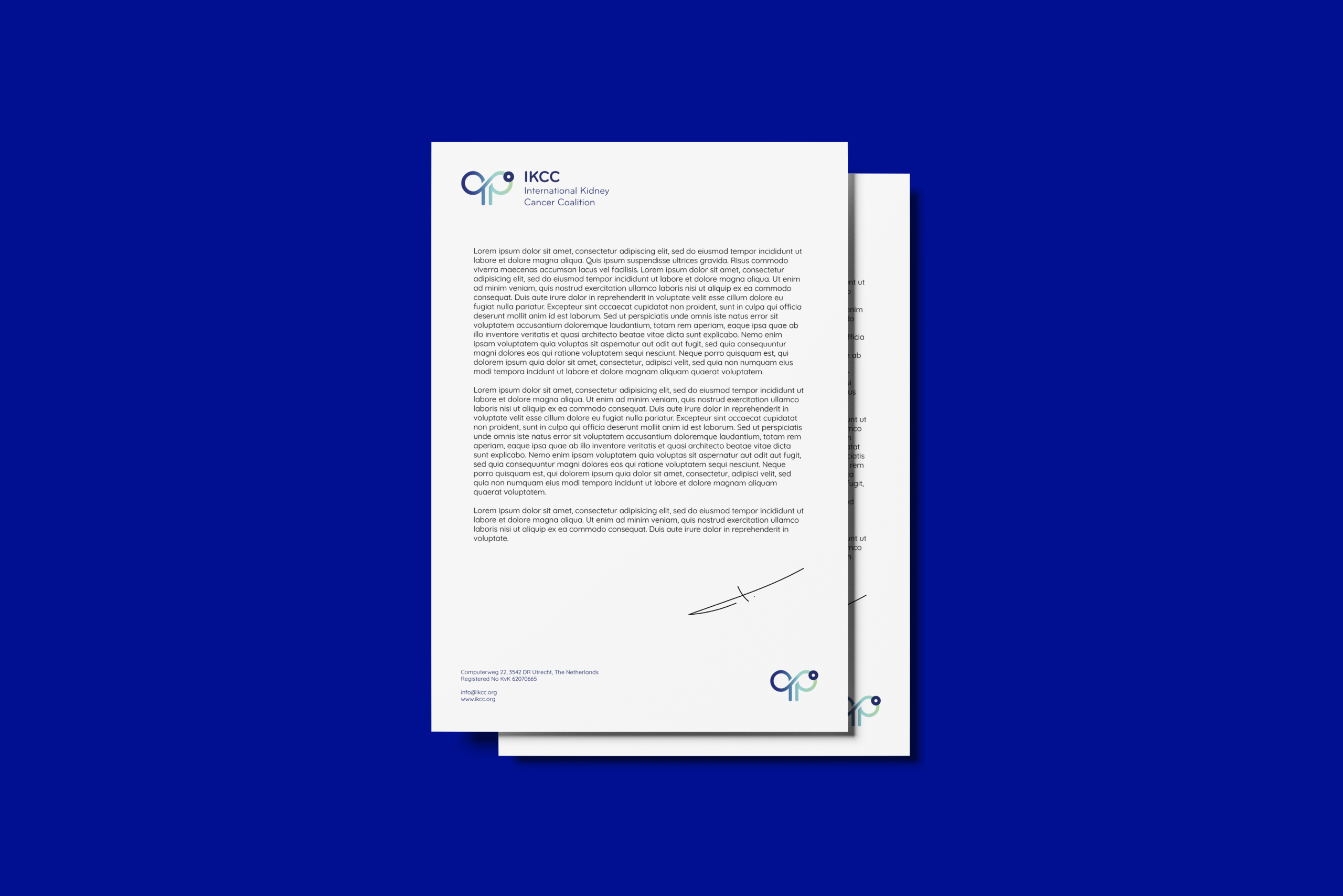
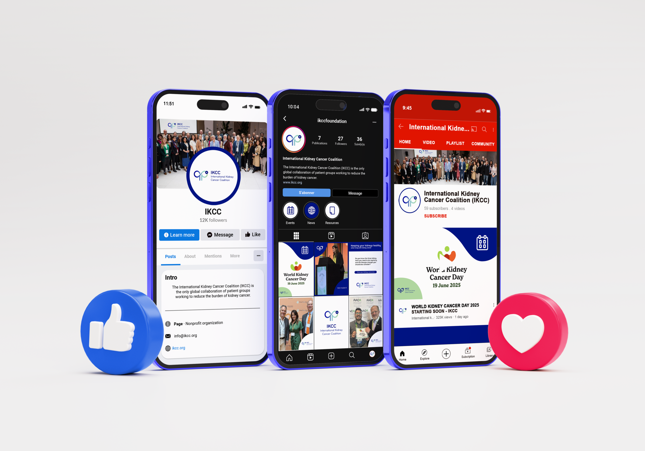
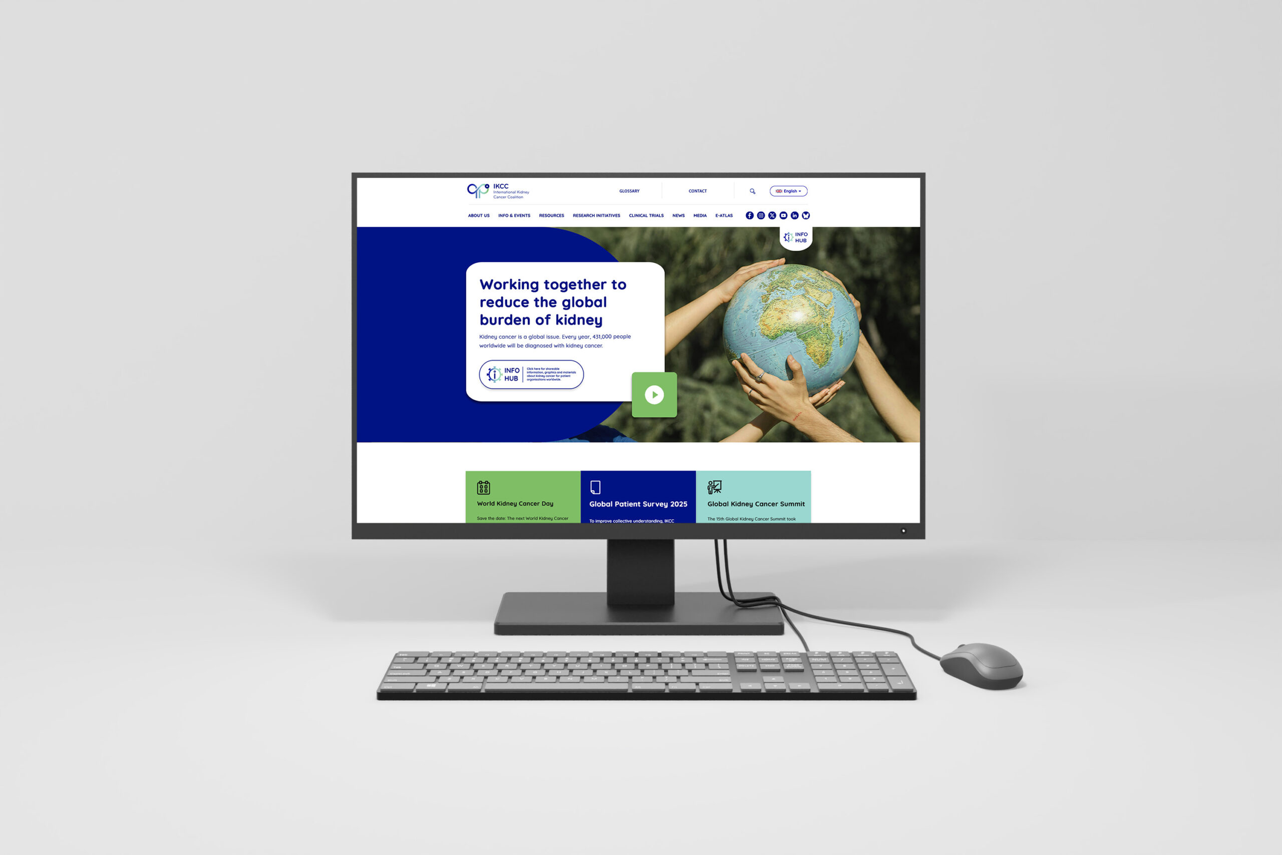
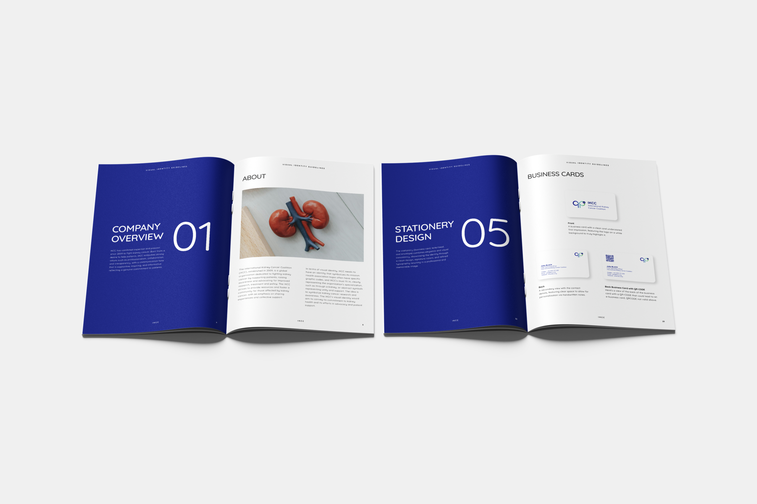
Started with IKCC’s core values: professionalism, collaboration, transparency, responsibility, ethics, innovation. Researched health association branding (cancer organizations, kidney foundations) for common visual codes (ribbons, organ silhouettes, hands, circles). Explored symbol options: a stylized kidney shape combined with interlocking figures (unity) or a ribbon integrated with a kidney. Decided on an abstract mark representing both a kidney and a support network (e.g., overlapping organic curves). Selected the color palette through careful balancing: indigo blue for trust, pastel blue for innovation, light moss green for empathy, peach pink for hope, and softened black for seriousness. Chose Quicksand typography for its approachable, rounded, sans-serif design that feels warm and professional without being childish. Designed logo variations: full color, monochrome, and reversed for different backgrounds. Created a comprehensive brand guideline document covering color usage, typography hierarchy, tone of voice examples, and do’s and don’ts. Applied the identity to mockups: website homepage, annual report cover, social media graphics, informational brochures, and patient support materials. Tested readability and emotional resonance with focus groups including patients and medical professionals. Delivered a visual identity for IKCC that is as compassionate as it is credible where every color and every letterform works together to fight kidney cancer through clarity, hope, and unity.