911 Guêpes et frelons called on our expertise to design its visual identity using the Visual Identity Pack. Experts in wasp, hornet, and Asian hornet nest destruction at all heights, near you. They operate in Gironde. A young company that wanted an identity reflecting its image.
Client
911 Guêpes et Frelons
Role
Art Director
Services
Branding, Prototyping
911 Guêpes et frelons is a young, dynamic pest control company specializing in the removal of wasp and hornet nests, including the invasive Asian hornet. They operate throughout Gironde, handling interventions at any height (from ground level to rooftops). The company wanted a strong, impactful visual identity that conveys strength, speed, and reliability. The logo features a muscular wasp behind bars, using dominant yellow and black colors. This imagery communicates power, danger (appropriately), and the idea of “incarcerating” pests. The overall identity is bold, aggressive, and memorable designed to inspire confidence in an emergency service.
Creating a logo that feels powerful and professional, not cartoonish or overly aggressive. Using yellow and black (common wasp colors) without looking like a generic warning sign. Making a “muscular wasp behind bars” concept recognizable at small sizes (business cards, phone screens). Balancing the urgent, dangerous nature of the service with approachability for residential customers.
Design a bold logo featuring a muscular wasp behind bars in yellow and black. Develop a color palette dominated by high-contrast yellow and black, with possible neutral accents (white or dark gray) for readability. Create a visual identity that conveys expertise, speed, and reliability for emergency interventions. Produce a complete branding package including logo, business cards, vehicle signage, uniform patches, and a website header. Position 911 Guêpes et frelons as the go-to local expert for nest removal in Gironde.
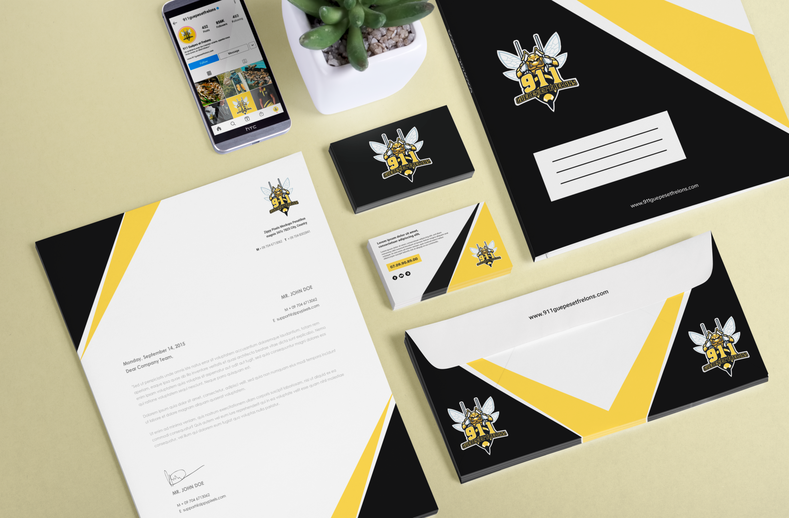
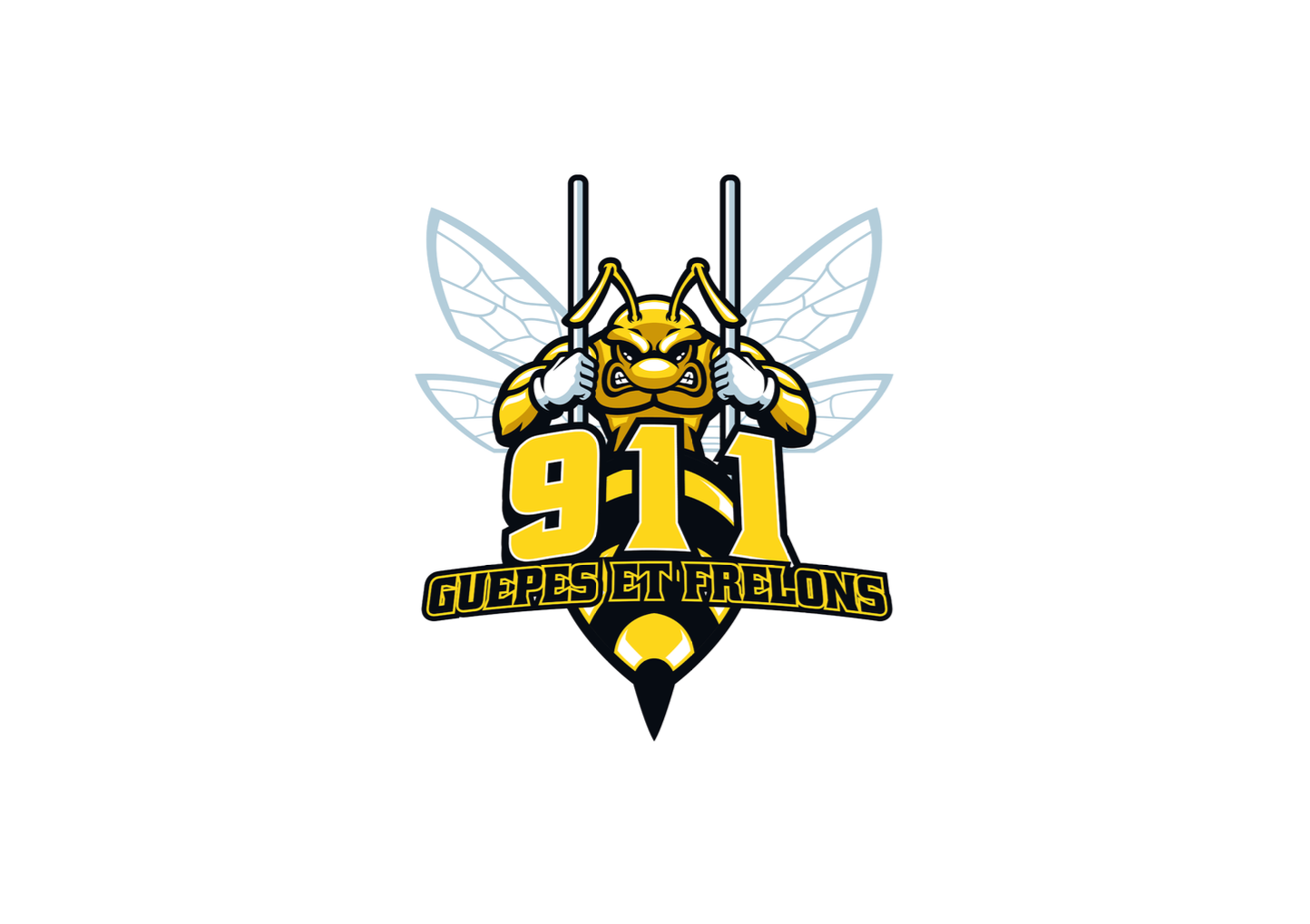
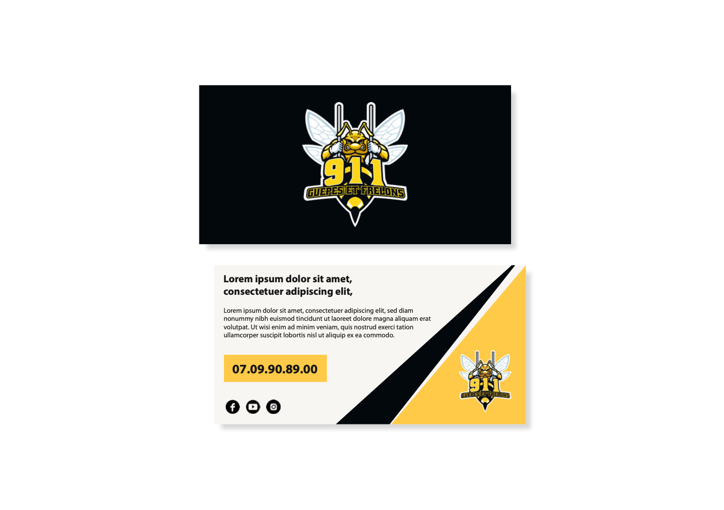
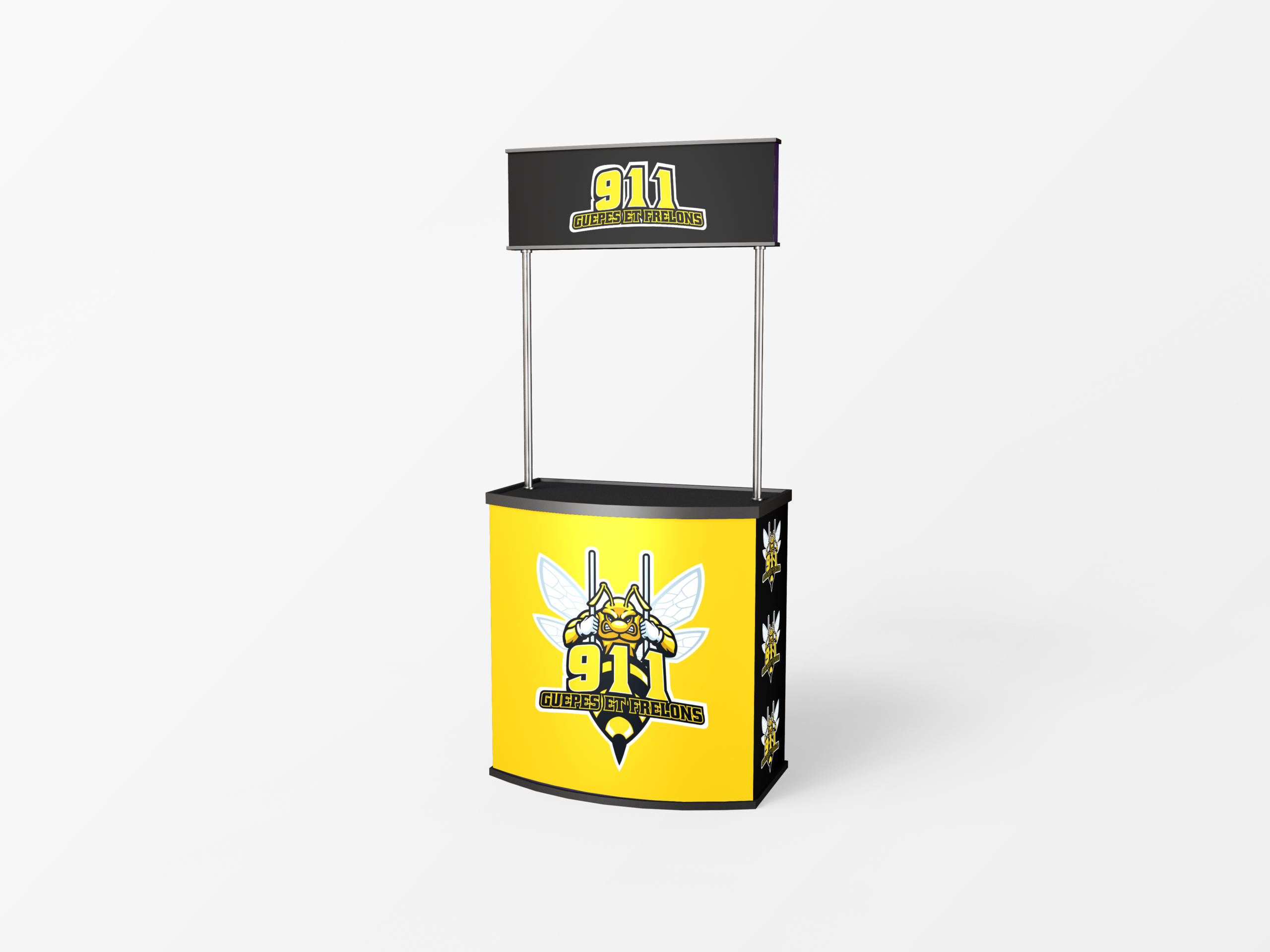
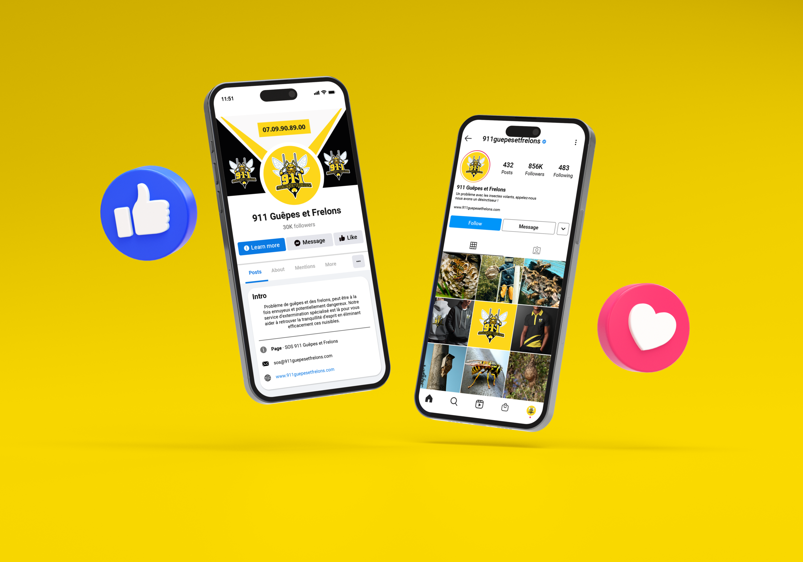
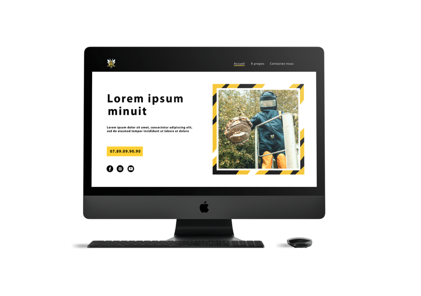
Started with research on pest control branding: often use shields, crosses, or cartoon bugs. Avoided clichés by focusing on strength and incarceration metaphors. Chose yellow and black as primary colors (wasp warning colors, high visibility, strong contrast). Sketched multiple logo concepts: a wasp with exaggerated muscular arms and thorax, shown behind prison bars or a cage. Refined the wasp’s expression to be fierce but not grotesque. Added the “911” prefix to emphasize emergency response. Selected a bold, condensed sans-serif typography for the company name to match the aggressive tone. Designed mockups: a van wrap with the large logo and phone number, technician uniforms with embroidered patches, business cards with yellow and black gradient, a website header showing a wasp nest with the logo overlaid. Ensured all materials include clear emergency contact information. Tested the identity with potential customers to ensure it conveys trust and rapid action. Delivered a brand for 911 Guêpes et frelons where the muscular wasp behind bars says it all: we lock up your pest problem, fast and strong.